3.1 About Organization Chart
You can use the Organization Chart page to display the relationships among users and groups in the form of an interactive organizational chart. In the chart, each user or group is represented graphically in a format that resembles a business card.
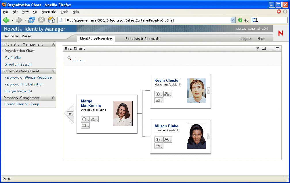
When you first display the Organization Chart page, it shows your own manager-employee relationships. For example, here’s what Margo MacKenzie (Marketing Director) sees by default when she goes to the Organization Chart page:

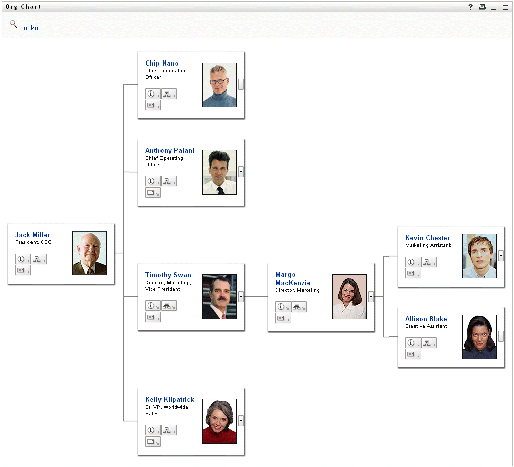
You can navigate the chart by expanding or collapsing it, level by level. Here’s what Margo MacKenzie sees when she navigates up two levels and expands the chart:

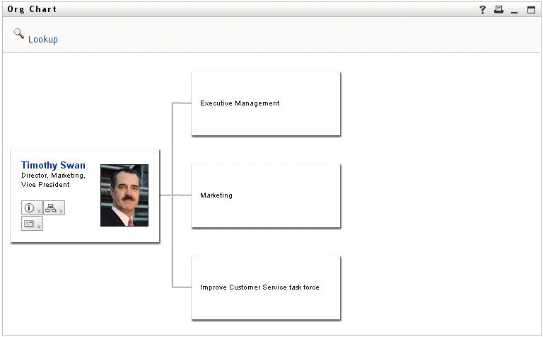
The chart also enables you to view other relationships. For example, the user-group relationships for Timothy Swan (Marketing Vice President) look like this:

The chart provides links for performing other useful actions on users and groups. You can:
- Look up a user to display in the chart
- Display details (Profile page) for a selected user
- Send user details (in the form of a link) to someone via e-mail
- Send new e-mail to a selected user or to a manager’s team