6.5 Form Control Reference
This section describes the controls you can add to a form.
Table 6-4 Control Types and Supported Data Types
6.5.1 Controls for User Entered Comments
Designer supports a special internal control you can add to a form to allow users to add comments to a workflow or to view previously entered comments. They are required on forms that use or . The comments are not part of the workflow data so you cannot access them via the flowdata object. The comments are special data items stored in the afcomment table of the workflow database. The comments are persisted as long as the row for the requestid in the afprocess table exists.
To create a form that supports user comments:
-
Add a control to your form. Select Comment as the data type. The Form Field name is automatically defined as apwaComment and the Control Type is TextArea. A single form can contain only one comment field.
-
Add a or to the form.
For more information, see Section 6.4, Action Reference.
6.5.2 General Properties
The properties in the following table are available for each control.
Table 6-5 General Properties
Sort Order
List-based controls sort content alphabetically. For DN-based lists, the sort order is alphabetical based on the Display expression property result. For all other types, the sort order is based on the display label.
6.5.3 DatePicker
Use this control for display and entry of a date and time. It allows users to choose a date from a pop-up calendar or type a date in a text field. At runtime, the form automatically validates the date using the format for the user’s locale and timezone. If the user enters an incorrect format, the form displays an error message. The DatePicker control’s tooltip displays the valid date format. The default DatePicker control looks like this:
Figure 6-6 Sample DatePicker Control

When the Show date picker property is true, the form displays the date field along with a button. When the user clicks the button, the form launches a calendar for the user to select the date. The calendar pop-up is shown here:
Figure 6-7 Sample Calendar Control
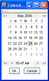
Table 6-6 DatePicker Control Properties
6.5.4 DNDisplay
Use this control to display a read-only DN. You populate the control from flowdata. The control can display the full DN or a set of attributes associated with the DN depending on the properties you set.
Figure 6-8 Sample DNDisplay

Figure 6-9 Sample DNDisplay with Display Expression Specified

Table 6-7 DNDisplay control properties
|
Property name |
Description |
|---|---|
|
Display expression |
Leave this value blank if you want to display the full DN or CN value. If you want to mask the DN by displaying attributes instead, launch the expression builder and select the desired attributes from the list. (You must first specify an .) For example, to show the user entity’s first and last name attributes, construct an expression like this: FirstName LastName. Make sure the attribute’s View, Read, Search, and Required properties are set to true in the directory abstraction layer. See Section 3.7.2, Attribute Properties. |
|
Entity key for DN expression lookup |
Leave this value blank if you want to display the full DN or CN value retrieved from the Identity Vault. If you want to mask the DN or CN by displaying attributes instead, choose the entity from the drop-down list and specify a set of attributes in the property. The entity you choose must:
See for more information, see Section 6.6, Working with Distinguished Names. |
6.5.5 DNLookup
Use this control to allow users to search and retrieve DNs from the Identity Vault. You can initialize the control with a DN from the flowdata. You set properties to control the entities and containers that the user can search and the format of the DN.
Figure 6-10 Sample DNLookup Control

The buttons associated with the DNLookup control are described in the following table.
Table 6-8 DNLookup Control Buttons
Table 6-9 DNLookup control properties
|
Property Name |
Description |
|---|---|
|
Display expression |
This property only applies when you initialize the control from flowdata. Leave this value blank if you want to display the full DN or CN value. If you want to mask the DN by displaying attributes instead, launch the expression builder and select the desired attributes from the list. (You must first specify an .) For example, to show the user entity’s first and last name attributes, construct an expression like this: FirstName LastName. Make sure the attribute’s View, Read, Search, and Required properties are set to true in the directory abstraction layer. See Section 3.7.2, Attribute Properties. |
|
Entity attribute key used for object lookup |
Choose an attribute of the selected property. The attributes in the drop-down are the attributes whose directory abstraction layer property is set to DNLookup. The DNLookup control type property controls the attributes displayed in the Object Selector dialog at runtime. If you leave this blank, the Object Selector displays all of the entity’s attributes that have the directory abstraction layer search and required properties set to true. |
|
Entity key for DN expression lookup |
This property only applies when you initialize the control from flowdata. Leave this value blank if you want to display the full DN or CN value retrieved from the Identity Vault. If you want to mask the DN or CN by displaying attributes instead, choose the entity from the drop-down list then specify a set of attributes in the property. The entity you choose must:
For more information, Section 6.6, Working with Distinguished Names. |
|
Entity key used for object lookup |
A required field. Specify an entity to display in the Object Selector dialog. If you do not specify a value in the , then you create a “general Object Selector”. You can find out more about general object selectors in Section 6.6, Working with Distinguished Names. This property is related to and the properties. |
|
Object Selector type |
Determines whether the Object Selector dialog box performs an Object Lookup or a Container Lookup. This is an example of an Object Lookup: 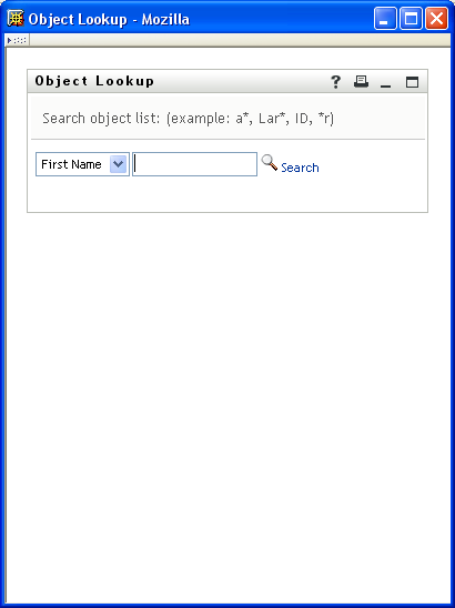
: Causes the Object Selector dialog to perform an object lookup. You specify the lookup criteria via the and the properties. : Causes the Object Selector dialog to display one or more containers for selection. The containers for searching are determined by the property specified in the directory abstraction layer for the entity named in the property. For example, if the property is Group, the search container is set to %group-root% by default. If no search container is used, the search root specified during the user application install is used. |
|
Show clear button |
If true, the form displays the button. |
|
Show object history button |
If true, the form displays the button. |
|
Show object selector button |
If true, the form displays the button. |
6.5.6 DNMaker
Use this control to allow users to construct a DN value by specifying a naming value and choosing a container.
Figure 6-11 Sample DNMaker Control

Table 6-10 DNLookup Control Buttons
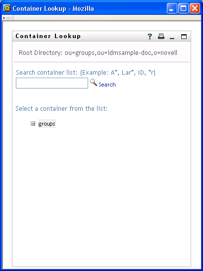
Table 6-11 DNMaker Control Properties
6.5.7 Global List
Use this control to allow users to select a single entry from a drop-down list. The contents of the list are defined in a directory abstraction layer global list element.
Figure 6-12 Sample Global List Control
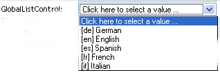
Table 6-12 Global List Properties
|
Property Name |
Description |
|---|---|
|
DAL global list key |
Specifies the unique identifier of the global list. This must correspond to the key specified in the directory abstraction layer. |
For more information about global lists, see Section 3.3, Working with Lists.
6.5.8 MVCheckbox
Use this control to display a set of labelled check boxes. You specify the label and its associated values through the List item property. A sample MVCheckbox control is shown below.
Figure 6-13 Sample MVCheckbox Control

Table 6-13 MVCheckbox Control Properties
HINT:To retrieve user-entered values for this control, use flowdata.getObject() and not flowdata.get(). If you use flowdata.get(), you get only the first value.
For more information on preselecting values, see the Section 9.2.3, Form Control Examples.
6.5.9 MVEditor
Use this control to allow users to display, edit, or add multiple values in a drop-down list box. You can load the data dynamically from the Identity Vault, or allow users to enter the values.
The control’s appearance varies depending on the data type of the control and the properties that you specify. For example, if the data type is a DN, you can set properties that displaying specific attributes related to the DN. You can also enable an Object Selector button that allows users to search and select values by setting the and the properties.
Figure 6-14 Sample MVEditor with Object Lookup Properties Set

Table 6-14 MVEditor with Object Selector Properties Set Control Buttons
|
Button |
Description |
|---|---|

|
Launches a search dialog box called an Object Selector. The Object Selector dialog box looks like this: 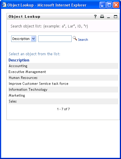
The user can select a value from the list to populate the control. The attribute displayed in the drop-down list ( in the above example) is specified in the directory abstraction layer. You specify it in the attribute’s UIControl property. See Attribute UI Control Properties. The availability of this button is controlled by the Show object selector property. |

|
Show history. Allows users to view the history of objects that they’ve searched. They can select from this list or clear its contents. The availability of this button is controlled by the Show object history button property. |

|
Reset field. Deletes the field contents. The availability of this button is controlled by the Show clear history button property. |
If you do not set the object lookup properties, the MVEditor displays a simple edit control.
Figure 6-15 Sample MVEditor without Object Lookup Properties Set

The buttons associated with the simple edit control are:
Table 6-15 MVEditor Control Buttons
|
Button |
Description |
|---|---|

|
Adds an item to the end of the list. |

|
Deletes the selected list item. |

|
Edits the selected list item. |
HINT:When the MVEditor control’s Editable property is false, this control is read-only and the form does not display any MVEditor control buttons.
Table 6-16 MVEditor Control Properties
|
Property Name |
Description |
|---|---|
|
Display expression |
Leave this value blank if you want to display the full DN or CN value. If you want to mask the DN or CN by displaying attributes instead, launch the expression builder and select the desired attributes from the list. (You must first specify an .) For example, to show the user entity’s first and last name attributes, construct an expression like this: FirstName LastName. Make sure the attribute’s View, Read, Search, and Required properties are set to true in the directory abstraction layer. See Section 3.7.2, Attribute Properties. |
|
Enforce uniqueness |
Forces user-entered list items to be unique. |
|
Entity attribute key used for object |
Choose an attribute of the selected property. The attributes in the drop-down are the attributes whose directory abstraction layer Control type property is set to DNLookup. The DNLookup control type definition controls the attributes displayed in the Object Selector dialog at runtime. If you leave this blank, the Object Selector displays all of the entity’s attributes that have the directory abstraction layer search and required properties set to true. |
|
Entity key for DN expression lookup |
Leave this value blank if you want to display the full DN or CN value retrieved from the Identity Vault. If you want to mask the DN or CN by displaying attributes instead, choose the entity from the drop-down list and specify a set of attributes in the property. The entity you choose must:
See Section 6.6, Working with Distinguished Names for more information. |
|
Entity key used for object lookup |
A required field. Specify an entity to display in the Object Selector dialog. If you do not specify a value in the , then you create a general Object Selector. You can find out more about general Object Selectors in Section 6.6, Working with Distinguished Names. |
|
Ignore case |
If true, ignore case when enforcing uniqueness. |
|
Lower bound (for numbers only) |
Minimum integer or decimal value. |
|
Maximum length |
Maximum number of characters for string values. |
|
Minimum length |
Minimum number of characters for string values. |
|
Number of lines displayed |
The number of rows displayed. |
|
Numbers only |
If true, only numbers can be entered. |
|
Object Selector type |
Determines whether the Object Selector dialog box performs an Object Lookup or a Container Lookup. This is an example of an Object Lookup:
: Causes the Object Selector dialog to perform an object lookup. You specify the lookup criteria via the and the properties. : Causes the Object Selector to display one or more containers for selection. The containers for searching are determined by the property specified in the directory abstraction layer for the entity named in the property. For example, if the property is Group, the search container is set to %group-root% by default. If no search container is used, the search root specified during the user application install is used. |
|
Show object history button |
When true, displays the button next to the control. |
|
Show object selector button |
When true displays the button next to the control. |
|
Upper bound (for Numbers only) |
The maximum numeric value users can enter. |
HINT:To retrieve user-entered values for this control, use flowdata.getObject() and not flowdata.get(). If you use flowdata.get(), you get only the first value.
For more information about preselecting items, see Section 9.0, Working with ECMA Expressions.
6.5.10 PickList
Use the PickList control to allow users to view and choose one or more values from a dynamically-generated list of choices. The list items are DN or CN values retrieved from the Identity Vault. You can display the full DN or CN or use the PickList properties to specify the attributes to display instead.
Figure 6-16 Sample PickList Control without DN Masking

Figure 6-17 Sample PickList Control with DN Masking

Table 6-17 PickList control properties
|
Property Name |
Description |
|---|---|
|
Allow multiple selections |
When true, the user can select more than one list value using their platform-specific multi-select keys. |
|
Display expression |
Leave this value blank if you want to display the full DN or CN value. If you want to format the DN or CN by displaying attributes instead, launch the expression builder and select the desired attributes from the list. (You must first specify an .) For example, to show the user entity’s first and last name attributes, construct an expression like this: FirstName LastName. Make sure the attribute’s View, Read, Search, and Required properties are set to true in the directory abstraction layer. See Section 3.7.2, Attribute Properties. |
|
Entity key for DN expression lookup |
Leave this value blank if you want to display the full DN or CN value retrieved from the Identity Vault. If you want to mask the DN or CN by displaying attributes instead, choose the entity from the drop-down list and specify a set of attributes in the property. The entity you choose must:
|
|
Number of lines displayed |
The number of lines displayed by the control. This is not the number of records retrieved or displayed, but the vertical size of the control. If you set this number to 10 and there are only 5 records to display, the control size is still 10 lines. |
HINT:To retrieve user-entered values for this control, use flowdata.getObject() and not flowdata.get(). If you use flowdata.get(), you get only the first value.
For more information on displaying the control with a preselected option, see Section 9.2.3, Form Control Examples.
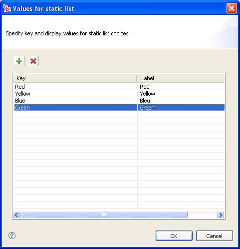
6.5.11 Static List
Use this control to display a list of items in a drop-down list from which users can select a single item. The list items are static and are stored with the provisioning request definition. The text “Click here to select” only appears if the field is not set to Required.
Figure 6-18 Sample Static List Control
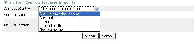
Table 6-18 Static List Properties
6.5.12 Text
Use the Text control for data display or user input. User input is validated depending on the control’s data type.
Figure 6-19 Sample Text Control

Table 6-19 Text Control Properties
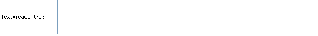
6.5.13 Text Area
Use this control to display or accept input of multi-line data. Users can select multiple lines of data using multi-select key combination for their platform.
Figure 6-20 Sample Text Area Control
6.5.14 Title
Use this read-only control to label your form or provide instructions.
6.5.15 TrueFalseRadioButtons
Use this control to display a choice of True or False as a set of radio buttons.
Figure 6-21 Sample TrueFalseRadioButtons Control

This control has no custom properties.
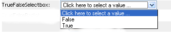
6.5.16 TrueFalseSelectBox
Use this control to display a choice of True or False in a drop-down. The text “Click here to select a value” displays only when the field is not required
Figure 6-22 Sample TrueFalseSelectBox Control
This control has no custom properties