Pageflow and Form Guide
CHAPTER 6
This chapter introduces the Novell exteNd Director Form Designer and describes how to use it to create and modify XForms 1.0-compliant Web forms. It includes these sections:
XForms provide a robust, standards-based way to define Web forms. The advantages of the XForms standard include:
A powerful event model (so that you don't have to use a lot of scripting for client-side validation or calculations)
XForms cannot run as standalone applications. They are designed to run as components within a host language like XHTML. In Novell's implementation, they run within the context of a pageflow application.
The Form Designer provides a graphical environment for developing XForms 1.0-compliant Web forms.
The Form Designer is divided into these tabs:
|
Tab |
Description |
|---|---|
|
Form |
Lets you define the form's user interface. You can graphically:
|
|
Model |
Lets you define the form's model elements. You can:
|
|
Source |
Launches a powerful XML source editor.
|
|
XForms Preview |
Lets you run a form in test mode.
|
To start the Form Designer, you:
Open an existing form (see To open an existing form: next)
Create a new form (see Creating forms)
Navigate to the location of the existing form (usually in the project's \data\form directory).
Click the form file and choose Open. (Optionally, you can double-click the form.)
You use the Form Wizard to create either an initial unbound form or a data-bound form based on:
Other strategies To create a complete pageflow including input and output forms from any other source, you'll launch a different wizard. For more information on launching other wizards that generate XForms within the scope of a pageflow application, see Database Pageflow Wizard, Web Service Pageflow Wizard, and Composer Pageflow Wizard.
 To create a form using the Form Wizard:
Open an exteNd Director project.
TIP: You can't start the Form Wizard unless you have a project that contains a resource set open.
On the Portlet tab, choose Form and click OK. (Alternatively, you can double-click Form.)
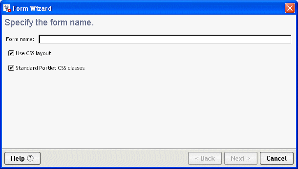
Specify the following options:
|
Option |
What to do |
|---|---|
|
Form name |
Specify a name for the form. You don't need to specify any extension. |
|
Use CSS layout |
Check this box when you want the wizard to use absolute positioning to layout the controls on the form, otherwise, uncheck this box. If you choose not to use CSS layout, absolute positioning is not available.
|
|
Standard portlet CSS classes |
Check this box when you want the wizard to use the WSRP CSS classes for fonts and colors. (The defaults are defined in the wsrp-classifications.xml file located in the Common\Resources\CSSClassifications directory). When checked, these classes are used in combination with the portal theme files at runtime for styling the page. Uncheck this box if you want to define your own colors and fonts. |
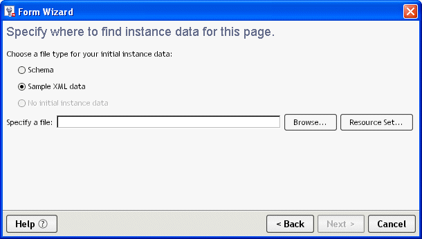
Specify one of the following file types for your initial instance data:
If you chose Schema, you are prompted to specify the root of the instance data defined by this schema on the next pane:
Specify the following options:
When the wizard reports that it has finished creating the form, click OK.
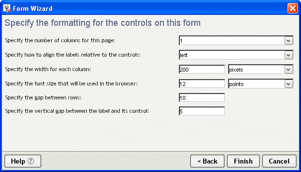
What happens When you click Finish, the Form Wizard generates an XHTML file including all of the markup necessary to:
Generate and bind default controls for each node of instance data
Generate a single absolute positioning region containing default controls (and labels) for each component of the instance data
Lay out the controls based on user input (such as the number of columns and how the label should appear)

The generated forms are XForms 1.0-compliant. They reside in an XHTML file. Each form generated by the wizard has the following:
XML namespace declarations are located at the top of the file and have this format:
xmlns:xforms="http://www.w3.org/2002/xforms"
XML namespaces identify the XML language an element belongs to—and how to process them. Some example prefixes include:
|
xmlns prefix |
Description |
|---|---|
|
xforms |
Treated as XForms language elements |
|
ev |
Treated as XML event language elements |
What you do You are not required to change the wizard-added namespaces. You may have to add new namespace declarations depending on your application.
The XForms model element is located within the <head> of the XHTML document. The model element defines the:
In the wizard-generated model element you'll see an id attribute with a name that includes _wsrp_rewrite_—like this:
  <xforms:model
     id="model1_wsrp_rewrite_">
A model ID is not required (unless there are multiple models); however, the Form Wizard always generates a model ID. The wizard-generated model ID always includes the wsrp_rewrite token. At runtime the wsrp_rewrite token is replaced with a unique name. This allows the runtime environment to manage multiple forms and models running within a single page.
What you do You'll use the Model tab to define instance data, submission elements, and model item properties. The runtime environment will manage the replacement of the wsrp_rewrite token.
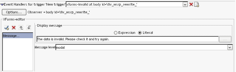
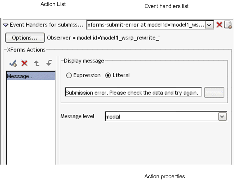
Within the model element, you'll see two predefined XForms <action> elements containing two XForms event handlers. They are default handlers for submit and data validation errors.
They provide user feedback when an error occurs on submission. They are intended to ensure that there are no silent failures for your form. They look like this:
  <xforms:action ev:event="xforms-invalid" ev:observer="div_wsrp_rewrite_">
  <xforms:message level="modal">The data is invalid. Please check it    and try again.</xforms:message>
  </xforms:action>

  <xforms:action ev:event="xforms-submit-error">
  <xforms:message level="modal">Submission error. Please check the
     data and try again.</xforms:message>
  </xforms:action>
What you do No action is required, but you can modify them or remove them if you do not want your form to include this functionality.
The <style> element contains the CSS definitions for the form and controls.
If you choose to use CSS layout (when generating the form), the styling information for the generated page is contained in CSS styling rules located in a <style> element within the <head> of the XHTML file. You can also store the CSS style rules in an external file referenced from the XHTML file through a link.
NOTE: If you specified not to use CSS styling (when generating the form via the wizard), the generated form will not contain a style node.
The following applies to all XForms controls on a form:
What you do You can modify the default CSS styling rules by:
 For more information, see Using the CSS Style Manager.
The Form tab provides the tools to define the user interface. This section describes how to use the Form tab. It includes these topics:
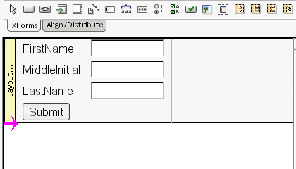
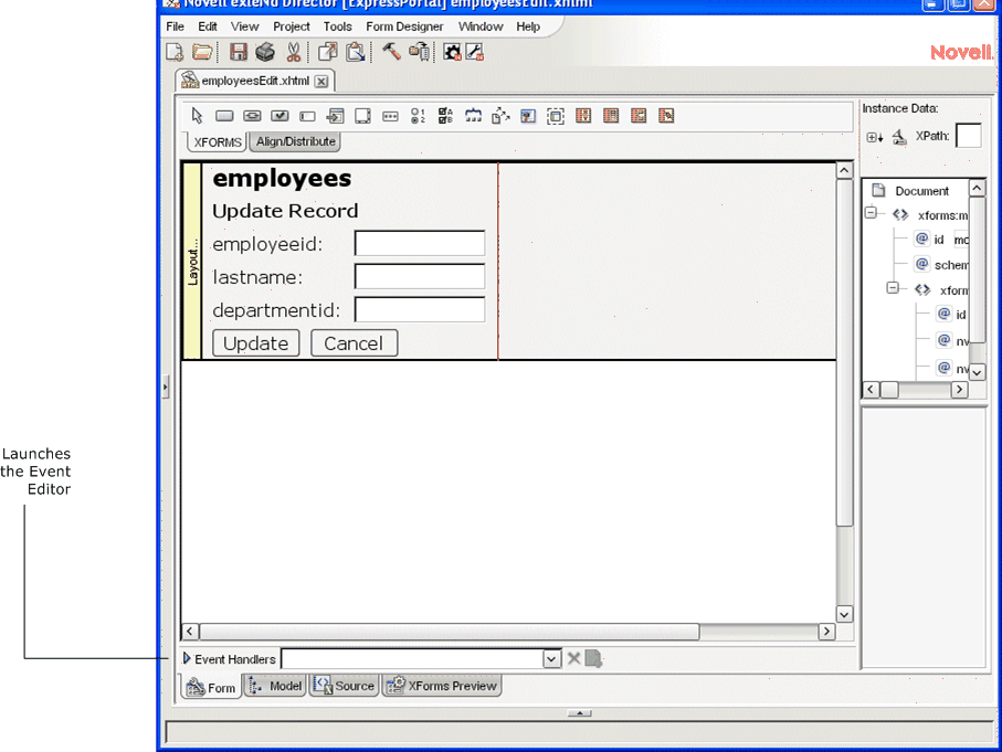
The Form tab provides a graphical way to create and manipulate the form controls that make up the user interface. The Form tab looks like this:
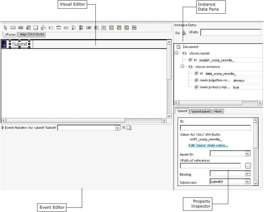
The Form tab provides:
|
Tool |
Description |
|---|---|
|
Visual Editor |
Use the Visual Editor to graphically create and manipulate the controls. The editor includes a tabbed toolbar that includes: |
|
Instance Data Pane |
Use the Instance Data Pane to bind instance nodes to form controls. You cannot use the Instance Data Pane (in the Form tab) to modify the structure of the instance data. Use the Instance Data Pane in the Model tab for those types of functions. |
|
Property Inspector |
Use the Property Inspector to manipulate the CSS and data binding properties on the currently selected control.
|
|
Event Editor |
Use the Event Editor to define the events and actions for controls on the form.
|
Only the form controls in layout regions on the page are editable. You cannot use the Visual Editor to edit the XHTML on the page. The XHTML tags are not expanded to display their content—only the tags are displayed. You cannot insert a form control into an XHTML tag.
You can use the following shortcut keys in the Visual Editor:
The Form Designer supports all of the XForms controls outlined in the XForms 1.0 specification and several other controls used by the Form Designer to control formatting. The controls include:
|
Icon |
Control |
Description |
|---|---|---|
|
|
XForms trigger control |
A standard XForms trigger control. For example, a button on a form. Allows user-triggered actions. |
|
|
XForms trigger styled as a link |
A standard XForms trigger control preconfigured to emulate a link. CSS rules are applied to make the trigger look like a link not a button. This means that:
|
|
|
XForms output |
Displays read-only data to the user. This control supports the format property which allows you to specify formatting for certain data types. You apply the formatting in the Property Inspector . |
|
|
XForms text area |
Allows users to enter freeform, multiline content. |
|
|
XForms upload control |
Allows users to upload a file from the local file system. IMPORTANT: The instance node to which the upload control is bound must be defined as a schema type of base64Binary or you will encounter inconsistent behavior at runtime. For example: <lastname xsi:type="xsd:base64Binary"/> |
|
|
XForms input |
Allows users to enter single-line freeform data. This control supports the format property which allows you to specify formatting for certain data types. You apply the formatting in the Property Inspector .
|
|
|
XForms range |
Allows users to select from a sequential range of values. |
|
|
XForms secret |
Allows users to enter single-line freeform data. The characters are disguised during data entry. Useful for things like passwords. |
|
|
XForms Select One |
Allows users to select a single item from a set of choices. |
|
|
XForms Select Many |
Allows users to make more than one selection from a set of choices. |
|
|
XForms submit button |
A special form of trigger that allows users to submit the contents of the form. |
|
|
XHTML image |
Displays an XHTML image loaded from the project's resource set. Visible in the Form tab, and View form in browser modes. |
|
|
HTML content box |
Read-only display of static HTML content. |
|
|
Absolute positioning region |
exteNd Director extension. Used for managing layout. |
|
|
XForms repeat |
Use to display collections of homogeneous data. To manage the repeated elements, add a repeat block to the form, then add the controls representing a single instance of the repeated data within the repeat block. At runtime the processor renders the repeat block once for each data element that the repeat control is bound to. Each instance of the repeated data is processed as a block. Each block is placed below the preceding block. All of the remaining, nonrepetitive content is placed below that. You cannot directly position nonrepeated objects : |
|
|
XForms switch |
Use to perform conditional processing of controls on the form. The switch element allows any number of case elements as children. Each case represents a subform, exactly one of which is rendered at any time by the runtime processor. The case rendered is determined by an action in an event handler not based on the result of a calculation. The Form Designer represents switch elements as a layout region for each case element. You cannot specify the order of the case statements within a switch block—but that is not necessary, since only one will be displayed at a time. The event handler determines how cases are displayed in response to the events that you specify. |
|
|
Pageflow link region |
exteNd Director extension. At runtime this control is replaced with one or more submit buttons.
|
For more information on the properties that you can specify for the controls, see Setting form control properties.
After you generate an initial form using the Form Wizard, you can refine it by adding or moving controls. You can use the Form tab for:
To add unbound controls from XForms toolbar:
To add unbound controls from the Form Designer menu:
You cannot remove a control without also removing its label.
To move more than one control:
By default, a control's width and height are unspecified so that they can automatically adjust to their content. You can specify an exact width and height in the two ways described below
NOTE: When you define the width and height, the contents of the control wrap to to accommodate the specified size. The runtime results are not guaranteed.
To size a form control graphically:
To size a form control using the Property Inspector:
You can align controls within a layout, repeat, or switch block.
Select the control to use as a reference, plus the additional controls that you want to align with it.
Choose the alignment you want (from the Align toolbar) to apply to the selected objects.
You may want to create groups of controls, because a group can:
Provide a hint to the client side XForms renderer, so that related controls can appear together on limited capability devices, such as cell phones and PDAs.
Simplify the XPath expressions within a group by establishing a context for the controls in the group.
Provide a container for the controls to which you can apply CSS styles within the group via inheritance.
Groups must be strictly nested—that is, the entirety of a group must be contained by a higher-level container such as group, repeat, or switch/case blocks.
The entirety of a control (not just the label, for example) belongs to a group.
Be careful when using groups. Grouping a set of controls in the Form Designer does not lock the controls together spatially. You cannot ungroup and regroup a set of controls without losing information (such as the instance data context, or style information attached to the group element).
Most of these rules are required because of the hierarchical nature of XML.
Select Add to Group from the Form Designer menu or by right-clicking and selecting it from the popup menu.
The Form Designer creates the new group, and it becomes the current selection. The Property Inspector displays properties for the selected group. When the group is selected, it can be dragged around the page to reposition the controls within the group.
When you create a group:
The XML is reorganized to create a new group element whose parent is the parent of the control that is the primary selection.
The selected controls become children of the new group element.
The nodeset binding for the group node is set to the instance data node that is the "lowest" ancestor to the instance data nodes bound to the selected controls
The XPath bindings for the controls in the new group are adjusted to become relative to that node.
Binding specifications using the bind attribute are not adjusted.
Select Form Designer>Group>Add to Group (or right-click to display a popup menu).
Select the name of the group to add the control to.
The selection does not change to the entire group, in case there are additional commands to be performed on the selected control. The XML element for the control is moved under the group element representing the group, and the instance data binding XPath is adjusted to be relative to the node bound to the group element.
To remove controls from a group:
Right-click and select Remove from group (or select it from the Form Designer menu).
Choose the group from which the element should be removed.
The XML element(s) representing the control(s) are detached from the group element and made siblings of it; the instance data XPath expressions are adjusted to absolute expressions. If no controls remain in the group, the group element is removed from the document.
When you remove a group:
The XML elements representing the controls in the group are detached from the group element and made siblings of it.
The instance data XPath expressions for the controls are adjusted to absolute expressions.
The Form Designer provides default styles (based on standard portlet CSS class definitions) to implement color, sizing, and fonts used in the form's presentation. The default class attributes for the styles are defined in wsrp-classification.xml (located in the \Common\Resources\CSSClassifications directory). At runtime, the various portal theme files define the styles associated with these class attributes, and with some internal Novell class attributes.
The wizard generates class attributes for each of the controls on a form. For example, an input field on a form could be given a name like:
class="nvP1_wsrp_rewrite_ portlet-form-input-field"
The nvp1 class value references a unique selector in the internal style node that specifies the absolute positioning rules for this element.
The wsrp_rewrite is a token that is replaced at runtime to ensure unique names for all of the controls on a page in a multiportlet page.
The portlet-form-input-field is the class name that references a formatting rule in an external style sheet (normally a portal theme file).
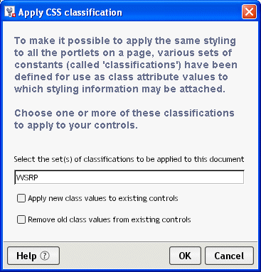
These classes are defined in WSRP-classification.xml in the Common\Resources\CSSClassifications directory. This file maps the class names to particular control types. These class names are added by the wizard if you check the Standard Portlet CSS Classes check box (on the first page of the wizard).
To
apply CSS Classifications to a file that was not generated with these values:
Choose Form Designer>Set CSS Classification.
Complete the panel as follows:
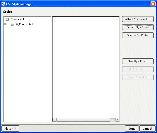
You can use the CSS Style Manager to edit any internal or external CSS style sheets associated with your form from within the Form Designer. You can use it to specify CSS properties like background color, text color, and font size associated with specific controls and labels. (The Form Designer directly handles control and label positioning; you cannot use the CSS Style Manager for this function.)
To open the CSS Style Manager:
NOTE: Pressing cancel on this main dialog does not cancel completed actions.
You'll use the CSS Editor to create, edit, and delete style rules for both internal and external style sheets.
For more information, see the chapter on the CSS Editor in Utility Tools.
To allow you more precise control of the layout of the controls on a form, the Form Designer requires you to place form controls within a layout region. A layout region is a container for the XForms controls within an XHTML page. Like other form controls, you can add, remove, size, and set properties on layout regions. The following controls can act as layout regions:
Layout regions are identified with a gutter in the far left of the Visual Editor. :
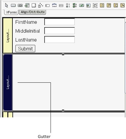
Click the gutter to select the control for setting layout region properties, resizing, or deleting.
To add a layout region to a form:
Position the cursor to the location where you want to add the control.
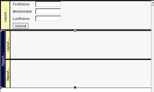
To create nested repeat blocks:
Click the Insert XForms Repeat icon in the XForms toolbar.
Click in the white space of an existing repeat block in the Visual Editor (click away from the block's boundary—clicking on or near the lower boundary of the repeat block adds the new repeat after, not within, the existing block).
The Form Designer adds an empty repeat group to the form. It looks like this:
Move the pointer to the white space at the bottom of the bottommost block.
Enter two or more case IDs separated by spaces.
You'll use the case IDs to program the behavior in the Event Editor.
The The Form Designer adds a switch block with a case block for each case id you entered.
Add controls to the case layout regions, as described in Adding and removing controls.
TIP: You can add or remove cases by selecting the switch box, right-clicking and choosing the action from the popup menu.
Properties are attributes that you can set at design time for a particular control. You specify property values in the Property Inspector. See the table below for properties specific to the exteNd Director extensions (such as the Pageflow link region) or conveniences (such as the Alert literal text). For all other definitions, see the XForms specification.
|
Property name |
Description |
Applies to |
|---|---|---|
|
Alert literal text |
The text displayed in an alert box. |
All controls for which model item properties can be defined |
|
Button height |
Specifies the height of buttons added to the Pageflow link region at runtime. The default is 25. |
|
|
Button layout |
Specifies the layout of the buttons added to the Pageflow link region at runtime. The default is Horizontal. |
|
|
Button spacing |
Specifies the spacing between the buttons added to the Pageflow link region at runtime. The default is 5 pixels. |
|
|
Button width |
Specifies the width of the buttons added to the Pageflow link region at runtime. |
|
|
Dynamic choices |
||
|
Launches a dialog that lets you: |
All controls for which CSS styling applies |
|
|
Emulate link |
Defines a trigger control's appearance. Checked—Trigger is styled as a link. Adds an <xforms:action> event handler that listens for the DOMActivate event (button press). The action element contains an <xforms:load> element that loads a new page via an HTTP GET operation (and thus the Request type is set to Get). There is no default URL to use for the GET; you have to add that via Target URL. UnChecked—Trigger is styled as a button. |
XForms trigger control, XForms trigger styled as a link, Pageflow link region |
|
Field type |
Sets the data type that the control assumes for the instance item it is bound to. Use this in conjunction with the Format property. Make sure that you specify a field type that is valid for the data type of the field. When there is a conflict between these two types:
See also Format |
All controls that can be bound to data |
|
Format |
Specifies how to format the data when displaying it. Valid formats are: Number, currency, percent, ###,###.##, #####0.##, #####.00 See also Field type |
All controls that can be bound to data |
|
Hint literal text |
The text displayed in a tooltip. |
All visible controls |
|
ID |
A unique identifier for the control. |
All controls |
|
Label |
The text displayed for the control's label. |
All controls that can have a label |
|
Model ID |
The ID of the model associated with the Form control. |
All controls that can be data bound. |
|
Request type |
Get—Uses the <xforms:load> action. Requires a Target URL property. Post—Uses the <xforms:send> action. Requires a Submission property. |
XForms trigger control, XForms trigger styled as a link, Pageflow link region |
|
Source |
Specifies the name of the source file containing the XHTML image to insert. |
|
|
Style as link |
Checked—The XForms Trigger control is styled as an HTML link. Adds a CSS class selector (nv-link-style) to the trigger's class attribute. This CSS selector styles the trigger to look like the default appearance of the HTML <a> tag. This selector rule is added to the page's <style> node so you can modify it to look the way you want. All triggers marked to emulate links share this same style. Unchecked—Removes the selector name from the trigger's class attribute, but does not delete the selector rule from the <style> node. |
XForms trigger control, XForms trigger styled as a link, Pageflow link region |
|
Submission |
Specifies the value of <xforms:send>'s submission attribute. (This is the ID of an <xforms:submission> in the <xforms:model>.) |
XForms trigger control, XForms trigger styled as a link, Pageflow link region |
|
Target URL |
Specifies the value of <xforms:load>'s resource attribute. (The URL that a GET is sent to in order to load the new page.) This URL automatically gets marked up for URL rewriting in the portlet context, so specifying a relative URL here will get back to your portlet.) |
XForms trigger control, XForms trigger styled as a link, Pageflow link region |
The Form Designer makes it easy to bind controls to a single node or a node set. In many cases you won't need to take any action to bind a control to data. For example:
When you drag a data node from the Instance Data Pane onto a control in the Visual Editor, the Form Designer generates the data bindings automatically
If you want to modify the generated bindings, or if you want to bind controls that you've added to the form from the toolbar, you can use the Property Inspector to specify the binding attributes. You can also set up a <bind> in the Model tab, then set the bind property to the <bind> element's ID. See Binding elements to controls.
NOTE: The following procedure generates a binding via a <ref> attribute on the control. It's possible to specify either a <ref> or a <bind>. When you specify one, the Form Designer removes the other. If you enter both via the Source tab, the <bind> takes precedence.
To bind a control to a single node via an XPath:
Using the Property Inspector, specify the model ID (when there is more than one model element for the form).
Typing the XPath in the text box of Reference (generates a <ref> attribute)
Launching the XPath Navigator (by clicking the ellipsis next to the XPath text box)
In the XPath Navigator dialog, locate the node you want to bind to and select it.
For more information on using the XPath Navigator, see the chapter on scoped paths and XPaths in Developing exteNd Director Applications.
To bind a control to a node set:
NOTE: <repeat> elements require that you bind to a node set.
Using the Property Inspector, specify the model ID.
In the XPath Navigator dialog, locate the node you want to bind to and select it.
For more information on using the XPath Navigator, see the chapter on scoped paths and XPaths in Developing exteNd Director Applications.
NOTE: If a <ref> resolves to multiple nodes, the first node is used.
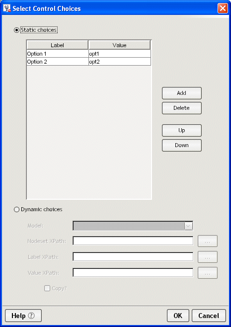
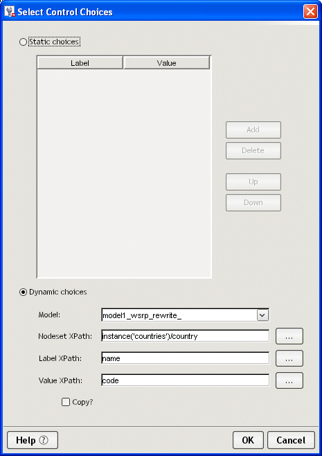
There are two ways to provide a list of values for the Select controls:
List values Lists have two types of values:
The user sees the label, but the associated value is the value written to the instance node. This allows you to display user-recognizable text while storing keys or other types of codes in the instance node. For example, if you entered the words apples, oranges, and pears, these words would appear in the display list. However, selecting apples might return the value 1, oranges could return 2, and so on.
Instance elements A Select control is usually associated with two instance elements:
Choose the Edit Select Choices link.
Click the ellipsis next to the Nodeset XPath to access the XPath Navigator to choose a nodeset.
Click the ellipsis beside Label XPath to access the XPath Navigator to the display value.
Click the ellipsis beside the Value XPath to access the XPath Navigator to choose storage value. This value is written to the instance node.
The XForms model element defines the structure of the XML data available to the form. It defines the:
The Model tab includes these elements:
The Model tab provides a graphical way to define the elements that comprise the form's model. The Model tab looks like this:
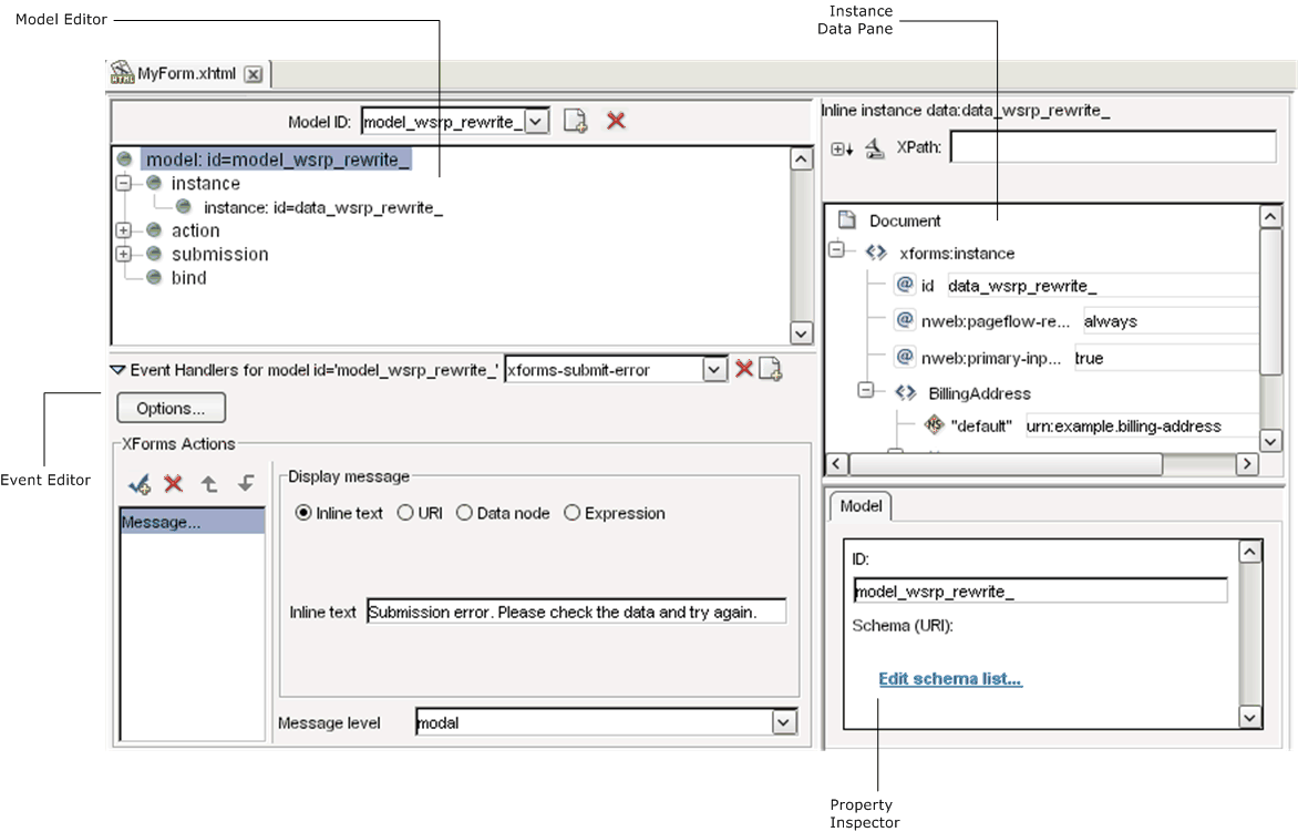
The Model tab provides:
By default, the wizard-generated forms include a model.
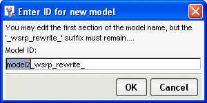
With the form open in the Model tab, click Add (at the top of the Model Editor).
The following dialog is displayed.
You'll see that wsrp_rewrite_ is appended to the model ID name. This is a placeholder that is recommended. At runtime the wsrp_rewrite_ is replaced with a unique ID to ensure that no naming conflicts occur among other forms or portlets on the same page.
The Form Designer creates a new, empty model tree and displays it in the Model Editor.
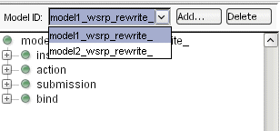
With the form open in the Model tab, select the model element you want to delete from the dropdown list box.
Access the Property Inspector and complete the properties as follows:
For information about adding events, see Customizing event handlers.
NOTE: Some element types only allow you to add elements to the root (like Instance). Others allow you to nest elements within other elements (like bind). You can determine which elements can be nested by selecting an element (not the root) and right-clicking to see if Add item is offered on the menu.
To set instance data properties:
Select an instance element (not the root).
The instance element's properties are displayed in the Property Inspector. They include:
|
Property |
Description |
|---|---|
|
ID |
A unique identifier for the instance data. This is necessary only when there are multiple instance data nodes in a single document. It is good practice to always allow the Form Designer to add _wsrp_rewrite_ because at runtime there might be multiple portlets with multiple XForms on a single page. |
|
Use pageflow data at runtime? |
Specifies how instance data should be handled at runtime (once the form is incorporated within a pageflow). Options are:
IMPORTANT: When you incorporate a form into a pageflow (as an XForms activity), you'll be able to specify a set of scoped paths (using the Property Inspector for the activity), indicating the replacement data for each of the replaceable <xforms:instance> nodes. (These are the instance nodes whose Use pageflow data at runtime is set to always, if-available, or delete-if-not-available. ) |
|
Is primary instance data? |
Specifies whether data for an <xforms:instance> node is treated as the primary instance data. The primary instance data is the input data to the page rendering's XSLT transformation; it is the default context for use in XSLT expressions in the page. All other input data is secondary input data and can be accessed only via variable references in XSLT expressions.
|
|
Is inline? |
Check this box when data is contained within the model element of the form. When this is checked, you can use the instance data generated by the wizard or you can import the instance data from a file located within the project's resource set. See Import instance data from file (below). Uncheck this box when you want the data to be referenced from an external file. See Source (URI) (below). |
|
Import instance data from file |
To import instance data: |
|
Source (URI) |
When the data is not inline, you can specify the location of the data using a URI. NOTE: The URI must reference a location within the current project's resource set. To add a link to the instance data: |
At runtime, the form's data is replaced as specified by the Use pageflow data at runtime? property. The data is replaced for each form (which runs as a portlet) separately, and it happens before aggregation into the portal page. Additionally, the data corresponding to one or more input documents may be made available, according to the following rules:
For more information on adding events to the instance element, see Working with events and actions.
The Form Designer provides multiple ways for defining actions within your form:
|
Method |
Description |
|---|---|
|
The action node of the Model tab |
Use the action node of the Model tab as a place to create one or more actions (with unique IDs) and then reference them elsewhere in your form. |
|
The Event Editor in the Form tab |
Use the Event Editor launched from the Form tab to create actions for your form controls
|
The remainder of this section describes how to specify actions in the Model tab.
To create an action/event handler:
From the Model tab, select the top-level action node from the model tree.
Navigate to the Property Inspector and supply the following properties:
Right-click and choose the action you want performed for the event.
Navigate to the Property Inspector to define the specification for the selected action.
The submission element defines:
To create a submission element:
From the Model tab, select the top-level submission node from the model tree.
Navigate to the Property Inspector and supply the following properties:
For more information on adding events to the submission element, see Working with events and actions.
Use the Bind element to set rules on the instance data. For example, you can define fields as required, enabled, or disabled depending on selections that the user makes, and so on. You can also use a bind element as an indirect way of specifying the binding for a control; instead of using <ref> or <nodeset>, use the bind=bindingID attribute on the control. Once you have defined the bind elements in the Model tab, you can return to the Form tab and associate them with form controls to create a UI Binding expression.
To set properties on a bind element:
Access the Property Inspector and complete the properties as follows:
|
Property |
Description |
|---|---|
|
ID |
A unique ID for the bind element. |
|
XPath of Nodeset |
The node(s) in the bind. |
|
Model Item Properties |
Lets you define the model item properties to apply to the nodes defined in the XPath of Nodeset above.
|
|
Type |
Specifies the XML schema data type for the associated node. The Form Designer includes a convenience that allows you to specify formatting for certain data types. Only the data types shown in bold support this formatting. You apply the formatting in the Form tab Property Inspector for the control bound to such a node.
|
You can specify these Model Item properties like this:
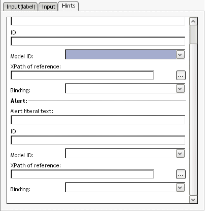
The Form Designer makes it easy to notify users that a control (or the form) has failed one of the model item property validation tests.
When you've defined the model item properties, access the Form tab.
Select the control bound to the node for which the model item property is defined.
In the Property Inspector for the control, access the Hints tab.
Choose the Binding associated with the model item property definition from the dropdown.
Type a message in the Alert literal text to display to the user when a failure is encountered.
When you've defined the bind elements in the Model tab, you can return to the Form tab and associate them with form controls to create a UI Binding expression.
XForms supports and extends the DOM Level 2 event model which is based on the XML event model.
You use the Event Editor to create event handlers and define XForms Actions.
This section includes the following information:
The Event Editor is available on both the Form tab and the Model tab. It looks like this:
The Event Editor is enabled when you select an item that allows event handlers such as a form control, a submission element, or a bind.
The Event Editor supports all XForms events and actions, but not all events are presented as choices when creating an event handler. If an event is not presented as a choice, you can type it in the choice box or use the Source tab to define it.
Navigate to the bottom of Form Designer (in the Form or Model tabs).
Click the icon next to the Event Handlers label. The following graphic shows the location of the icon in the Form tab.
Select a form control or model item for which you want to define an event.
The Event Editor is now available to edit existing or create new Event Handlers.
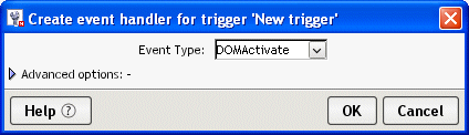
Select the element that you want to define the event handler for.
Click the Create a new event handler icon.
Choose an event from the Event Type dropdown, or type an event name (if it is not listed).
If you want to further customize the event handler by adding observers, and default actions, click Advanced options and see To customize event dispatching:.
The Event Editor now allows you to choose XForms Actions to respond to the event handler (described next).
NOTE: You can't put an event handler on the instance element because instance nodes are restricted to a single child element. When you use the Event Editor to add an event handler to the instance element, it will put it on the model.
To specify XForms Actions for an event handler:
The Event Editor generates the event handler and XForms Action defined by the properties you specified.
For more information about Action properties, see the XForms specification.
Click an action to display complete information.
|
Action |
Action |
|---|---|
Description
Deletes a specific node of repeated instance data. Typically, the nodeset is bound to a repeat block.
Attributes
To construct the action, use the Event Editor to define it's attributes.
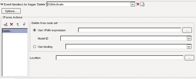
Complete the attributes as follows:
Description
Dispatches XForms events to a named element on a form. You can dispatch events that are:
Standard XForms events—like xforms-enabled, xforms-disabled, and so on.
Custom XML events—A custom event that you've defined for the form.
Attributes
To construct the action, use the Event Editor to define the attributes.
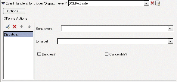
Complete the attributes as follows:
Description
Inserts a new node of instance data. The XForms Specification requires that the instance data be a homogeneous collection (typically, a repeat block).
By default, the inserted node is a duplicate of the last node in the nodeset.
Attributes
To construct the action, use the Event Editor to define it's attributes:
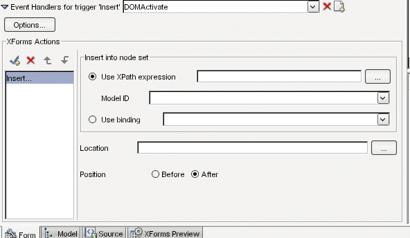
Complete the attributes as follows:
Description
Navigates an URL in the same or different browser window.
To test the Load link action, use View in browser option (available from the XForms Preview tab). The Load Action is not supported in Preview mode.
If the link fails at runtime, no navigation occurs and the xforms-link-error event fires. You can set up an event handler for the xforms-link-error event to intercept and handle this error gracefully.
Attributes
To construct the action, use the Event Editor to define it's attributes:
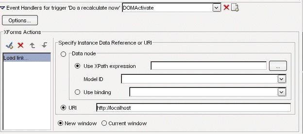
Complete the attributes as follows:
Description
Launches a modal, modeless, or ephemeral message box.
Attributes
To construct the action, use the Event Editor to define it's attributes:
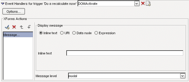
Complete the attributes as follows:
Description
Forces xforms-rebuild, xforms-recalculate, xforms-refesh and and xforms-revalidate events to occur. Use the corresponding actions to specify a behavior different from the default for these events.
For more information on XForms event processing flow, see the xforms-rebuild, xforms-recalculate, xforms-refresh, and xforms-revalidate events in the XForms 1.0 Specification.
Attributes
To construct the action, use the Event Editor to define it's attributes:
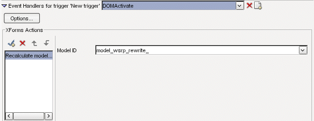
Complete the attributes as follows:
|
Attribute |
What to do |
Notes |
|---|---|---|
|
Model ID |
Choose the Model ID from the choice box. |
This is the model that will receive the event. |
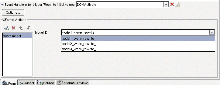
Description
Sets the instance data, of the specified model, to the values at form initialization.
For more information on XForms event processing flow, see the xforms-reset event in the XForms 1.0 Specification.
Attributes
To construct the action, use the Event Editor to define it's attributes:
Complete the attributes as follows:
|
Attribute |
What to do |
|---|---|
|
Model ID |
Choose the ID of the Model you want reset |
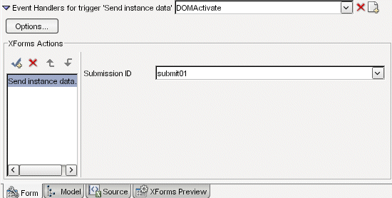
Description
Forces the form to begin submit processing.
Attributes
To construct the action, use the Event Editor to define it's attributes:
Complete the attributes as follows:
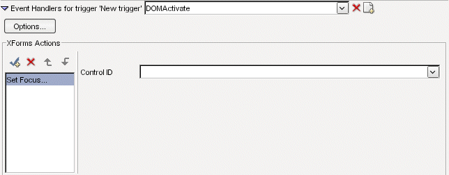
Description
Use Set Focus to move focus to a specific form control.
Attributes
To construct the action, use the Event Editor to define it's attributes:
Complete the attributes as follows:
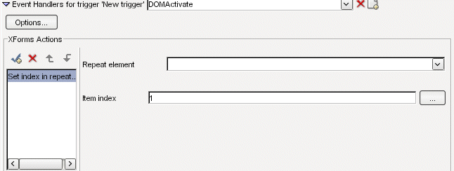
Description
Use the Set index to specify the current node of a repeat block.
Attributes
To construct the action, use the Event Editor to define it's attributes:
Complete the attributes as follows:
|
Attribute |
What to do |
|---|---|
|
Repeat element |
Choose a repeat element from the choice box. |
|
Item index |
Specify an XPath expression that defines index |
Description
Use to set the value of an instance node.
Attributes
To construct the action, use the Event Editor to define it's attributes:
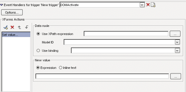
Complete the attributes as follows:
Description
Use to specify the case to display in a Switch element.
Attributes
To construct the action, use the Event Editor to define it's attributes:
Complete the attributes as follows:
|
Attributes |
What to do |
Notes |
|---|---|---|
|
Case to select |
Select the case ID from the choice box. |
The choice box is only populated if you've defined a Switch element. |
To customize event dispatching:
Complete the dialog as follows:
You'll want to test your form's data processing logic and its look and feel. The Form Designer provides built-in tools for each of these tasks:
|
Use this tool |
To test this |
|---|---|
|
XForms preview |
Event and data processing XHMTL component look and feel |
|
View Form in Browser |
The look and feel of all components on the page |
XForms Preview uses a Swing renderer to render the XForms controls on the page. This feature is especially useful for testing the structure of your submitted data.
XForms Preview limitations The XForms Preview does not display any HTML associated with the XHTML page.
The View Form in browser uses an XHTML renderer to display both the XHTML and the HTML on a single page. This feature is especially useful to help you work out any layout issues.
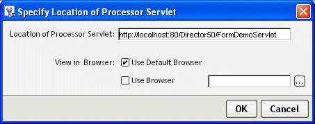
To use View Form in browser, your form's project must be deployed to an application server. Once your project is deployed, changes that you make to the form are immediately available—you don't have to redeploy your project.
Choose the View Form in browser button.
Complete the dialog using the following values:
The form displays in the browser. If you receive a Page Not Found error, make sure that the form's project has been deployed to the server specified.
For more information on deploying, see the chapter on deploying in Developing exteNd Director Applications.
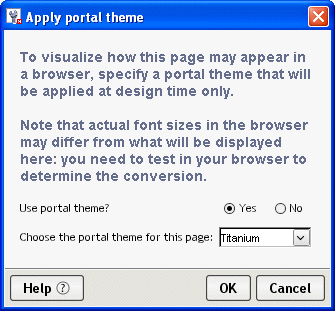
You may want to test what your form would look like using various portal themes.
To test
what your form would look like using a portal theme:
Choose Form Designer>Set Portal CSS Theme.
Complete the panel as follows:
|
Field |
What to specify |
|---|---|
|
Use portal theme? |
Choose yes to apply a theme. |
|
Choose the portal theme for this page |
Choose the portal theme to apply. |
This styling applies only at design time. The Form Designer deletes the link to the theme file when the file is saved and restores it when the file is reopened (in the Form Designer). To remove the link completely, reopen the dialog and choose No.
The portal theme is not used by XForms Preview or View form in browser.
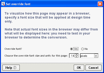
You may want to test your form with various font sizes.
To test
browser font sizes at design time:
Choose Form Designer>Set browser font override.
Complete the dialog as follows:
The font you specify is applied as a font size style on the <body> tag.
This styling applies only at design time. The Form Designer deletes the link to the theme file when the file is saved and restores it when the file is reopened (in the Form Designer). To remove the link completely, reopen the dialog and choose No.
You can validate the form to ensure that its XML is well formed and that it conforms to the schemas for the declared namespaces that can be resolved.
Copyright © 2004 Novell, Inc. All rights reserved. Copyright © 1997, 1998, 1999, 2000, 2001, 2002, 2003 SilverStream Software, LLC. All rights reserved. more ...