13.2 Configuring the Org Chart Portlet
To configure the Org Chart portlet, complete the steps in Table 13-1.
Table 13-1 Org Chart Portlet: Configuration Steps
|
Step |
Task |
Description |
|---|---|---|
|
1 |
Define the relationship that you want to display. |
You can use one of the predefined relationships that are installed with the Identity Manager User Application, or you can create your own. For more information about defining a relationship, see Section 1.2.2, Directory Abstraction Layer. |
|
2 |
Verify that the entities and attributes that you want to use in the relationship are available in the directory abstraction layer. |
For more information about defining a relationship, see Section 13.2.1, Directory Abstraction Layer Setup. |
|
3 |
Determine where you want to display this relationship. |
Do you want to create a new page for launching the org chart? Or, do you want to launch it from the Detail portlet or from another org chart? For more information about creating pages and adding portlets to those pages, see Section 6.0, Page Administration. |
|
4 |
Set preferences for the portlet. |
Preferences let you define:
For more information, see Section 13.2.2, Setting Preferences. |
|
5 |
Test. |
Test the relationship definitions and layout. |
|
6 |
Set eDirectory™ rights and establish any indexes needed to enhance performance. |
Effective rights. To display attributes defined by the portlet, users must have Read rights to the attributes. Performance enhancement. The performance of the org chart display can be enhanced by adding an eDirectory value index to the relationship’s target attribute because the target attribute is used to do the LDAP search. |
13.2.1 Directory Abstraction Layer Setup
The entities and attributes displayed within an Org Chart must be defined in the directory abstraction layer. Table 13-2 shows the attributes and properties that you must set for each entity and attribute displayed in an org chart.
Table 13-2 Org Chart Portlet: Entity and Attribute Settings
|
Definition Type |
Setting |
Value |
|---|---|---|
|
entity |
view |
Selected (true) |
|
attribute |
read |
Selected (true) |
|
search |
Selected (true) |
Lookup Link requirements. allows users to navigate the org chart by performing searches for other objects of the same type as the Source Entity key. The Lookup Link requires that the source entity key have at least one attribute with the require and search access properties set to true (selected in the directory abstraction layer editor). If not, the lookup link’s Object Lookup dialog cannot be populated and is empty when displayed.
For more information on entity and attribute configuration, see Section 1.2.2, Directory Abstraction Layer.
13.2.2 Setting Preferences
You can define preferences for the relationships, the presentation (such as attributes and their order) and general display preferences. For more information, see:
Org Chart General Preferences
This category includes the preferences on the main preferences page and excludes the custom preferences. The preference page is shown in Figure 13-5 and Figure 13-6.
Figure 13-5 Org Chart Preferences
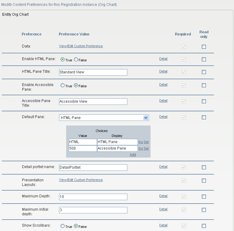
Figure 13-6 Org Chart Preferences (continued)
Table 13-3 Org Chart Portlet: Preferences
|
Preference |
What to Do |
|---|---|
|
Data |
Click to access the preferences that define the org chart’s relationships. See Org Chart Data/Relationship Preferences. |
|
Enable HTML Pane |
Click to enable the HTML display of related objects. This is the default display. It displays the related objects as business cards. |
|
HTML Pane Title |
Type the text to display in the tab. If you enable the display of the and the , this text is displayed as the title of the tab containing the HTML display. |
|
Enable Accessible Pane |
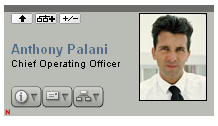
Click to enable the Accessible display of related objects. The Accessible pane displays the objects and links as text strings. This display provides 508-compliant access. |
|
Accessible Pane Title |
Type the text to display in the Accessible Pane tab. If the HTML Pane and the Accessible Pane are enabled, this text is displayed as the title of the tab containing the Accessible display. |
|
Default Pane |
Choose the pane to display as the default when a user clicks the action. It must be enabled. |
|
Detail Portlet Name |
Specify the name of the Detail portlet instance to launch when the user clicks the link. |
|
Presentation Layouts |
Click to access the layout preferences. They are described in Org Chart Presentation Layout Preferences. |
|
Maximum Depth |
Defines the maximum depth the user can drill down in an org chart. This is not the same as the ability to navigate through an org chart, which is restricted by effective rights. |
|
Maximum Initial Depth |
Defines the depth of the initial display. |
|
Show Scrollbars |
Click to enable scrollbars. |
|
OrgChart Skin |
Specify one of the skins for the org chart listed below: : 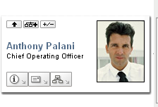
: 
: 
: 
: 
|
|
Connect wires to items |
Specifies whether the org chart cards are connected by wires. False means not connected. |
|
Tree Presentation |
Defines the Org Chart orientation (horizontal or vertical) and whether the chart displays as business cards or text. Values range between 0 and 5. Values of 0, 2, and 4 display business cards. Values of 1, 3, and 5 display text. |
|
Tree Presentation Values of 0, 2, and 4 display business cards. Specify , to place a card above a vertical list of items. 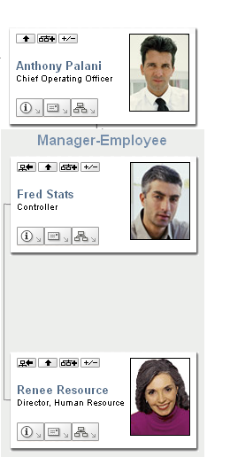
Specify , to place a business card above a horizontal list of items. 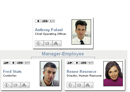
Specify , to place card before a vertical list of items 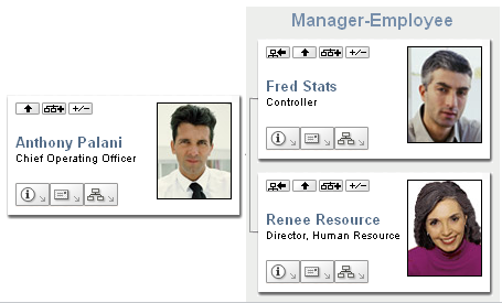
|
|
|
Tree Presentation Values of 1, 3, and 5 display the org chart using lines. Specify , to display a line above a vertical list of items 
Specify , to display a line above a horizontal list of items 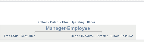
Specify , to display a line before a vertical list of items 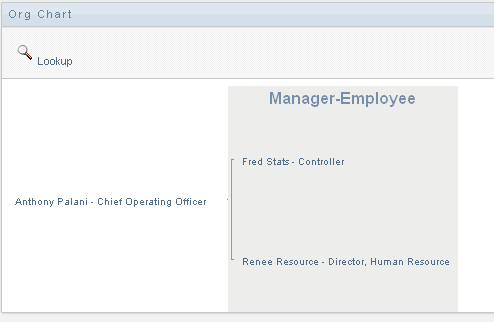
|
|
Leaf Presentation |
Defines the appearance (orientation and distribution) of the org chart’s entity at the maximum depth allowed. For example, if you defined the maximum depth as 10, the leaf presentation controls the display of the entity at the 10th level of the org chart. If you define the maximum depth as 1, this controls the layout of the entity at the 1st level. You can display any Leaf Presentation within any Tree Presentation. |
|
Minimum item width |
The minimum width (in pixels) of the business card display (in HTML mode). This value should equal to round ('item min height' * 1.618). |
|
Minimum item height |
The minimum height (in pixels) of the business card display. This value should equal to round ('item min width' / 1.618). |
|
Separator for multi-valued attributes |
The character used as a separator for attributes with more than one value. |
Org Chart Data/Relationship Preferences
You access the Org Chart relationship preferences by clicking the link of the preference. The initial preference page is shown below. It displays the default relationship used in the default Org Chart.
Figure 13-7 Org Chart Data/Relationship Preferences
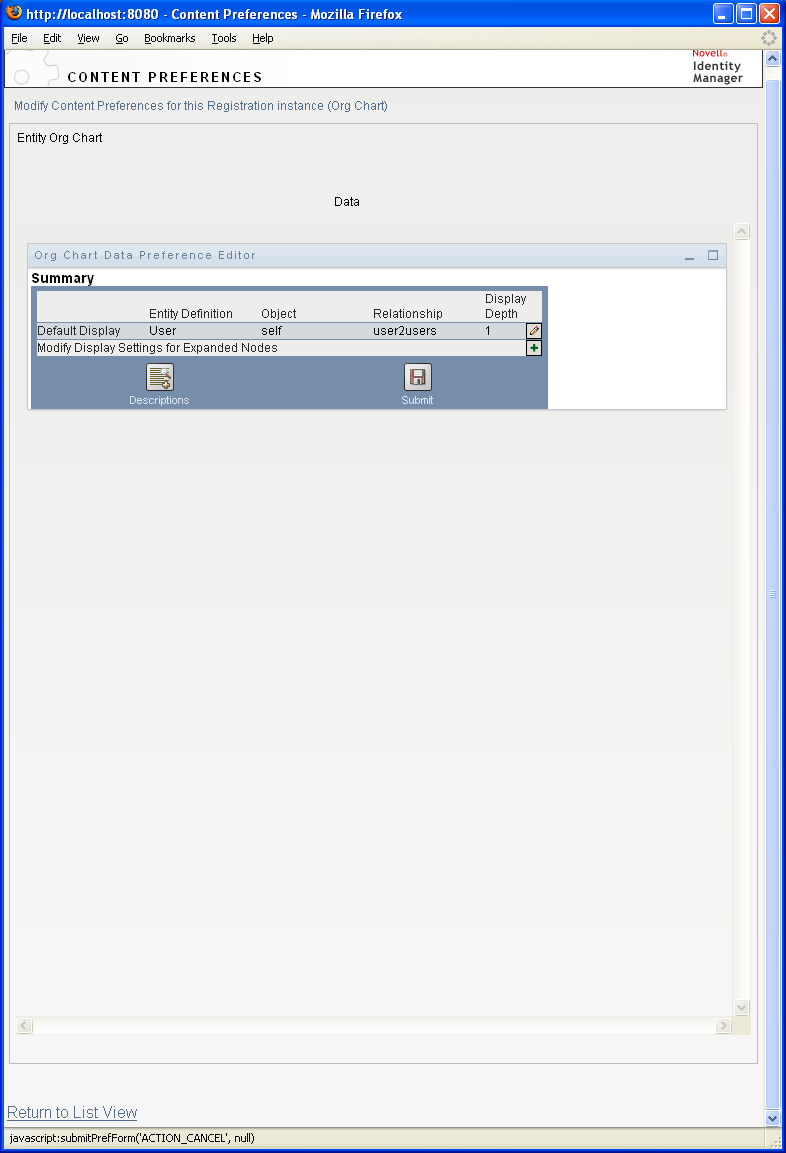
To edit the entity and relationships available to the org chart, click edit button
 . See Editing Data/Relationship Preferences. To modify the display settings for the expanded nodes, click the modify button
 . See Modifying Expanded Nodes.
Editing Data/Relationship Preferences
This set of preferences affects the initial display of the org chart and the relationships displayed when users click the expand/collapse relationship button.
 . You can define any number of relationship levels.
Figure 13-8 Edit Default Data/Relationship Preferences
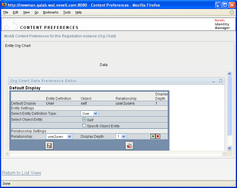
Table 13-4 Org Chart Data/Relationship Preference
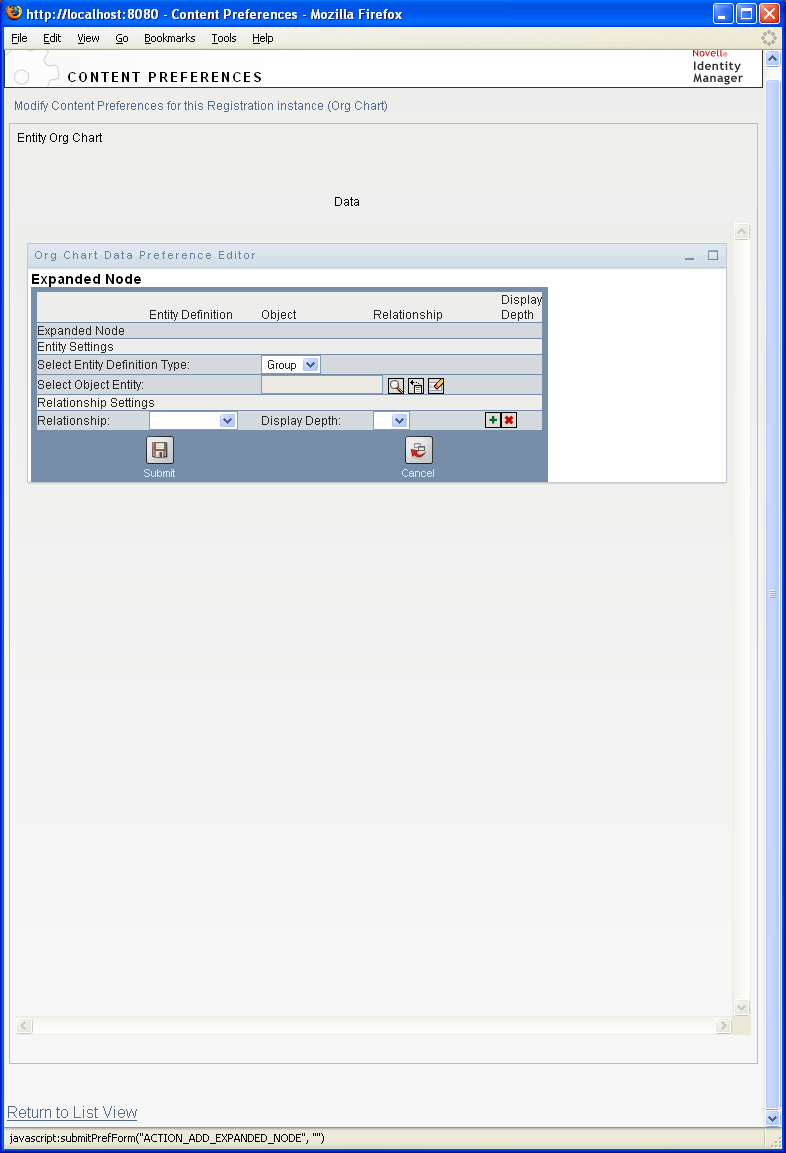
The expanded node preferences are the same, except that they control the relationships displayed after the user clicks the expand/collapse button
.
Modifying Expanded Nodes
preferences let you control what is displayed when the user clicks the expand/collapse button of the org chart.
.
Figure 13-9 Preferences for Modifying Expanded Nodes
Org Chart Presentation Layout Preferences
The preferences let you define the HTML layout for the display of the org chart entries. You can use the HTML editor available from the preferences sheet, or you can use the HTML editor of your choice for more precise editing. See Using an External HTML Editor.
The HTML editor, available from the preferences page, provides a WYSIWYG interface for defining the layout of the leaves of the org chart. It provides the typical features of an HTML editor for defining text formatting and lists, specifying anchors and images, and so on. Use the drop-down list to place attributes, commands, and navigation URLs within the layout area. When you choose a keyword from the drop-down list, it is inserted with the proper syntax, but you can also add HTML within the layout area.
Figure 13-10 Org Chart Presentation Layouts Preferences
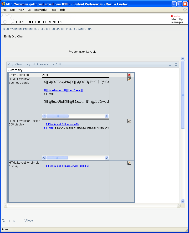
Table 13-5 HTML Layout Definitions
Using the HTML Editor
You access the HTML editor by clicking the button. The HTML editor is shown in Figure 13-11.
Figure 13-11 HTML Editor
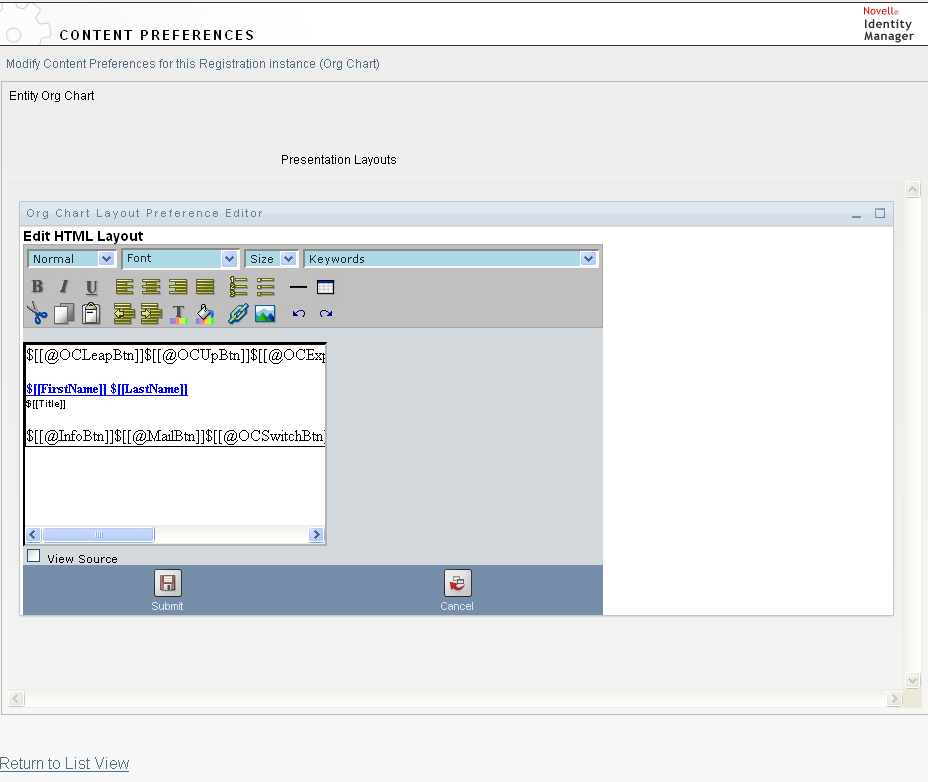
HTML Editor Features and Keywords
Table 13-6 describes the HTML editor features and drop-down list. To save your layouts, click .
Table 13-6 HTML Editor Features
|
Feature |
Tip |
|---|---|
|
Insert Link button |
In Mozilla:
In IE:
NOTE:If your image or URL is located in the upper-left quadrant of the HTML editor, the pop-up window overlaps it. Because the pop-up cannot be moved, you must create the text you want elsewhere in the editor and cut and paste it to the correct location. |
|
Add Image button |
In Mozilla:
In IE:
NOTE:If your image or URL is located in the upper-left quadrant of the HTML editor, the pop-up window overlaps it. Because the pop-up cannot be moved, you must create the text you want elsewhere in the editor and cut and paste it to the correct location. |
|
drop-down List: Attributes |
The set of attributes available for this entity. When designing your layout, you can use the Keywords drop-down list to insert variables that are replaced at runtime with specific attribute values. You can also type the attributes directly in the editor using the following syntax:
$[[keyword]]
where keyword is the value of an entity attribute such as LastName. You can concatenate attributes using this syntax: $[[keyword+keyword]] $[[FirstName+LastName]] For example, you can concatenate as many attributes as you want and can also include quoted strings like this: $[[keyword+”sample text”+keyword]] This renders the values of the keywords and the quoted text. NOTE:When a keyword is mistyped in a layout, it is rendered as-is in the org chart (including the $[[]]). |
|
drop-down List: Commands |
These commands allow the Org Chart portlet to display the links or buttons for the built-in links described in Built-in links.. The keyword commands generate:
There is a set of commands that generate buttons for the HTML display and a set of commands that generate links for the accessible view. The links do not display with link attributes. See Table 13-8. |
Table 13-7 Org Chart Keywords: Built-in Action URLs
The keywords in Table 13-8 generate localized text links for use on the HTML pane.
Table 13-8 Org Chart Keywords: Built-in Action Links
The keywords in Table 13-9 generate image buttons for use with the HTML pane.
Table 13-9 Org Chart Buttons Built-in Action Buttons


Using an External HTML Editor
Use the following process to work in an external HTML editor:
-
Create the HTML source for the entity attributes, commands, and keywords using , available in the preferences.
-
Copy the HTML source to the editor of your choice.
-
Make the changes that you want.
-
Copy the HTML source back to the HTML Layout Editor preference when you have finished editing it.
13.2.3 Dynamically Loading Images
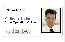
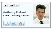
To display images that are stored in your Identity Vault (such as user photos), you can add the attribute name to the business card. For example, adding the User Photo attribute to the business card layout displays the user’s photo.
If you store images outside the Identity Vault, you need to use the IMG: tag within the View Source mode of the HTML Editor as follows:
-
Go to the Org Chart portlet’s preferences and access the HTML Editor.
-
Click .
-
Use the IMG: tag to combine a location, an attribute key, and a file extension using a syntax like this:
$[[IMG:”URL” + attribute-key-name + ”fileextension”]]
The following example shows the syntax you would use if you stored employee photos as JPG images by Last Name in the /images subdirectory of your application server:
$[[IMG:"http://myhost:8080/images/"+LastName+".jpg"]]
At runtime, the org chart concatenates the URL with the LastName attribute and the file extension .jpg.
The HTML Editor supports a flexible syntax. It supports any combination of text and attributes so that the syntax is:
$[[IMG:”some text” + attribute-key-name + ...]]