3.1 Appearance & Themes Settings
The Appearance & Themes settings let you change the way your KDE desktop and applications look.
- Changing Your Desktop Background
- Choosing Colors For Your Desktop
- Setting Desktop Fonts
- Changing Desktop, Panel, Konqueror, and Toolbar Icons
- Configuring Cursor and Taskbar Feedback
- Configuring Screen Saver Options
- Managing the KDE Startup Splash Screen
- Setting Widget Styles
- Choosing Window Decorations
3.1.1 Changing Your Desktop Background
Click .
The Background module allows you to configure colors or wallpapers for your desktop background. By default, your modifications are applied to all virtual desktops. To configure the backgrounds separately for the individual virtual desktops, select the desktop you want from the drop-down list. The effect of your configuration can be seen in the preview monitor at the top right of the dialog.
Figure 32 KDE Control Center Background Dialog
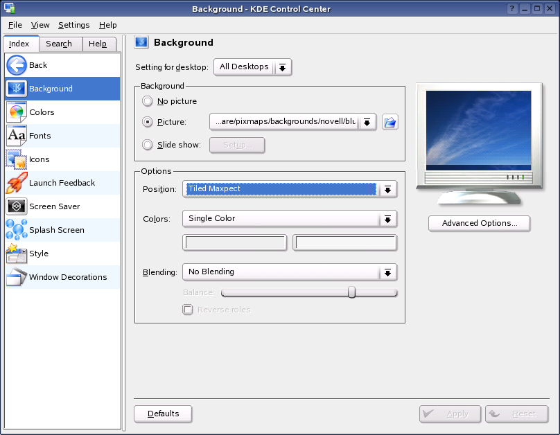
The Background section lets you load a wallpaper image on top of the color gradient chosen in the Options section (described below). You can choose from the following options:
-
No Picture:No picture background is shown. The color and pattern choices displayed still take effect.
-
Picture: A single picture is used as the background for the selected desktops.
-
Slide Show:Lets you use an automatic slide show of wallpaper images. Click , then choose the images (or folder of images) you want to use.
HINT: Displaying wallpaper requires that the image be kept in memory. If you are low on memory, we recommend using a small, tiled image (or no image at all).
Scaling or centering a small image still requires an image the size of your display to be maintained in memory.
The Options section lets you choose the type of color, gradient, or pattern to display under (or in place of) wallpaper. The Blending option lets you make a smooth transition (blend) from the wallpaper as it changes to the background. If you are using a picture as wallpaper, you can skip this section. However, if your chosen wallpaper does not cover the entire desktop, choose colors to show in the remaining space.
3.1.2 Choosing Colors For Your Desktop
Click .
This module lets you manage and edits color schemes for your desktop. There are a variety of color schemes installed by default with NLD, or you can create your own. You can also modify the contrast and choose whether you want your KDE colors to be applied to non-KDE applications (for a more consistent overall appearance).
Figure 33 KDE Control Center Colors Dialog
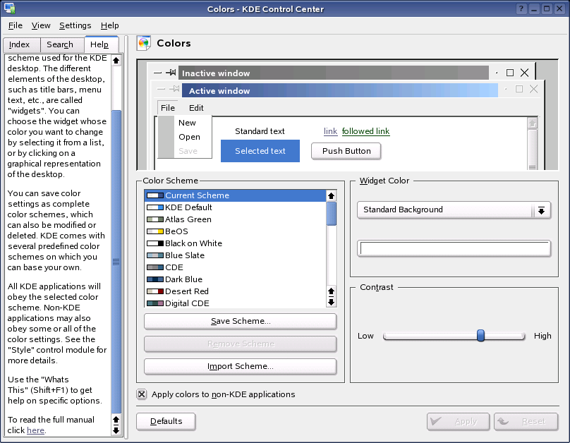
The preview area at the top demonstrates how a color scheme applies to a sample selection of widgets (a widget is a commonly-used programmer’s term referring to user interface elements such as buttons, menus, and scroll bars). It provides you with a preview of your current color choices. Each widget is labeled to help you identify how your changes will impact the color scheme.
To change the color of a widget, select the name of the widget from the drop-down menu, then click the color bar below to choose a suitable color in the color editor. The color will be updated in the preview area.
Use the slider to change the contrast between different shadings of the selected colors. The preview area instantly updates to show the results of you change.
To use a predefined scheme, choose the scheme you want from the list. The major color components of each scheme are shown beside the name in the list. To preview a scheme in the preview area, click the name in the list box.
You can use the NLD-supplied color schemes as a starting point to create your own schemes. Click to store the color scheme under a new name, then modify it. You can’t modify or delete the NLD-supplied schemes.
Use to add new entries to the Color Scheme list. These can be color schemes you have created on another computer and saved, or color schemes you have downloaded from the Internet.
To change the style of widgets (that is, how individual widgets are drawn), see Setting Widget Styles.
3.1.3 Setting Desktop Fonts
Click .
All fonts and font attributes used on the desktop can be configured here. You can also modify anti-aliasing settings, including what range of fonts to exclude from antialiasing settings.
Figure 34 KDE Control Center Fonts Dialog

The Fonts panel contains different font groups that give you flexibility in configuring your fonts:
-
General: Used everywhere the other font groups don’t apply.
-
Fixed Width: Used anywhere a non-proportional font is specified.
-
Toolbar: The font used in KDE application toolbars.
-
Menu: The font used in KDE application menus.
-
Window Title: The font used in the window title.
-
Taskbar: The font used in the taskbar panel applet.
-
Desktop: The font used on the desktop to label icons.
Click next to the font group you want the change, then specify your settings in the dialog that opens. An example of the font you have chosen is displayed in the space between the font group name and the button.
Click to quickly set properties for all the fonts selected above. A Select Font dialog similar to the standard one appears, but it has check boxes that let you change the Font, Font Style, or Size independently of each other. You can choose any of these options and apply them to all the font groups. For example, if you have selected several font faces, then realize that they are all a size too big (this often happens when you change screen resolutions), you can apply a new font size to all fonts without affecting your customized font faces and styles.
By default, antialiasing is activated for all fonts. Antialiasing is a software technique for diminishing jagged edges that should be smooth. These jagged edges occur when the output device (such as a monitor or printer) doesn’t have a high enough resolution to represent a smooth line. Antialiasing reduces the prominence of jagged edges by surrounding the edges with intermediate shades of gray (for gray-scaling devices) or color (for color devices). Although this reduces the jagged appearance of the lines, it also makes them fuzzier.To deactivate or customize antialiasing, select the respective check boxes.
HINT: Changes to the anti-aliasing settings are applied only to newly started programs. Programs already open are not affected by the changes.
3.1.4 Changing Desktop, Panel, Konqueror, and Toolbar Icons
Click .
Icons are used on the desktop, the panel, the Konqueror file manager, and toolbars of applications. You can use this module to install and choose icon themes, choose different icon sizes, assign effects to icons (for example, you can make them semi-transparent or colorize them), and configure settings for each of the different places icons are used
Figure 35 KDE Control Center Icons Dialog
You can see example icons at the top of the dialog. These icons change appearance depending on the icon theme you select. To choose an icon theme, click its name, then click . Click to install any icon themes you have downloaded from the Internet.
Click to remove a theme that you installed using this module. You cannot remove globally installed themes here.
Use the options on the Advanced tab to configure icons for a particular use (for example, for use on the desktop or in toolbars), and to change the size of icons. You can choose from a drop-down list of icons sizes, and you can tell KDE to draw all pixels using double-sized pixels (that is, using a 2x2 block instead of normal pixels). The icon sizes offered depend on the icons that you selected on the Theme tab. You can also choose animated icons, but keep in mind that the animations might appear slow or jerky if your graphics card is old or you are low on memory.
You can configure certain filters to be applied to icons that are in one of three states:
-
Default: This is how the icon looks normally.
-
Active: This is how the icon looks when the mouse cursor is over the icon.
-
Disabled: This is how the icon looks if its corresponding action is disabled (that is, if clicking it does not lead to any result).
Select one of these states, then click to configure a corresponding icon effect. This configuration only affects icons of the currently selected Use of Icon category. Configuring an effect for active icons while the Toolbar icon usage is selected does not affect icons in other places. Selecting the semi-transparent option makes the background shine through the icon.
3.1.5 Configuring Cursor and Taskbar Feedback
Click .
This is where you can modify what kind of cursor and taskbar feedback you want for launching applications. This gives you visible feedback to help you know if you clicked an icon or not.You can also set the duration of this feedback. For example, the default setting is for a bouncing cursor with a duration of 30 seconds, or when the application has loaded.
Figure 36 KDE Control Center Launch Feedback Dialog
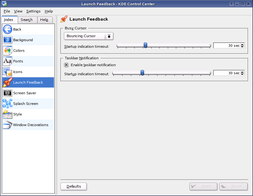
The traditional way to indicate that your computer is busy is to modify the cursor. You can turn this on by selecting an option from the drop-down list. When this option is enabled, your cursor has an icon attached to it for a short time when a new application is being launched. You can use the option to configure how long this icon is displayed (in seconds).
If you enable the option, any application you start gets an immediate entry in the taskbar, with the icon replaced by a spinning hourglass to let you know something is happening. This is useful because not all applications that you start show a window or an entry in the taskbar. Some applications are docked into the system tray, and some are sent to a different virtual desktop. Setting a timeout ensures that you get launch feedback and that the feedback goes away when the job is finished.
3.1.6 Configuring Screen Saver Options
Click .
Use this module to configure screen saver options. For example, you can configure the timeout before it starts, and whether it requires a password to unlock the screen.
Figure 37 KDE Control Center Screen Saver Dialog
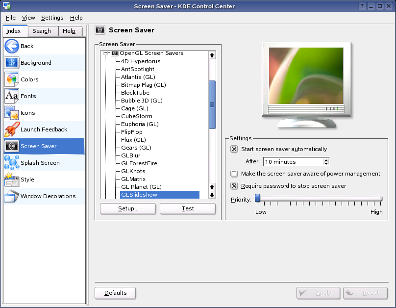
Select the screen saver you want from the list on the left. The preview to the right shows how the selected screen saver will look. Use and to test the screen saver in the running system and to configure it.
The Settings section of the Screen Saver dialog contains the following options:
-
Start Screen Saver Automatically:For the screen saver to be activated automatically, select this check box and specify the time (in minutes) after which the screen saver should be activated.
-
Make the Screen Saver Aware of Power Management:Select this option if you don’t want the screen saver to start while you watch TV or movies on your monitor.
-
Require Password to Stop Screen Saver:The screen saver can lock your workstation and require a password for its release.
-
Priority:Use the slider to set the priority of the screen saver in relation to other processes. If you use a graphically complicated screen saver that generates a high processor load, set the priority higher to achieve a smooth display quality. In this case, the priority of other processes is reduced accordingly. However, if you frequently let your machine work while you do other things, you should refrain from running a complex screen saver with a high priority.
HINT: If you have a collection of .jpg images that you want to use as a screen saver, click , type xscreensaver, click , and then click . This opens the window.
Set the to and select in the list. Click the tab, select , then specify the directory where your images are located.
After you close the window, you can use the dialog in the KDE Control Center to set other parameters and test your screen savers.
3.1.7 Managing the KDE Startup Splash Screen
Click .
This is where you can install, remove and test the splash screens that display on KDE startup.
Figure 38 KDE Control Center Splash Screen Dialog
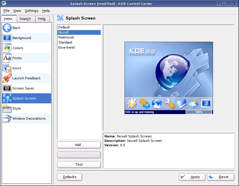
For information on making your own splash screens, see How to Make Themes for KSplash.
3.1.8 Setting Widget Styles
Click .
This module let you set the style for all widgets (elements of the graphical interface such as buttons, menus, and scroll bars) in KDE applications. A variety of styles come with NLD, and you can download more from the Internet. You can also enable or disable interface options such as transparent menus, and the display of icons on buttons and tooltips. Some styles have more configuration options than others.
Figure 39 KDE Control Center Style Dialog
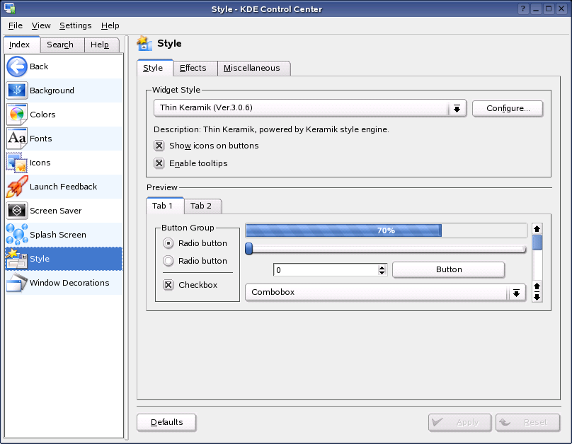
The configuration contains three tabs. Select the style under , using the preview area in the lower part of the window. Use to configure various GUI effects and transparency types, if supported by the respective style. Use Miscellaneous to change toolbar settings.
To change the color of widgets, see Choosing Colors For Your Desktop.
3.1.9 Choosing Window Decorations
Click .
This module lets you select a style for the borders around windows, and select title bar button positions and custom decoration options.
Figure 40 KDE Control Center Window Decorations Dialog
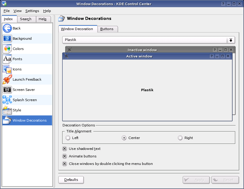
Select a window decoration style from the drop-down list at the top of the dialog to see a preview of it in the lower pane. Click to test the selected style. If there are any configurable options for the theme, they become available below the preview area.
To position or move individual elements of the title bar, activate and then rearrange the elements on the tab. If additional configuration options are available for the selected style, access these on the tab.