2.2 Look and Feel
Look and Feel settings include the following:
2.2.1 Customizing the Desktop Appearance
Use the Appearance module to customize the look of the desktop. With this module you can change the desktop theme, fonts, and background, as well as changing the look of menus and the main toolbar.
Choosing a Theme
A theme is a group of coordinated settings that specifies the visual appearance of a part of the desktop. You can choose themes to change the appearance of the desktop. Use the Theme Preferences tool to select from a list of preinstalled themes. The list of available themes includes several themes for users with accessibility requirements.
To choose a theme, click , then click the tab.
The color settings for the desktop and applications are controlled using themes. You can choose from a variety of preinstalled themes. Selecting a style from the list overview applies it automatically. opens another dialog where you can customize the style of single desktop elements, like window content, window borders, pointers, and icons. Making changes and leaving the dialog by clicking switches the theme to Custom Theme. Click to save your modified theme under a custom name. The Internet and other sources provide many additional themes for GNOME as .tar.gz files. Install these with the Install theme.
Creating a Custom Theme
The themes that are listed in the Theme Preferences tool are different combinations of controls options, window frame options, and icon options. You can create a custom theme that uses different combinations of options.
-
Click , then click the tab.
-
Select a theme from the list of themes, then click .
The following settings can be customized:
-
Controls
The controls setting for a theme determines the visual appearance of windows, panels, and applets. It also determines the visual appearance of the GNOME-compliant interface items that appear on windows, panels, and applets, such as menus, icons, and buttons. Some of the controls setting options that are available are designed for special accessibility needs. You can select an option for the controls setting in the Controls tabbed page of the Theme Details tool.
-
Colors
The color settings determine the colors of various screen elements. Set the colors to provide an appearance that most appeals to you.
-
Window Border
The window border setting for a theme determines the appearance of the frames around windows only. You can select an option for the window frame setting in the Window Border tabbed page of the Theme Details tool.
-
Icons
The icon setting for a theme determines the appearance of the icons on panels and the desktop background. You can select an option for the icon setting in the Icons tabbed page of the Theme Details tool.
-
Pointer
You can set the appearance and size of your mouse pointer so it is appealing and easy to see with your chosen theme.
-
-
Select the controls option that you want to use in the custom theme from the list in the tab.
-
Click the tab, then select the colors you want to use for the available interface elements.
-
Click the tab, then select the window frame option that you want to use in the custom theme.
-
Click the tab, then select the icons option that you want to use in the custom theme.
-
Click the tab, then select the desired mouse pointer.
The following table lists the mouse pointer preferences you can modify.
-
Click .
The Save Theme to Disk dialog is displayed.
-
Type a name and a short description for the custom theme in the dialog, then click .
The custom theme now appears in your list of available themes.
Installing a New Theme
You can add a theme to the list of available themes. The new theme must be an archive file that is tarred and zipped (a .tar.gz file).
-
Click , then click the tab.
-
Click .
-
Browse to the location of the theme archive file, select the archive, then click .
-
Click to apply the theme.
or
Click to continue using the currently applied theme.
Deleting a Theme
You can delete controls options, window frame options, or icons options.
-
Click , then click the tab.
-
Select the theme you want to delete.
-
Click .
Changing the Desktop Background
The desktop background is the image or color that is applied to your desktop. You can customize the desktop background in the following ways:
-
Select an image for the desktop background. The image is superimposed on the desktop background color. The desktop background color is visible if you select a transparent image or if the image does not cover the entire desktop.
-
Select a color for the desktop background. You can select a solid color or create a gradient effect with two colors. A gradient effect is a visual effect where one color blends gradually into another color.
To change the desktop preferences:
-
Click , then click the tab.
-
Set the background preferences the way that you want them.
The following settings can be changed:
Table 2-8 Background Preferences
-
When you are satisfied with your choices, click Close.
Your desktop immediately changes to show the new settings.
Configuring Fonts
You can select the fonts to use in your applications, windows, terminals, and desktop. To set the Font preferences, click , then click the tab.
Figure 2-10 Font Preferences Dialog
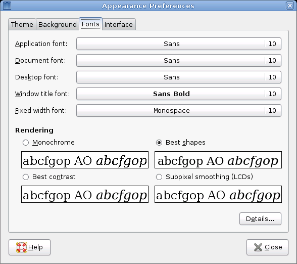
The upper part of the dialog shows the fonts selected for applications, documents, the desktop, window titles, and a fixed-width font for terminals. Click one of the buttons to open a selection dialog where you can set the font family, style, and size.
To specify how to render fonts on your screen, select one of the following options:
-
Monochrome: Renders fonts in black and white only. The edges of characters might appear jagged in some cases because the characters are not antialiased. Antialiasing is an effect that is applied to the edges of characters to make the characters look smoother.
-
Best Shapes: Antialiases fonts where possible. Use this option for standard Cathode Ray Tube (CRT) monitors.
-
Best Contrast: Adjusts fonts to give the sharpest possible contrast and antialiases fonts so that characters have smooth edges. This option might enhance the accessibility of the GNOME desktop to users with visual impairments.
-
Subpixel Smoothing (LCDs): Uses techniques that exploit the shape of individual Liquid Crystal Display (LCD) pixels to render fonts smoothly. Use this option for LCD or flat-screen displays.
Click to specify further details of how to render fonts on your screen:
-
Resolution (Dots Per Inch): Use the spin box to specify the resolution to use when your screen renders fonts.
-
Smoothing: Select one of the options to specify how to antialias fonts.
-
Hinting: Select one of the options to specify how to apply hinting to improves the quality of fonts at small sizes and at low screen resolutions.
-
Subpixel Order: Select one of the options to specify the subpixel color order for your fonts. Use this option for LCD or flat-screen displays.
Configuring Menus and Toolbars
You can configure the appearance and behavior of menus and toolbars. Click , then click the tab.
Showing Icons in Menus
If you want icons to appear in menus, select . Not all menu items have icons.
Defining New Keyboard Shortcuts
If you want to be able to define new keyboard shortcuts for menu items, select . When this option is enabled, you can change an application shortcut key by placing the mouse pointer over the menu item you want to change, then pressing the new key combination. To remove a shortcut key combination, place the mouse pointer over the menu item, then press Backspace or Delete.
IMPORTANT:If you assign a new keyboard combination, you are not warned if you select a combination that was previously assigned to something else. The previous assignment is removed and replaced by the new one. There is no automatic way to restore the original, default keyboard shortcut for a command. You must manually reassign the keyboard shortcut.
This feature does not maintain shortcuts that are normally assigned to all applications, such as Ctrl+C for copy. This might lead to inconsistencies in your GNOME applications.
Configuring Placement of Toolbar Button Labels
Select one of the following options to specify how toolbar button labels display in your GNOME-compliant applications:
Text below icons: Displays icon labels below the icons for each button.
Text beside icons: Displays icons on the toolbar, with text beside the most important icons.
Icons only: Displays icons only, without any text labels.
Text only: Displays text labels on each button, without icons.
A preview of the selected option appears in the dialog.
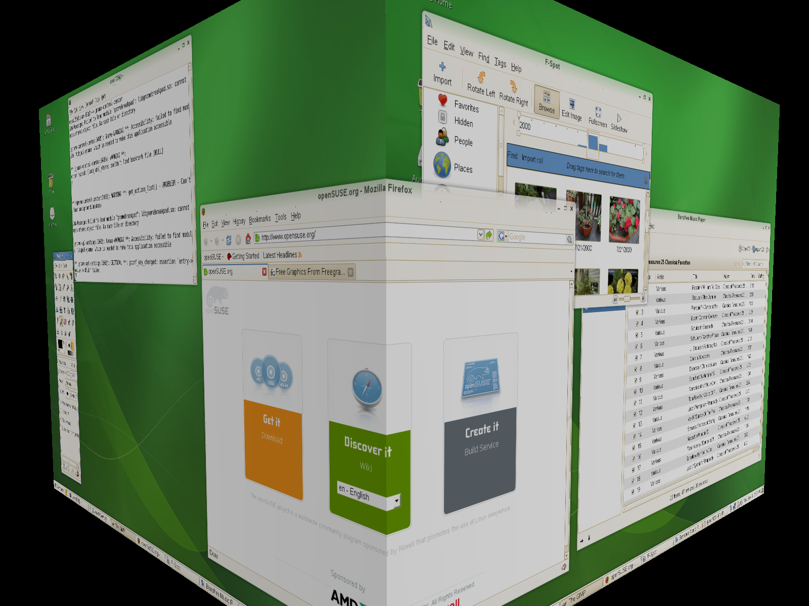
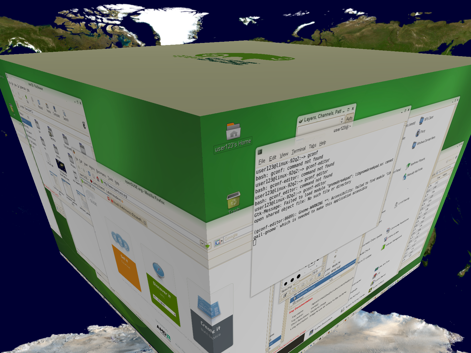
2.2.2 Configuring Desktop Effects
Xgl is an Xserver architecture that lets you turn your desktop into a rotating 3-D cube, tile windows so they don’t overlap, and switch tasks while viewing live thumbnails. You can enable translucent or transparent windows, zoom in and out of the desktop screen, and use other window effects such as shadows, fading, and transformations. You can also configure windows to snap to other windows and screen edges when they are moved.
Figure 2-11 3-D Desktop
Enabling Desktop Effects
To enable Xgl, you need a graphics adapter capable of providing 3-D support, and you also need the graphics driver that Linux uses to operate the graphics adapter. This driver must be able to handle OpenGL (or 3-D) requests from the Linux kernel. For a list of supported adapters, see the /etc/X11/xgl-hardware-list file that is included with the openSUSE installation. This file tells you which graphics cards are known to work with Xgl, which cards do not work with Xgl, and which cards might work with Xgl but are not supported because they are either too slow or contain too many known defects.
Your screen resolution must be within the 1024x768 to 1920x2000 range, and your color depth must be set at 24-bit. 3-D acceleration must also be enabled. Use SaX2 to change your graphics card and monitor properties if necessary.
To enable desktop effects:
-
Click .
-
Click in the group.
The Desktop Effects tool analyzes your system and tries to determine whether or not you can run Xgl. If it finds anything wrong, it advises you on what actions you can take. For example, you might be advised to change your screen resolution or color depth, or to activate 3-D acceleration. Follow the on-screen prompts to configure your system for Xgl.
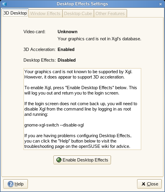
-
After your system is configured for Xgl, click .
-
Type the root password, then click .
-
Click to log out of your session, then type your username and password to log back in.
The default desktop effects are now enabled. For example, windows “wobble” when they first appear and when you move them, they fade away when you close them, and dragging a window to the far right of the screen rotates the desktop cube. To change any of these effects, see Modifying Desktop Effects.
You can also enable Xgl by running the following command as root:
gnome-xgl-switch --enable-xgl
To disable Xgl, click in the Desktop Effects Settings dialog box, or run the following command as root:
gnome-xgl-switch --disable-xgl
Modifying Desktop Effects
Use the Desktop Effects Settings tool to enable or disable specific desktop effects, or to change the keystrokes or mouse actions used to control those effects.
-
Click .
-
Click in the group.
-
Choose from the following options:
-
When you finish making changes, click .
You can also use gconf-editor to change Xgl settings.
-
Click or press Alt+F2 and enter gconf-editor.
-
Navigate to the apps/compiz/general and apps/compiz/plugins registry folders and make the changes you want.
-
Click to close the Configuration Editor.
Window Effects
Use the options on this tabbed page to specify what happens when you move windows, how window transitions appear, and to change window opacity.
Figure 2-12 Window Effects Tabbed Page
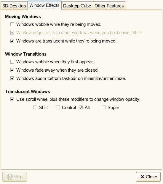
- Moving Windows
-
By default, windows appear transparent when you move them. If you want window edges to stick (snap) to other windows and workspace edges when you hold down the Shift key while moving the window, both the and options must be selected.
You can also choose to make windows appear distorted (wobbly) as you move or resize them, giving the impression that the window is more fluid than rigid.
- Window Transitions
-
These options let you add a fade-in and fade-out effect to windows and menus when you open and close them. Windows will also shrink smoothly onto the task bar when they are minimized and will grow smoothly back to their normal size when they are reopened.
- Translucent Windows
-
This option lets you use the scroll wheel to change how transparent a window appears on-screen. Select , then select the button or combination of buttons you want to use. Select a window, hold down the button or buttons you selected, then scroll the mouse wheel up or down to change the transparency of the window.
Figure 2-13 Translucent Window
Desktop Cube
Use the options on this tabbed page to specify how many sides your desktop cube has, which keystroke and mouse button combination you can use to drag the cube, and to configure edge flipping.
Figure 2-14 Desktop Cube Tabbed Page
- Desktop Cube
-
By default, this option gives you four desktops on the faces of a virtual cube that you can rotate to access each desktop. This provides extra space in which to arrange open applications and windows. For example, you can put an editor on one desktop, some shells on another, and your e-mail application and Web browser on the third desktop. Using Ctrl+Alt+Left arrow and Ctrl+Alt+Right arrow, you can rotate the cube to access the programs running in the selected desktop and avoid windows piled on top of each other on one desktop.
Dragging a window to the edge of the screen rotates the cube and places the window on the new desktop. To rotate the cube manually in 3-D, press Ctrl+Alt, left-click the desktop, then drag the mouse pointer. Ctrl+Alt+Shift+Left-arrow or Right-arrow lets you rotate the cube while taking the currently selected window with you.
Use the options under to change the default keystrokes used to rotate the cube.
For information on how to add an image behind your cube, see Displaying a Skydome Image Behind the Cube.
- Edge Flipping
-
When edge flipping is enabled, the desktop cube rotates to the next face when you bump the mouse pointer to the edge of the screen. You can choose to always enable edge flipping or to enable edge flipping only when you drag a window or icon to the edge of the desktop.
Use the slider bar at the bottom of the tabbed window to specify how long (in microseconds) it takes to rotate the cube after you bump the edge of the desktop with a window or the mouse pointer.
Other Features
Use the options on this tabbed page to configure window tiling, zooming, and water effects.
Figure 2-15 Other Features Tabbed Page
- Window Picker
-
This option lets you tile (or scale) the windows on your desktop so that you can see what windows you have open and select a specific one. This also provides you with a snapshot of all applications open on your desktop. Pressing Ctrl+Alt+Up-arrow shrinks all windows and rearranges them on the screen so that they do not overlap. Selecting a window with the mouse causes all windows to return to their original size and position, with the selected window on top.
To change the keystrokes used to tile windows, click the box to the right of until appears. Then press the keystrokes you want to use. The new keystrokes appear in the box.
You can also choose to tile windows by moving the mouse pointer to the top left (default), top right, bottom left, or bottom right of the screen.
Figure 2-16 Application Tiling
- Zoom
-
These options give you the ability to zoom in and out of areas on your screen, which significantly improves desktop accessibility for visually impaired users or for anyone who wants to see a part of the screen displayed in a larger size.
By default, pressing the Super key (the Windows key)+Button 3 zooms in on part of the desktop. If you have a two-button mouse, press the Super key, then press the left and right buttons simultaneously. You can move the mouse while holding those buttons down to see other parts of the screen. You can also press the Super key and use the scroll wheel on the mouse to manually zoom in and out of the desktop.
You can choose to deactivate any of these options, or to change the zoom keystrokes.
- Water Effect
-
This option creates a ripple effect on your screen when you hold down the specified key or key combination (Ctrl+Alt+Super by default) and move the mouse pointer. You can also enable or disable a rain effect when you press Shift+F9. To change the keystrokes used to enable and disable the rain effect, click the box to the right of until appears. Then press the keystrokes you want to use. These new keystrokes will appear in the box.
Use the slider bar at the bottom of the tabbed window to specify the intensity of the rain effect.
Figure 2-17 Water Effect
Xgl Shortcuts
Table 2-9 contains a list of the default keystrokes and mouse movements you can use to perform desktop effects. To change any of these shortcuts, see Modifying Desktop Effects.
Table 2-9 Desktop Effects Shortcuts
More Desktop Effects
You can also do these things with Xgl:
Switching Tasks
Press Alt+Tab to display a thumbnail view of all windows open on your desktop. While holding the the Alt key down, press Tab to cycle through the list of windows. The currently highlighted window will appear in focus. Release the keys to access that window.
Figure 2-18 Thumbnail View
Unfolding the Cube
Press Ctrl+Alt+Down-arrow to unfold the desktop cube, opening a panoramic view of all your desktops. Your desktop cube is laid out like a filmstrip on your screen. You can use the Left-arrow and Right-arrow to select a different screen. This is similar to the switcher feature (Alt+Tab), but lets you view a thumbnail of your entire desktop instead of only your active windows.
Figure 2-19 Panoramic View of All Desktop Cubes
Displaying a Skydome Image Behind the Cube
You can add background wallpaper (also known as a skydome image) that is visible when you rotate or unfold the desktop cube.
-
Click or press Alt+F2 and enter gconf-editor.
-
Navigate to the apps/compiz/plugins/cube/screen0/options registry folder.
-
Scroll down the list on the right side of the Configuration Editor and select .
-
Double-click , then specify the path to the skydome image you want to display behind the cube.
Skydome images must be in .png format. The suggested image sizes for skydome images are 1024 x 1024, 1024 x 2048, 1024 x 4096, 2048 x 1024, 2048 x 2048, 2048 x 4096, 4096 x 1024, 4096 x 2048, and 4096 x 4096.
-
(Optional) Select to make it look like you are moving around the cube when you use your mouse to rotate the cube.
-
Click .
-
Click to close the Configuration Editor.
Figure 2-20 Skydome Image
2.2.3 File Management Preferences
You can change the File Manager preferences in the Control Center by clicking , or from Nautilus by clicking . The configurable preferences are organized on five tabs:
Views
To configure the appearance of the File Manager, click (or from Nautilus), then click the tab.
Figure 2-21 File Manager Views Dialog Box
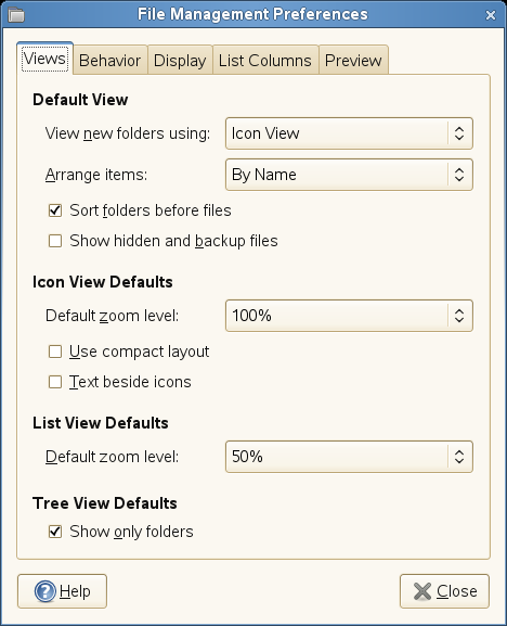
Select from the following options:
Table 2-10 File Manager Views Options
Behavior
To configure the behavior of the File Manager, click (or from Nautilus), then click the tab.
Figure 2-22 File Manager Behavior Dialog Box
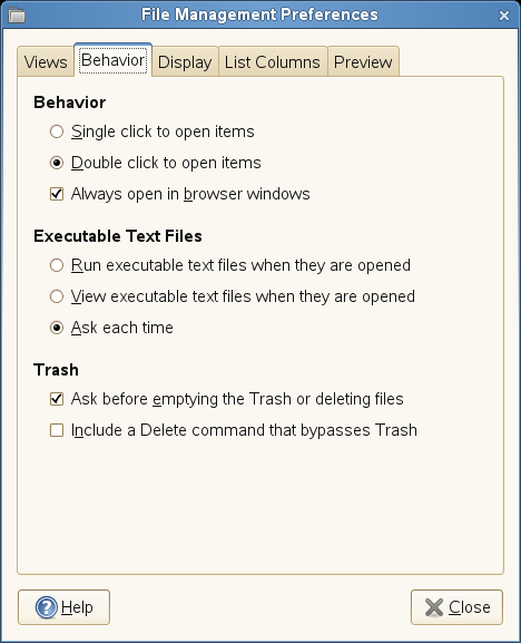
Select from the following options:
Table 2-11 File Manager Behavior Options
Display
To configure the way icon captions and dates appear in the File Manager, click (or from Nautilus), then click the tab.
Figure 2-23 File Manager Display Dialog Box
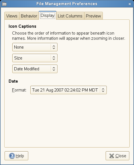
Select from the following options:
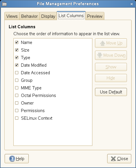
List Columns
To configure the columns that appear in the File Manager, as well as the order in which they appear, click (or from Nautilus), then click the tab.
Select the columns that you want to appear. To change the order, click or .
Figure 2-24 File Manager List Columns Dialog Box
Preview
To configure how file previews appear in the File Manager and whether folders show the number of items they contain, click (or from Nautilus), then click the tab:
Figure 2-25 File Manager Preview Dialog Box
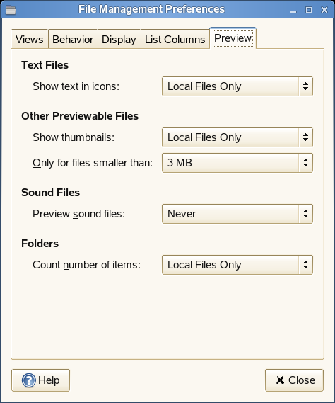
Select from the following options:
Table 2-13 File Manager Preview Options
2.2.4 Locking Desktop Functions
The Lockdown Editor lets you disable (lockdown) certain desktop functions. This is useful if you want to restrict the actions that users can perform on a computer. For example, you might want to prevent command line operations on a computer that is for public use at a trade show.
To start the Lockdown Editor, click
You will see a window with a list of options on the left. Each option represents a different category of desktop settings that can be disabled.
When the Lockdown Editor starts, it tries to connect to the GConf mandatory configuration source (
xml:merged:$prefix/etc/gconf/gconf.xml.mandatory). If you have access to this configuration source, a lock icon is displayed next to the checkbox for each setting. Click the lock to specify if the setting is mandatory. If the setting is mandatory, regular users will not be able to change or override the setting. If you don’t have access to the mandatory configuration source, the lock icon does not appear. In this case, all disabled settings are stored in the user's default configuration source and can be modified later using other tools such as gconf-editor or gconftool-2. For more information about GConf and mandatory configuration sources, see
GConf Configuration Sources
in the
GNOME Desktop System Administration Guide.
General
Use the options in the General category to disable printing, access to the command line, and saving to disk.
Figure 2-26 General Lockdown Editor Settings
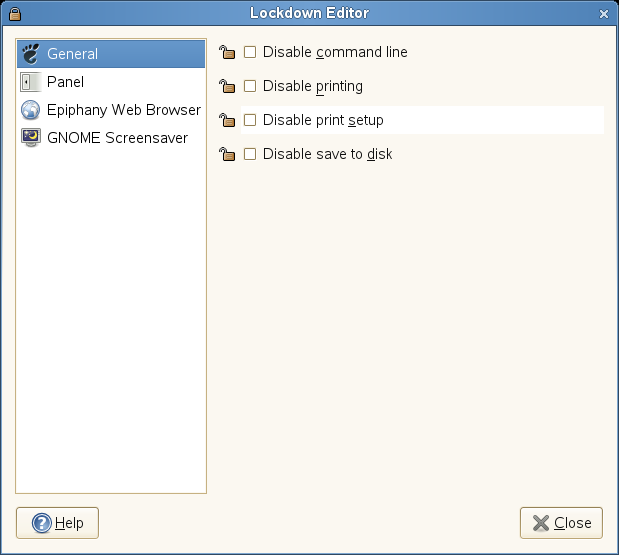
- Disable command line
-
Prevents the user from accessing the terminal or specifying a command line to be executed. This options also disables access to the panel's dialog box.
- Disable printing
-
Prevents the user from printing. This option disables access to the dialogs boxes in all applications.
- Disable print setup
-
Prevents the user from modifying print settings. This option disables access to the dialog boxes in all applications.
- Disable save to disk
-
Prevents the user from saving files to disk. This option disables access to the dialog boxes in all applications.
Panel
Use the options in the Panel category to lock down the panel, disable the panel applets you specify, and disable the force quit, lock screen, and log out options.
Figure 2-27 Panel Lockdown Editor Settings
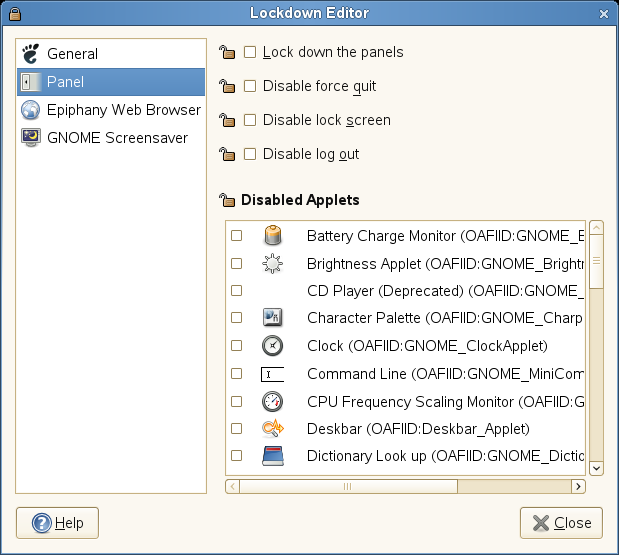
- Lock down the panels
-
If this option is selected, the panel will not allow any changes to be made to the configuration of the panel. Individual applets might need to be locked down separately, however. The panel must be restarted for this to take effect.
- Disable force quit
-
If this option is selected, the panel will not allow a user to force an application to quit (by removing access to the force quit button).
- Disable lock screen
-
If this option is selected, the panel will not allow a user to lock their screen (by removing access to the lock screen menu entries).
- Disable log out
-
If this option is selected, the panel will not allow a user to log out (by removing access to the log out menu entries).
- Disable Applets
-
.Disables the applets selected in the list.
Epiphany Web Browser
Use the options in the Epiphany Web Browser category to control access to features in Epiphany.
Figure 2-28 Epiphany Web Browser Lockdown Editor Settings
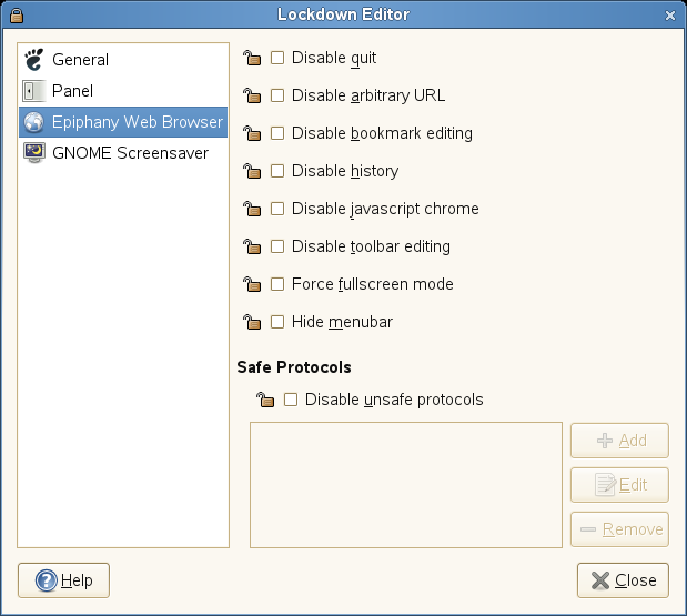
- Disable quit
-
Prevents the user from closing Epiphany.
- Disable arbitrary URL
-
Prevents the user from typing a URL in Epiphany.
- Disable bookmark editing
-
Prevents the user from adding or editing bookmarks.
- Disable history
-
Disables all historical information by disabling back and forward navigation, not allowing the history dialog box, and hiding the most used bookmarks list.
- Disable javascript chrome
-
Disables JavaScript's control over window chrome.
- Disable toolbar editing
-
Prevents the user from editing toolbars.
- Force fullscreen mode
-
Locks Epiphany in fullscreen mode.
- Hide menubar
-
Hides the menubar by default. The menubar can still be accessed using F10.
- Disable unsafe protocols
-
Disables loading of content from the unsafe protocols you specify. Safe protocols are http and https.
GNOME Screensaver
Use the options in the GNOME Screensaver category to lock the screen when the screensaver goes active, enable or disable the log out after a delay option in the unlock dialog box, and to enable or disable the switch user option in the unlock dialog box.
Figure 2-29 GNOME Screensaver Editor Settings
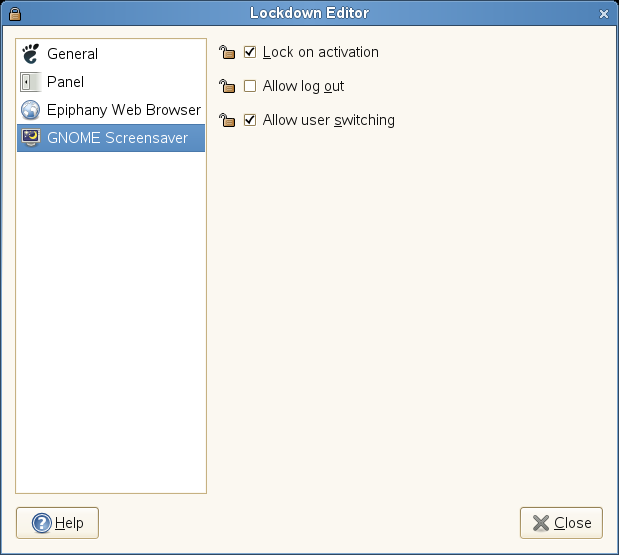
- Lock on activation
-
Select this option to lock the screen when the screensaver goes active.
- Allow log out
-
Select this option to offer an option in the unlock dialog box to log out after a delay.
- Allow user switching
-
Select this option to offer an option in the unlock dialog box to switch to a different user.account.
2.2.5 Customizing the Main Menu
Use the Main Menu application to customize the GNOME Main menu. To start this application, click .
NOTE:Changes you make to the Main menu are not overwritten during a subsequent system update. Changes are applied after the latest menu view is generated.
This section contains the following information:
Editing the Main Menu
This section describes the following ways you can edit the Main menu:
IMPORTANT:The first time you use Main Menu, changes to the menu do not take effect until you log out and log back in. After the first time, changes appear immediately when you make them.
NOTE:Some features, such as the ability to nest groups and insert separators, apply only if you use older versions of the GNOME menu.
Finding Menu Items
The window is arranged with the Main menu submenus in the list on the left and the items in the selected menu in the list on the right. Groups in a submenu are nested below that submenu. To find an item, click the arrow next to a submenu in the list, select the group containing that item, then locate the item in the list.
Figure 2-30 Main Menu Editor
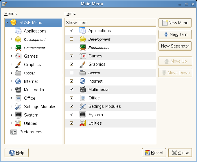
For example, to locate the Sound Recorder application:
-
Click .
-
Click the arrow next to the submenu in the list, then select the group.
-
Locate Sound Recorder in the list.
Rearranging Menu Items
You can change the order in which items appear in the Main menu. For example, you might want to place your frequently used applications at the top of the menu or at the top of their groups to make them easier to find.
To move an item, click it and drag it to a new location in the menu. You can move the item to a new location in the same menu, or drop it on an item in the list to move it to a new menu or group. You can also use the and buttons to change an item’s location in the menu.
Creating New Separators
Separators serve as visual cues to make it easier to find items in menus.
NOTE:Separators are not used in the current version of the GNOME menu. Adding a separator will have no effect. However, if you install and use an older version of the GNOME menu, you can use separators.
To create a separator:
-
Click .
-
Select the item above the space where you want the separator to appear.
For help locating an item, see Finding Menu Items.
-
Click .
The new separator appears beneath the selected item in the list. You can drag the separator to a new location like you would any other menu item. To delete a separator, see Deleting Items from the Main Menu.
Showing or Hiding Menu Items
To show or hide an item:
-
Click .
-
Locate the item in the list
-
Select the box next to the item to show the item.
or
Deselect the box next to the item to hide the item.
-
Click .
When you hide an item, it remains in the list and can be shown at another time if you decide you want it to appear in the menu. To delete an item from the list, see Deleting Items from the Main Menu.
Deleting Items from the Main Menu
There are two ways to remove an item from the Main menu:
-
To remove an item but retain it in the list so you can easily add it to the menu, hide the item as explained in Showing or Hiding Menu Items.
-
To delete an item from the list so it can no longer be shown, right-click the item and click .
NOTE:Separators can not be hidden. They can only be added or deleted.
If you want to show a deleted item, you must add it like you would a new application. See Adding New Items to the Main Menu for information about adding an application.
Renaming Menu Items
-
Click .
-
Locate the menu item whose name you want to change, as explained in Finding Menu Items.
-
Right-click the item, then click .
-
Replace the current name with the name you want to give the item, then click .
The old name is replaced by the new one in the menu.
Changing an Item’s Generic Name
A short descriptive name appears beneath the name of each item in the Main menu. This is known as the generic name. To change the generic name:
-
Click .
-
Locate the menu item whose generic name you want to change, as explained in Finding Menu Items.
-
Right-click the item, then click .
-
Replace the current generic name with the generic name you want to give the item, then click .
The old generic name is replaced by the new one in the menu.
Adding New Items to the Main Menu
You can add a new item to the Main menu. This is especially helpful when you install an application, but it is also useful if you have other applications that do not currently appear on the menu. You can also add a directory, a link, or another type of item to the menu.
To add an application to the Main menu:
-
Click .
-
In the list, click the arrow next to the menu containing the group where you want to add the application, then select the group.
The contents of that group appear in the list.
-
Click .
-
Type a name and generic name for the item.
-
Click and browse to the item.
-
Select the item.
-
Click the list, then select the type of item.
For example, if you are adding a directory, click the list and select . If you are adding an application, leave the default item type, , as is.
-
(Optional) To assign an icon to the new item, click , then select an icon for the item.
If you do not select an icon, the item appears in the menu without an icon.
-
Click .
After the item is added to the menu, you can move it to the place where you want it to appear in the menu, as described in Rearranging Menu Items.
2.2.6 Improving Access for the Visually Impaired
The Orca screen reader assists visually impaired users so they can read the information on the screen, either by magnifying the screen, reading screen output aloud, or outputting information from the screen in Braille to a screen reader. To configure Orca, click .
The first time you run this module, a terminal opens so you can set up the Orca screen reader. This setup consists of a series of yes/no questions. Answer the questions as appropriate for your setup. After the setup is complete, you must log out and log back in for your setup to take effect.
After the initial setup, to change the preferences you set during setup or to set additional options, click .
2.2.7 Configuring the Screen Saver
A screen saver is a program that blanks the screen or displays graphics when the computer is not used for a specified amount of time. Originally, screen savers protected monitors from having images burned into them. Now they are used primarily for entertainment or security.
To configure a screen saver, click .
Figure 2-31 Screensaver Preferences Dialog
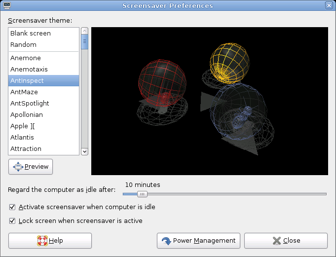
You can select from (random selection of screen savers from a custom-defined list), , or a selection of installed screen savers.
Select a screen saver from the list to choose it. The currently selected screen saver is displayed in the small preview window. Specify the amount of time that the screen is to be idle before the screen saver is activated, and whether the screen is locked when the screen saver is activated.
2.2.8 Customizing Window Behavior
Use the Window Preferences tool to customize window behavior for the desktop. You can determine how a window reacts to contact with the mouse pointer or to double-clicks on its titlebar, and you can define which key to hold for moving an application window.
To customize window behavior, click .
Figure 2-32 Window Preferences Dialog
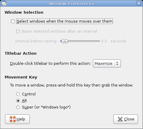
When several application windows populate the desktop, the active one by default is the one last clicked. Change this behavior by activating . If desired, activate and adjust the latency time with the slider. This raises a windows a short time after the window receives focus.
Application windows can be shaded (rolled up) by double-clicking the title bar, leaving only the title bar visible. This saves space on the desktop and is the default behavior. It is also possible to set windows to maximize when the title bar is double-clicked.
Using the radio buttons, select a modifier key to press for moving a window (Ctrl, Alt, Hyper, or the Windows logo key).