5.1 Chart Viewer
Charts provide a graphical representation of workload and utilization data. To view a chart for a given server, select the server in the Data Center Explorer or click a cell belonging to the server in a report view. You can also select several servers in the Data Center Explorer (hold down Ctrl or Shift while you select the servers) to render charts for multiple servers. In this case, a chart is not automatically rendered, but a button is displayed in the Chart Viewer. Click to render the chart.
All times displayed in the Chart Viewer are local times. Times shown in reports are in UTC time.
5.1.1 Chart Controls and Commands
Figure 5-1 Chart Controls
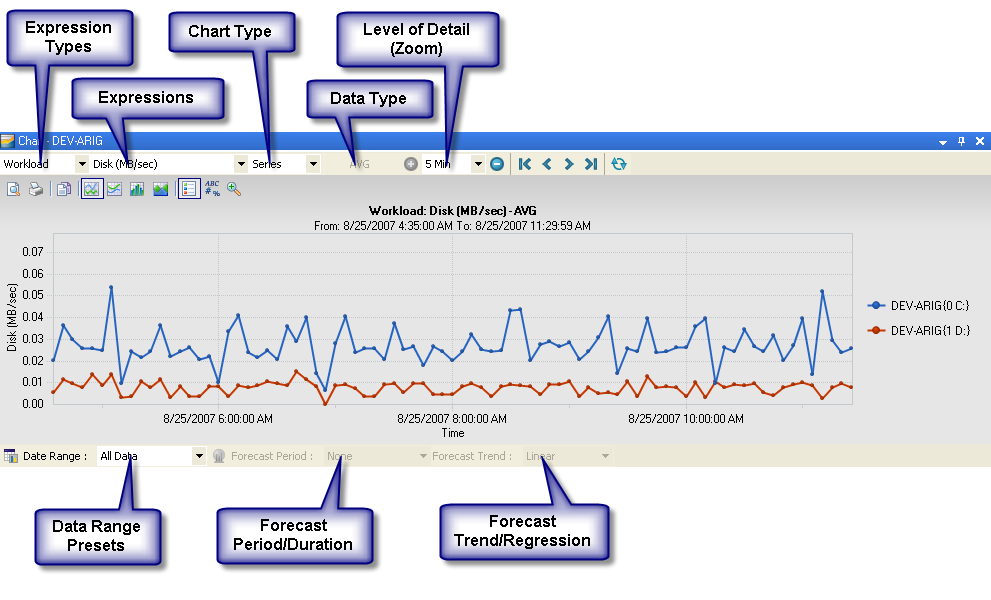
Table 5-1 Chart Viewer Commands
|
Command |
Description |
|---|---|
|
|
Print Preview. Preview chart before printing. |
|
|
Print. Print the chart. |
|
|
Copy To Clipboard. Copy the chart to the clipboard. |
|
|
Line. Display straight lines between points of continuous data. |
|
|
Curve. Display curved lines between points of continuous data. |
|
|
Candlestick. View the variability of sample data. This button appears only for the candle chart. |
|
|
Stacked Bar. View cumulative workload data from multiple servers. This is enabled for Expression types other than Utilization. |
|
|
Stacked Area. View cumulative workload data from multiple servers. This is enabled for Expression types other than Utilization. |
|
|
Legend Box. Give a visual cue and description for each data object. The legend is very useful for quickly glancing through the data on a chart. |
|
|
Point Labels. Display labels for the values in a chart. |
|
|
Zoom. Switch between normal and magnified view. |
|
|
Zoom In/Out. Adjust the granularity of the chart for the collected data. See Section 5.1.3, Level of Detail. |
|
|
Navigate Beginning/Back/Forward/End. Scroll the visible data. |
|
|
Historical Data Settings. Select the historical data time range upon which to base forecasting. |
|
|
Forecast Settings. Select the forecasting time period and algorithm. This button is only enabled for daily or weekly Series charts or for Profile charts. |
|
|
Refresh All Data From Server. Refresh the view. |


5.1.2 Expression Types
Expressions are individual data series that can be viewed on the currently displayed chart. Select an available Type/Expression combination and the chart is rendered to display the new metrics. The list of available expressions varies depending on the expression type and machine selected.
Table 5-2 Expression types
5.1.3 Level of Detail
From the drop-down list, select from the following levels of granularity (in terms of time) for collected data:
-
5 Min: Averages of data collected during five-minute intervals. (Series charts only.)
-
1 Hour: Summaries of data collected during one-hour intervals. (Series and Candle charts only.)
-
1 Day: Characterizes workloads over a day. This comprises 24 values that correspond to each hour of the day (0 to 23). Each value is calculated by taking the peak value from all values observed for that hour. (All chart types.)
-
1 Week: Characterizes workloads over a week. (All chart types.)
5.1.4 Data Type Statistics
The following data type statistics are collected for each hour and are available for selection when a 1 hour or higher zoom level is selected: This option is available only for series charts.
-
AVG: Average of all values.
-
MAX: Maximum sustained load.
-
MIN: Minimum sustained load.
-
STDEV: Standard deviation.
NOTE:Standard deviation is not calculated for Virtual Center counters.
-
Peak AVG: : (1 Day or 1 Week only) Peak average represents the averages of the values for the highest period for each 12-hour interval or each day in the reporting period.
5.1.5 Server Instance
Click the drop-down list to see all the instances of the currently selected resource (expression). Select each instance to see chart data for that resource. If multiple servers were used to render the chart, all instances of the resources for all servers are displayed.This option is available only for candle charts.
5.1.6 Date Range Presets
Select from the drop-down list , , , or . Select to open the Advanced Date Filter Settings dialog box for more specific date range options.
5.1.7 Forecasting
Forecasting is available for series and profile charts, for the 1 day and 1 week level of detail. At least three days of monitoring data are necessary to use forecasting in charts.
To add forecasting to a chart view:
-
Display a chart.
-
Click the drop-down list and select a time period to base the forecast on.
-
(Optional) Click
 for advanced date filter settings.
The Advanced Date Filter Settings dialog box is displayed. Choose any desired settings and click .
-
Click the drop-down list and select a time period for the forecast.
-
(Optional) Click
 for advanced custom forecast settings.
The Advanced Forecast Settings dialog box is displayed. Choose any desired settings and click .
-
Click the > drop-down list and select a forecast trend or regression method.