2.1 Overview
The Ad Hoc Editor supports creating various types of reports such as tables, crosstabs, and charts. You can create reports by dragging and dropping the items. You can add and summarize items, define groups, label, title the report, and format data for each item. You can also use the editor to explore and analyze data interactively.
2.1.1 Data Sources
The following repository objects provide connections to data sources for Ad Hoc View creation:
-
: These are collections of objects mapped to database schema. Domains are available for various ZENworks products such as ZENworks Configuration Management, Audit of ZENworks Configuration Management, ZENworks Mobile Management, and so on.
-
: Topics are created as JRXML files and then associated with data sources in the server. A Topic can also be created from a Domain in the server. For more information about Topics, see the Jaspersoft Server User Guide.
2.1.2 Using the Data Chooser
After selecting the data source, the Data chooser is displayed.
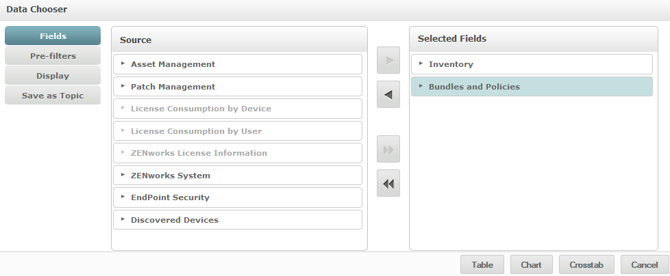
You must select items from the the to , to enable , , and buttons. The , , and buttons are optional and can be performed in any order. Click or at any time to begin designing a view based on the chosen data.
See the following sections for additional information about Data Chooser:
Selecting Items
Click to select items and sets of fields to use in the view, or to make available in the Domain Topic.
-
The panel displays the sets of fields from the Domain. Use
 and
and  to close or expand each set.
-
The panel displays the items selected from the panel. You can move a field between the panels by dragging, double-clicking, or selecting the item and clicking an arrow button.
-
If you move an individual field from a set, it appears in a set with the same name. If you do not want sets, use the settings on the panel.
-
Some Domains define sets that are not joined. When you select a field from such a set, the unjoined sets are not available.
Pre-filtering data
You can pre-filter data in the Data Chooser wizard before clicking , , or , or before clicking . Pre-filtering data limits the data choices available in a Domain Topic or the fields that ultimately display in the Ad Hoc View. You can define a filter on fields that does not display in the final report. The filter that meets all defined filters gets displayed in the final report. You can also design reports that prompt users to input data to use as a filter.
The panel provides powerful functionality for designing views within the server.
To define a filter:
-
In the Data Chooser wizard, click .
-
Expand the options in the panel.
-
Double-click to select a field.
-
Choose a comparison operator.
Text fields have substring comparison operators, such as or , and also whole string matching operators, such as , or . When you select a whole string matching operator, a list displays all existing values for the selected field; retrieved in real-time from the database.
In the panel, a drop-down list is displayed. The list contains the account names from which you can select multiple values.
-
In , click each value and move it to for comparison.
If there are more than 50 values to display in , click
 to search for the value. The maximum number of items that can be displayed in is configurable.
-
Select the check box to limit the view in .
By default, the check box is cleared, enabling end users to use filters when they run the report.
-
Click .
-
In the panel, click to modify the condition.
-
Click to save the changes.
To delete from the list, select a row, then click .
NOTE:Data rows must match all conditions. Which means, the filter applied to the data must be logical AND of all conditions that you have defined.
Changing the default label settings
Use the panel to change the default label and order of the fields in the Ad Hoc Editor. You can change the field labels and ordering at any time in the Ad Hoc Editor, but configuring the settings here makes them available in a Domain Topic.
The panel includes following options:
-
To change the order of fields, click in the row of the required field. Then, based on the required position, use the , , , or buttons.
Fields can be moved within their set, and sets as a whole can also be moved.
-
By default, the field name turns into the display label for the row, column, or measure that you create from the given field. To change the default display label of a field or set, double-click in the row and specify the new label in the text box.
-
Sets are not used in views, but can be used to add all their fields at once, expediting view creation.
-
If you do not want to use sets in the Ad Hoc Editor, select at the top of the panel. You can then relabel the fields and reorder them.
Saving the settings
On the panel, you can specify a name and description to save the Data Chooser settings as a Domain Topic. After saving these settings, you can create different views from the Domain Topic, using its fields, filters, and display label settings. You can also edit the Domain Topic to change the settings.
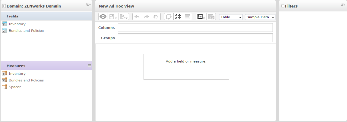
2.1.3 Ad Hoc Editor Panel
The Ad Hoc Editor enables you to create various types of views and reports.
Figure 2-1 Ad Hoc Editor
See the following sections for additional information about the panel:
The Data Source Selection Panel
The panel contains a list of items that are selected from a Topic or Domain and are placed in and .
To hide or unhide this panel, click the Data Source Selection icon in the top-left corner. The option helps you to arrange content in a large Ad Hoc View.
The Ad Hoc View Panel
The panel provides tools that allow you to control what data is included in a view and how it is organized.
Figure 2-2 Ad Hoc View panel
See the following sections for more information about the panel:
Ad Hoc Editor Tool Bar Icons
|
Icon |
Name |
Description |
|---|---|---|
|
|
Display Mode |
Enables you to hide the editor interface. This mode provides a subset of the editor’s full feature set. |
|
|
Save |
Enables you to select save options. |
|
|
Export |
Enables you to export the report into the following formats: PDF, Excel (Paginated), Excel, CSV, DOCX, RTF, Flash, ODT, ODS, XLSX (Paginated), XLSX (Paginated), and XLSX. |
|
|
Undo |
Enables you to undo the most recent action. |
|
|
Redo |
Enables you to redo the most recently undone action. |
|
|
Undo All |
Enables you to revert the view to its previous state before you last saved. |
|
|
Switch Group |
Enables you to change the display groups mode. For example, if Columns display the Bundle Type and Rows displays the Bundle Version and Bundle Create Date, when you click this icon the column information will be displayed as rows and vice versa. This is enabled only for Crosstab View and Chart View. |
|
|
Sort |
While working with tables, click this icon to view the current sorting and to select fields for sorting data. For more information, see Sorting Tables. |
|
|
Input Controls |
Click this icon to see the input controls applied to this view. For more information, see Section 2.8.2, Using Input Controls. |
|
|
Page Options |
Place the cursor on this icon to select the page-level options. You can select the following options:
|
|
|
View SQL Query |
Enables you to view the SQL query to verify the data. To perform this acton, you must have administrator rights. The query is read-only, but can be copied to a clipboard or other document for review. By default it is disabled. To enable the query, click, then select the check box. |
|
Drop-Down |
|
The Layout Band
Below the is the , with two fields. These fields have different labels and functions, depending on the View type.
-
For Table View, the available fields are and .
-
For Charts and Crosstabs Views, the available fields are and .
You can drag and drop items from and into these boxes.
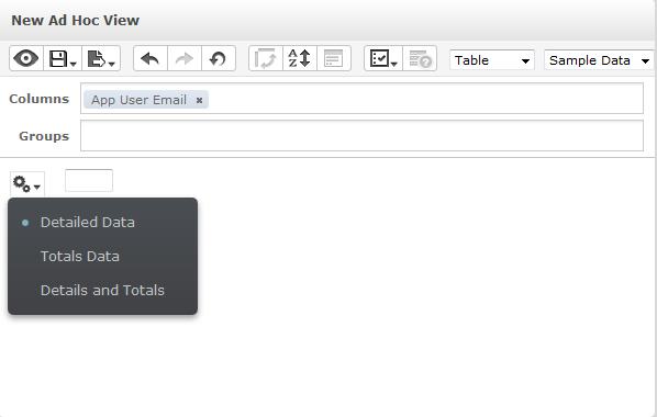
Managing Grid Details
Below the Layout Band is the Grid Detail selector. This option is available only for Chart View or Table View. In Table View, click  to select the following options:
-
displays the table detail.
-
displays the table totals.
-
displays both details and totals.
The Filters Panel
The panel displays filters that are defined for the view. You can set the filter values and view the results in the panel. To hide and unhide the panel, click the Filter icon in the top-right corner of the panel.
For more information, see Section 2.8, Using Filters and Input Controls.
2.1.4 Ad Hoc View Types
The Ad Hoc Editor allows you to select the following View types:
Tables
Table views are used to view values in the database and to summarize the values in columns. The table view consists of columns, rows, and groups.
Using groups, rows can be grouped by identical values in any field with intermediate summaries for each grouped value. For example, a table view of bundle details will contain columns that indicate the Bundle Name, Version, and Create Date of each bundle, and its rows will display the Bundle Type.
|
Bundle Type |
Bundle Name |
Version |
Create Date |
|---|---|---|---|
|
|
|
|
|
Patch Bundle |
B1 |
0 |
09-06-2013 |
|
Windows Bundle |
B2 |
1 |
30-04-2013 |
|
Linux Bundle |
B3 |
1 |
18-08-2013 |
For more information about Table Views, see Section 2.5, Working with Tables.
Charts
Chart Views compare one or more measures across multiple sets of related items. Charts summarize data graphically and support chart types such as bar chart, line chart, area chart, and pie chart.
For example, in the following table, the tab indicates the data in a bar chart that compares the Bundle Count for each Bundle Type.
|
|
|
Bundle Type |
|
|

 Patch Bundle
  Windows Bundle 02
  Linux Bundle
For more information about Charts View, see Section 2.6, Working with Charts.
Crosstabs
Crosstabs are more compact representations than tables; they provide data for items and their computed values. Columns and Rows specify the dimensions for grouping; cells contain the summarized measurements.
For example, in a with columns grouped by Bundle Type, the Bundle Count is as follows:
|
Bundle Type |
Bundle Count |
|
Patch Bundle |
100 |
|
Windows Bundle |
150 |
|
Linux Bundle |
50 |
|
Totals |
300 |
For more information, see Section 2.7, Working with Standard Crosstabs.