
Process Manager User's Guide
CHAPTER 4
This chapter describes the user interface functionality of Composer Process Designer, which is the design-time environment in which you will create your process models.
The Process Designer is a visual editing environment for creating process models represented by directed-edge graphs. In this environment, you can quickly create and arrange activities (represented by icons), draw links between activities, and designate data mappings, link conditions, etc., between and among activities. The point-and-click nature of the drawing environment allows for rapid creation of flow graphs.
An important feature of Process Designer is that any process can be run in animation mode at design time, so that process models can be designed, tested, and debugged in a single session. In animation mode, you can step into or over activities, set breakpoints, watch data transformations as they occur, see log messages, observe the behavior of splits and joins, etc., all in real time. You can also drill down on activity implementations, make changes to action models in components, edit message maps or documents, modify link or join logic, and so forth, interactively, without leaving the session. This capability greatly speeds development.

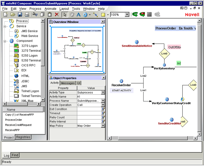
The Process Designer runs inside Composer (along with other component editors), so the overall environment should look familiar to any Composer user. (See graphic, below.)
When Process Designer is the front editor, three new panes are visible:
The Process Model Pane (also called the canvas), where you draw the process model graph. This is the largest pane.
The Object Properties Pane, in which you can specify property values for various elements of the process model (e.g., activities, links, text labels, and shapes).
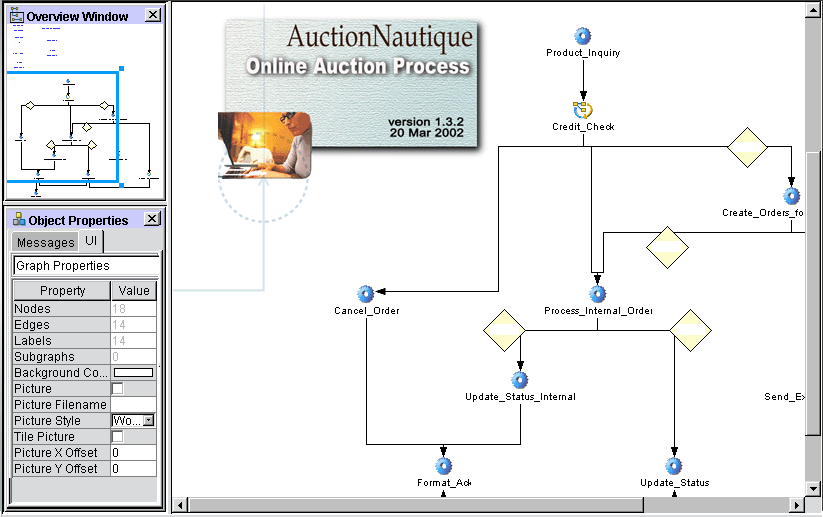
The Overview Pane, which contains a "bombsight view" of the main canvas. By holding the mouse down and dragging the blue rectangle within this mini-window, you can pan across the main canvas, setting the visual focus to a particular region instantly, without using scrollbars.
Composer Process Designer adds several new tools to the Composer toolbar, as shown below.
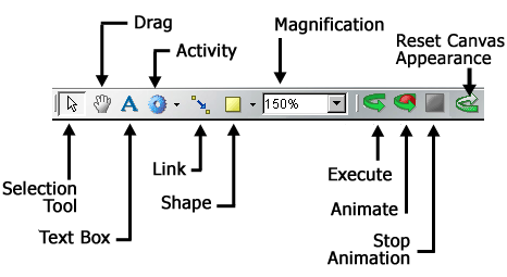
Graph elements include activities, links, text boxes, and shapes (rect and oval). The creation tools for these elements can be accessed via the Process menu on the main Composer menubar or via tool icons on the main toolbar. They operate in point-and-click fashion.
NOTE: The appearance characteristics (colors, borders, text justification, etc.) for each of the different graph-element types discussed below can be adjusted by means of controls located in the UI tab of the Object Properties pane. (You can toggle this pane's visibility by means of the Object Properties command under the View menu.)
Activities can be of five types, as depicted above. The various activity types are briefly described below.
To create an instance of one of these activity types in your graph, simply select the corresponding tool icon from the main toolbar (or the flyout icon list under the icon), then click anywhere on the main canvas.
The Link tool allows you to connect activities with a directed edge (arrow). Its operation is very simple. First, select the tool from the toolbar. Then click on any activity; this becomes the source activity for the link. With the mouse still down, drag out a line to the desired target activity. (Be sure the line extends not just to the activity, but actually over the middle of the activity icon.) When you let go of the mouse, an arrowhead will appear on the "target end" of the link and the two activities will be linked in terms of control flow. At this point, if you use the Selection cursor to drag either activity around the canvas, the link will automatically expand and/or reorient as necessary so that both activities remain connected.
The Text tool allows you to place text boxes on the canvas. When you click on the canvas, a rectangle will appear with the word "Untitled." You can then change the text in the box, set its background and outline colors, etc., by entering appropriate settings in the UI tab of the Object Properties pane.
Text boxes are simply arbitrary text labels that you can use at various spots around the canvas to document activity characteristics, control-flow intents, etc., or to indicate titles, author info, revision dates, and so on. Text boxes can be repositioned (by dragging) at any time and have no effect on control flow. Their use is optional.
By using the controls in the UI tab of the Object Properties pane, you can change a text box's appearance, not only with regard to colors, resizability, margins and centering, etc., but also involving text size, font, and style.
The Shapes tool will let you put rectangles, ovals, or your own .jpg or .gif graphics anywhere on the canvas. These elements are strictly decorative and have no effect on process runtime dynamics.
In Composer, when the Process Manager is the front editor, a number of process-specific menu commands appear in Composer's menus. The File, View, Process, and Layout menu structures are illustrated and discussed below.
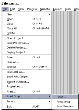
The only addition to Composer's File menu is the Print Graph command.
.
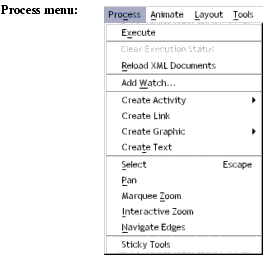
The Process Menu commands are explained below.
|
Menu |
Command |
Description |
|
Layout |
Global Layout |
Default layout mode: Entire graph is cached in memory at design time. |
|
Layout |
Incremental Layout |
Optional layout mode that uses memory more efficiently. |
|
Layout |
Circular Layout |
Arranges nodes in a hub-and-spoke manner. See discussion elsewhere under "Layout Properties". |
|
Layout |
Hierarchical Layout |
Applies the familiar "organizational chart" style of diagramming, in which top-down relationships are emphasized. |
|
Layout |
Orthogonal Layout |
Constrains nodes and links to a row-and-column motif. |
|
Layout |
Symmetric Layout |
Edge crossings are minimized and node distributions are made uniform so that symmetrical relationships are emphasized. |
|
Layout |
Tree Layout |
Applies the familiar "family tree" layout to a graph, similar to the hierarchical style described above, except that links are not parallel and seldom run perfectly horizontal or vertical. |
|
Layout |
Properties |
Brings up a preferences dialog for fine-tuning the above settings. |
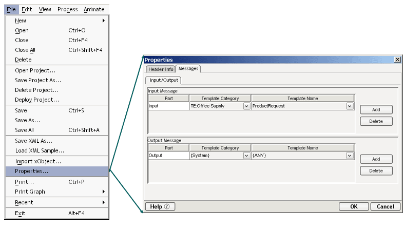
General info for a whole process can be accessed via File > Properties. The dialog that appears has two tabs, Header Info and Messages. The Header Info tab gives Name and comment-type information about the process in question. The Messages tab contains XML Template information for the input and output messages of the process.
Each type of object depicted in a directed edge graph created in Process Designer has its own set of properties. The properties are context-sensitive: they vary according to the type of object that you have selected on the canvas. To see the current properties for any object, simply select an object (by clicking on it using the Pointer tool) and toggle Object Properties under the View menu (if the Object Properties palette is not already visible).
The Object Properties palette (equivalently referred to as the property sheet for an object) is where you can specify such important activity attributes as:
The following sections describe what the property sheets for the various process elements look like when the appropriate type of object has focus.
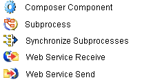
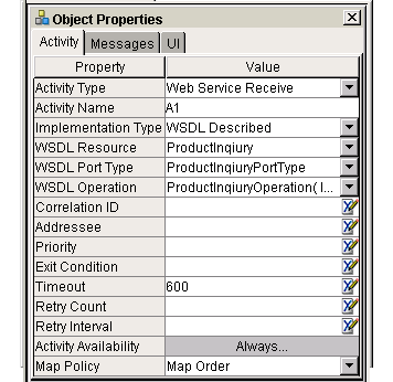
The Process Manager supports five activity types, each with its own set of object properties: Composer Component, Web Service Send, Web Service Receive, Subprocess, and Synchronize Subprocesses. The property sheets for each are discussed in some detail below.
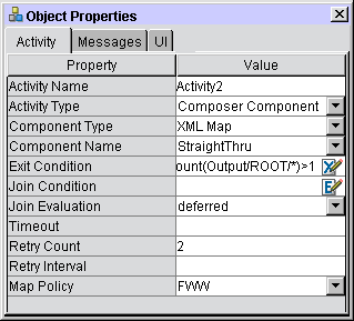
The Component Activity Object Properties panel has three tabs: Activity; Messages, and UI. Their appearances are illustrated below; their functionality is discussed in the tables that follow.
Note that all Object Properties tabs and panels are context-aware: Their contents update automatically to reflect the attributes of the activity that you have selected on the canvas. Likewise, any changes you make in any of the property settings will take effect in real time, as soon as the field in question loses focus. (You may have to click outside of a property field in order for a change to take effect.)
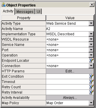
The Web Service Send activity has its own unique object properties, which are reflected in the Activity tab on the Object Properties panel.
NOTE: The Messages and UI tabs for this activity are the same as for the Component activity described above. Only the Activity tab will be described below.
|
Property |
Control Type |
Usage |
|
Activity Type |
Dropdown |
A dropdown list of Activity Types |
|
Activity Name |
Activity 1...n (default) |
The name of the Activity. |
|
WSDL Resource |
Dropdown |
A dropdown list of the available WSDL Resources within the Composer project. |
|
Service Name |
Dropdown |
A dropdown list of the available Web Services within the WSDL Resource. |
|
Service Port or Binding |
Dropdown |
A dropdown list of the Binding Names within the WSDL Resource. |
|
Operation |
Dropdown |
A dropdown list of the Operation Names within the WSDL Resource. |
|
Endpoint Locator |
XPath Expression |
Enter the Endpoint Location (usually a URL pointing at a servlet) for the Web Service you wish to use, wrapped in quotation marks. (Alternatively, enter an XPath expression that will evaluate to an Endpoint Location at runtime.) |
|
Connection |
Connection |
A dropdown list of Connections. |
|
HTTP Params |
Pushbutton |
This displays the `HTTP Header Parameters' dialog, where you can specify content-length and other common HTTP parameters. |
|
Exit Condition |
Text Field |
See discussion under "Exit Condition", page 124. |
|
Join Condition (as applicable) |
Text Field |
See discussion under "Join Condition", page 124. |
|
Join Evaluation |
Dropdown |
Like the Join Condition field, this field will only appear when the target activity is a join activity. The dropdown choices (Immediate, Deferred) determine the join's evaluation mode. |
|
Timeout |
Text Field |
See discussion under "Exit Condition" on page 124. |
|
Retry Count |
Numeric Field |
See discussion under "Retry Count", page 125. |
|
Retry Interval |
Text Field |
See discussion under "Retry Interval", page 125. |
|
Map Policy |
Text Field |
See discussion under "Map Policy", page 125. |
The settings on these tabs work the same as described for the Component Activity (already discussed).
|
Property |
Control Type |
Usage |
|
Activity Type |
Dropdown |
A dropdown list of available Activity Types |
|
Activity Name |
Activity 1...n (default) |
The name of the Activity. |
|
Implementation Type |
Dropdown |
One of: Web Service, JMS Service, or External. |
|
WSDL Resource |
Dropdown |
A dropdown list of the available WSDL Resources within the Composer project. |
|
WSDL Port Type |
Dropdown |
The port type for this service. |
|
WSDL Operation |
Dropdown |
A dropdown list of the Operation Names within the WSDL Resource. |
|
Correlation ID |
Text Field |
Arbitrary user-defined value, used to uniquely identify a transaction |
|
Addressee |
Text Field |
Arbitrary string label, typically to define the "owner" (name of an individual) associated with this particular transaction or activity |
|
Priority |
Text Field |
Some arbitrary numeric value relating, typically, to the importance of this activity or work item |
|
Exit Condition |
Text Field |
See discussion under "Exit Condition", page 124. |
|
Join Condition (as applicable) |
Text Field |
See discussion under "Join Condition", page 124. |
|
Timeout |
Text Field |
See discussion under "Exit Condition" on page 124. |
|
Retry Count |
Numeric Field |
See discussion under "Retry Count", page 125. |
|
Retry Interval |
Text Field |
See discussion under "Retry Interval", page 125. |
|
Map Policy |
Text Field |
See discussion under "Map Policy", page 125. |
The settings on these tabs operate the same as described earlier for the Component Activity (see above).
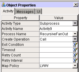
All properties on all tabs of the Object Properties panel for Subprocess have exactly the same names (and operate the same way) as for the Composer Component properties, except for the Create Operation property, which is one of spawn or call, to reflect whether the subprocess should be invoked asynchronously ("fire and forget") or synchronously (poll until response comes).
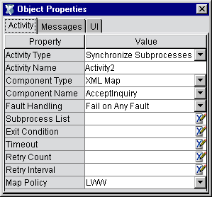
The Synchronize Subprocesses activity type is a specialized activity that coordinates the "fan-in" of multiple results from fanned-out subprocesses. See the discussion of "Synchronize Subprocesses Activity" in a later chapter.
|
Property |
Control Type |
Usage |
|
Activity Type |
Dropdown |
A dropdown list of available Activity Types |
|
Activity Name |
Activity 1...n (default) |
The name of this Activity. |
|
Component Type |
Dropdown |
A list of available components in this Composer project. |
|
Fault Handling |
Dropdown |
Two choices: Fail on Any Fault, or Fail If All Fail. |
|
Subprocess List |
Text Field (XPath) |
XPath locations of the ProcessInfo data for fanned out subprocesses. |
|
Exit Condition |
Text Field |
See discussion under "Exit Condition", page 124. |
|
Join Condition (as applicable) |
Text Field |
See discussion under "Join Condition", page 124. |
|
Timeout |
Text Field |
See discussion under "Exit Condition" on page 124. |
|
Retry Count |
Numeric Field |
See discussion under "Retry Count", page 125. |
|
Retry Interval |
Text Field |
See discussion under "Retry Interval", page 125. |
|
Map Policy |
Text Field |
See discussion under "Map Policy", page 125. |
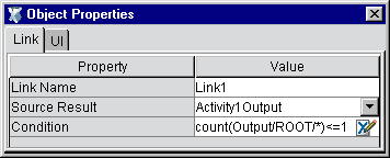
The Link Object Properties has two tabs: Link and UI.
The Process Object (or graph) property sheet has a Messages tab and a UI tab. To see the graph's properties, click anywhere on the bare canvas, then bring the Object Properties palette into view (use the View menu's Object Properties command). You will use this window to set overall process input, output, and fault message mappings, and customize the appearance of the graph.
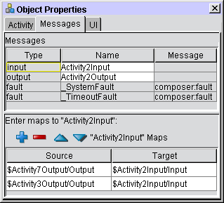
The Messages tab is where you will typically specify the end-activity-to-process-output data mapping(s). For example, if Activity4 on your graph is the end activity for the process (the final activity to execute), and you want the process to return a message containing Activity4's output, this is where you would specify the ProcessOutput mapping. See example below.
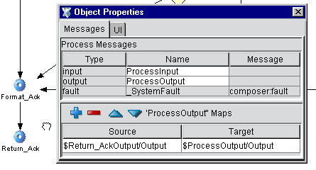
In the above example, the activity Return_Ack is the end activity for the process. Its output is mapped to $ProcessOutput/Output, as shown at the bottom of the Object Properties pane. The first step in setting up this pane was to click on the bare canvas (thus deselecting all activities, links, and other graphic elements). This makes the Object Properties pane reflect the properties of the process-as-a-whole. (Notice the input and output messages are simply ProcessInput and ProcessOutput.)
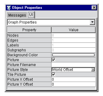
The graph lUI tab has two purposes: It allows you to define custom appearance-related settings for the overall graph, and it provides summary information about the number of nodes on the graph, the number of links, labels, etc.
Remember that this set of properties is reachable only when you click on bare canvas.
NOTE: For additional information about how to customize the appearance of a graph, see the section "Layout Properties" further below.
The following table describes the properties available in the UI tab of the process Object Properties panel.
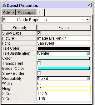
The Selected Node Properties UI tab is for inspecting or setting appearance attributes on objects shown on the graph. Single-click an object to select it, then select the UI tab from the Object Properties pane; then choose Selected Node Properties from the dropdown menu control at the top of the tab. See below.
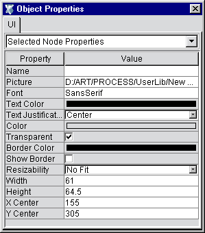
The UI tab for Text objects, Shapes, etc., has a Selected Node Properties pane with attributes similar to those described above. The table below describes the properties in detail.
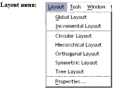
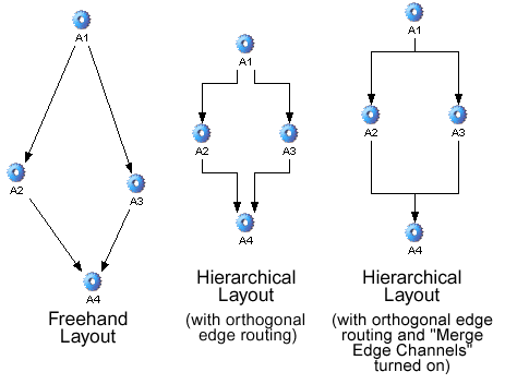
Process Designer will (if you wish) automatically reformat your graph according to any of five flow-diagramming algorithms:
Circular—Arranges nodes in a hub-and-spoke manner whenever possible, with spokes having identical lengths. This type of layout is appropriate when clustering is the predominant architectural feature (e.g., as in depicting a LAN or WAN layout).
Hierarchical—This is the familiar "organizational chart" style of diagramming, in which top-down relationships are emphasized. (You can, however, configure this layout option to show left-to-right or other flow polarities.) This layout option is appropriate for graphs in which hierarchical relationships need to be emphasized.
Orthogonal—This style constrains nodes and links to a row-and-column motif. Links are constrained to run parallel to x- and y-axes. Also note that nodes with more than one incoming link may be magnified in appearance relative to other nodes. This layout strategy is appropriate for situations where a grid or lattice relationship between elements needs to be emphasized, as opposed to hierarchical relationships.
Symmetric—In this style of graphing, edge crossings are minimized and node distributions are made uniform so that symmetrical relationships can be emphasized.
Tree—This diagram style is appropriate when the predominant need is to show parent/child relationships. It uses the familiar "family tree" type of layout, very similar to the hierarchical style described above, except that links are not parallel and seldom run perfectly horizontal or vertical.
All of the above diagramming styles can be extensively customized by means of preferences exposed in the Layout > Properties dialog. To bring up this dialog, go to Composer's main menubar and choose Properties from the Layout menu.
The dialog has six tabs: a General Preferences tab, and five tabs corresponding to the five autolayout styles just described. Each tab contains a wealth of controls and settings to allow you to exercise fine control over the many constraints that characterize a particular style of graphing.
The following tips are aimed at helping you achieve maximum productivity with Process Designer.
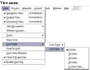
By default, everything you draw or position snaps to an invisible 5-pixel-by-5-pixel grid. But you can override this behavior at any time by holding the Alt key down. (You can override it permanently by setting Grid Size to one, using View > Grid Style > Grid Size > Custom Size.)
You can toggle the visibility of the grid by using the View menu's Hide Grid or Show Grid commands. (There is actually only one command; its name changes dynamically depending on which mode you just entered.) Grid Size and Style (dots versus lines) can also be set at any time through View menu commands .
You can instantly align graph nodes to the grid, at any time, by using View > Snap to Grid. You will see graph items suddenly "jump" to the closest grid lines.
Multiple Undo/Redo is available for all layout gestures.
Normally, a tool reverts to the arrow cursor after one use. For example, if you select the Activity Tool, then click on the canvas to put down a new activity icon, the tool will immediately revert to the arrow (or Selection Tool) when you let go of the mouse. You can override this behavior and make the tool mode persist across mouse clicks by turning on the Sticky Tools option. Look under the Process menu for Sticky Tools.
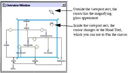
Exceptional control over pan and zoom can be had by using the Overview Window (see below). Toggle this pane's visibility by using View > Overview Window.
Two behaviors are available from the overview window:
You can drag the blue "viewport rect" around the overview pane to pan the canvas in real time.
You can click-drag just outside the viewport rect to interactrively zoom the canvas to a bigger or smaller size.
Notice that the cursor changes appearance depending on the position of the mouse (inside or outside the viewport rect).
Note that you can customize the canvas in various ways. For example, you can specify a background image; change the appearance of any activity to use a custom image; and/or add any number of decorative images or logos to the canvas, and use Send to Back or Bring to Front to "stack" images in any order. These features allow you to build presentation-quality process graphs for use in meetings, demonstrations, etc.
NOTE: To access canvas properties, click anywhere on bare canvas, then choose the UI Tab in the Object Properties panel.
One way in which the canvas can be customized is to add a custom background, consisting of a .gif or .jpg image. The following illustration shows a canvas that contains a .jpg background.
Click the white area to the right of Picture Filename. A navigation dialog will appear.
Navigate your hard disk or network and find a .jpg or .gif file that you wish to use as a graph background picture.
In the UI Tab, check the Picture checkbox to apply the image to the canvas.
Optionally check the Tile Picture checkbox if you wish to tile the canvas with the image.
Next to Picture Style you will find a dropdown menu. Select one of the two choices available on this menu:
World Offset—Choosing this option means that the image will shrink or grow with the canvas as you choose different zoom settings and maintain its relative position to other objects on-canvas. This is the normal behavior for all Process Designer graphics.
Device Offset—Choosing this option means that the image will not shrink, grow, nor change position as you pan or zoom.
Optionally adjust Picture X-Offset and/or Picture Y-Offset values to place the picture exactly where you want it on the graph. (You may enter positive or negative values here as required.)
As explained earlier, Process Designer will reformat your graph according to various diagramming algorithms, if you desire. The auto-diagramming option you are most likely to use is the Hierarchical layout option. This option (Layout > Hierarchical Layout) will reformat a graph to a top-down (or left--to-right, or other) hierarchy view, with or without X/Y alignment of links, and with or without merging of parallel links.
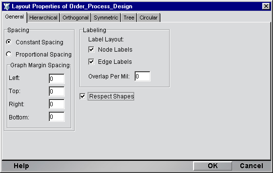
Various constraint options are available for Hierarchical Layout (as for the other autolayout modes). To access the settings, use the Layout menu's Properties command, which brings up the Layout Properties dialog:
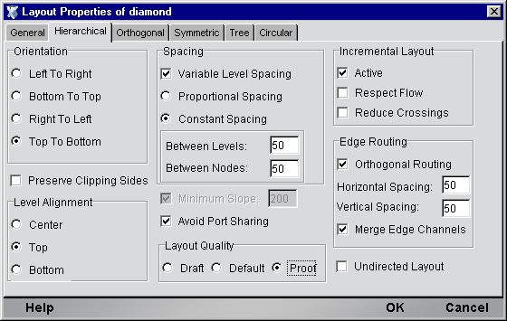
Take special note of the Edge Routing control group at the lower right. You must check the Orthogonal Routing checkbox if you want links to be X/Y-axis aligned. If you want stems of parallel links (coming into or out of a common node) to be depicted as a single stem, you should check the Merge Edge Channels checkbox.
Copyright © 2003 Novell, Inc. All rights reserved. Copyright © 1997, 1998, 1999, 2000, 2001, 2002, 2003 SilverStream Software, LLC. All rights reserved. more ...


