Cascading Style Sheets (CSS)

The CSS tab allows Users to customize the look and feel of banner backgrounds and tabs within the system. Knowledge of working with cascading style sheets is recommended when making changes to these settings.

The options available for configuration include:
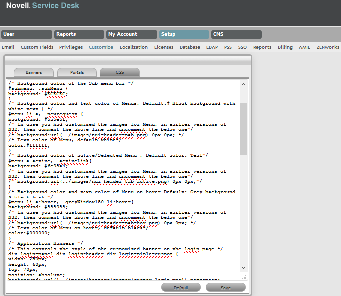
Background Colors

CSS Editor


Background Colors


#header

This controls the background color of the header.

#menubar, .greyWindow150

This controls the background color of the menu bar.

#submenu, .subMenu

This controls the background color of the submenu bar.

#menu li a, .newrequest

This controls the color of the menu background and the text.

#menu a.active, .activeLink

This controls the background color of the active selective menu.

#menu li a:hover, .greyWindow150 li:hover

This controls the background color of menu on hover.
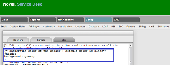
Example 1

This example shows how to change the default header color to green. In the #header section for background, you can either directly specify green or use the Hex color code for green. After saving the changes, you can see a change in the background color of all portals as shown below:

Example 2

The following screen displays the customized colors of the header, menu bar, submenu bar; the active menu and the configurations made to get this result:

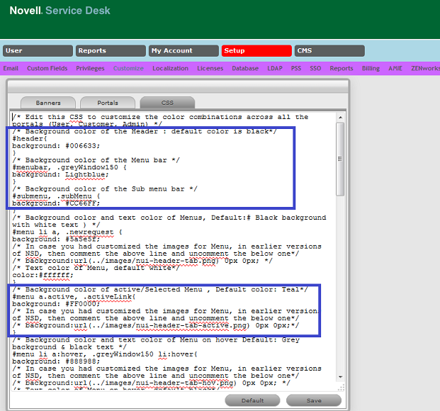
NOTE:After saving the changes, ensure that you clear the browser cache to view your custom changes.

Application Banners

CSS Editor


Application Banners


div.login-panel div.login-header div.login-title-custom

This controls the style of the customized banner on the Login page.

div.login-panel div.login-header div.login-title-container

This controls the style of the default banner on the Login page.

div.login-panel div.login-header span.login-app-logo

This controls the helpdesk icon graphic on the Login page.

#header .customPngBanner

This controls the style of the customized banner within the User portal.

#header .defaultBanner

This controls the style of the default banner graphic within the User portal.

#header .customPngBanner

This controls the style of the customized banner within the Customer & Public portals.

#pageHeader .defaultBanner

This controls the style of the default banner within the Customer & Public portals.

Menu Options (User Portal)


#menu a.active

This controls the highlight on the active (main) menu selection.

submenu a:hover

This (in tandem with the span extension) controls the mouseover (hover) on the submenu tabs.

#submenu a:hover span

This (in tandem with the hover default above) controls the mouseover (hover) on the submenu tabs.

#submenu a.active

This controls the highlight applied to the selected submenu options.

If unwanted changes are made to the system Style Sheets, use the Default button to return the system to the out-of-the-box format.

For trademark and copyright information, see Legal Notices.