6.5 Customize
6.5.1 Customize
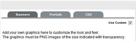
The Customize menu allows the Administrator to brand the application where system banners can be replaced with the appropriate organizational banners. Graphics included should be PNG images. The Application Banner should be 250 x 60 pixels and all other banners should be 500 x 60 pixels.
Adding a Customized Banner
To add a customized banner:
-
Select Setup>Customize
Banner Type
Displayed
Application
Visible on the Log in page of the system.
User
Visible in the portals for Supervisor, Technician, Administrator, Partner, Finance and Manager Users
Public/Email
Displayed on public portals for Knowledge, Outages, Surveys and Forums. This banner is also included in emails when the Setup>Email>Setup option of Include Banner is set to Yes.
Customer
Visible in the Customer Portal.
NOTE:Banners for Partner Organizations can be uploaded in the Banners tab of the User>Partner Organization screen. This will override the system Customer Portal banner for Customers associated with the Partner Organization.
-
To use Custom Banners, select the Use Custom checkbox at the top of the Customize Banners screen.
-
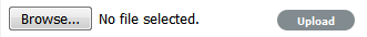
To upload a new banner, click New
A window with a browse function appears.
-
Browse to the location of the image and click

The image will be uploaded.
-
Repeat the process until all banners have been replaced
-
Click Save.
NOTE:When the Purchase Orders functionality is enabled within the Setup>Billing tab, the option to upload a logo that will be used for system generated POs is displayed. The graphic should be saved as 150x150 PNG file.
Portals Tab
All Public Access home page messages can be fully customized under the Portals tab. Links to documents and downloads may be added. The home page messages can be customized for:
-
Alerts
-
Forums
-
Knowledge Base
-
Login Page
-
Public Outages
-
Planned Outages
-
Surveys
-
Customer Portal welcome message
NOTE:Outage Home and Planned Home Messages apply in Service Manager only.
To customize a Public Access message:
-
Select Setup > Customize
-
Click the Portals tab
-
Select the Name hyperlink
The HTML editor appears.
-
Edit the message as required
-
Click Save.
Cascading Style Sheets
The system can be further customized using cascading style sheets (CSSs) to amend:
-
Color
-
Fonts
-
Tabs
-
Graphics
6.5.2 Portals
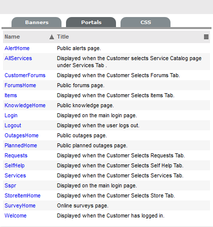
All Public Access home page messages and some Customer Portal pages can be customized within the Portals tab.
Knowledge of HTML is required to edit this section. Links to documents and downloads may be added. The content can be customized for the following system Portals:
-
Name
Description
AlertHome
Accessed by clicking the Alerts link on the system Login screen.
AllServices
Visible as the header within the Service Catalog screen of the Services tab in the Customer Portal.
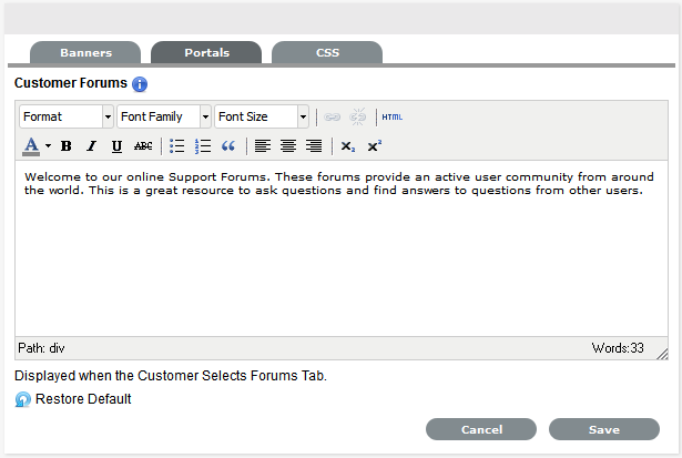
CustomerForums
Visible as the header within the Forums page of the Customer Portal.
ForumsHome
Visible as the header within the Forums pages of Public Forums.
Items
Visible in the Items tab within the Customer Portal.
KnowledgeHome
Accessed by clicking the Knowledge Base link on the system Login screen.
Login
Visible on the screen where system users enter their login credentials.
Logout
Visible on the page displayed when system users log out.
OutagesHome
Accessed by clicking the Outage link on the system Login screen of Service Manager installations.
PlannedHome
Accessed by clicking the Planned Outage link on the system Login screen of Service Manager installations.
Requests
Visible in the Requests tab within the Customer Portal.
SelfHelp
Visible in the Self Help tab within the Customer Portal.
Services
Visible as the header within the Services tab of the Customer Portal.
SurveyHome
Displayed in the public online surveys page.
Welcome
Displayed on the landing page when the Customer logs into the Customer Portal.
To customize a Portal message:
-
Select Setup > Customize
-
Select the Name hyperlink
The HTML editor appears.
-
Edit the message as required
-
Click Save
Cascading Style Sheets
The system can be further customized using cascading style sheets (CSSs) to amend:
-
Color
-
Fonts
-
Tabs
-
Graphics
6.5.3 Cascading Style Sheets (CSS)
The CSS tab allows Users to customize the look and feel of banner backgrounds and tabs within the system. Knowledge of working with cascading style sheets is recommended when making changes to these settings.
The options available for configuration include:
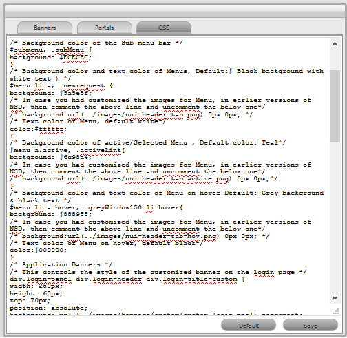
Background Colors
|
CSS Editor |
|
|---|---|
|
Background Colors |
|
|
#header |
This controls the background color of the header. |
|
#menubar, .greyWindow150 |
This controls the background color of the menu bar. |
|
#submenu, .subMenu |
This controls the background color of the submenu bar. |
|
#menu li a, .newrequest |
This controls the color of the menu background and the text. |
|
#menu a.active, .activeLink |
This controls the background color of the active selective menu. |
|
#menu li a:hover, .greyWindow150 li:hover |
This controls the background color of menu on hover. |
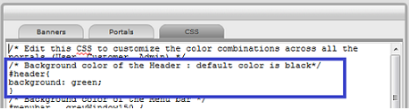
Example 1
This example shows how to change the default header color to green. In the #header section for background, you can either directly specify green or use the Hex color code for green. After saving the changes, you can see a change in the background color of all portals as shown below:
Example 2
The following screen displays the customized colors of the header, menu bar, submenu bar; the active menu and the configurations made to get this result:
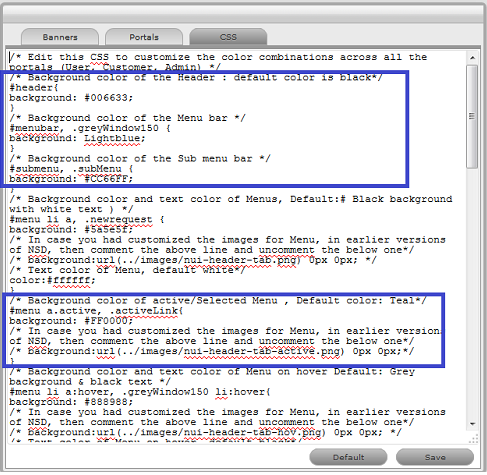
NOTE:After saving the changes, ensure that you clear the browser cache to view your custom changes.
Application Banners
|
CSS Editor |
|
|---|---|
|
Login Page (User Portal) |
|
|
div.login-panel div.login-header div.login-title-custom |
This controls the style of the customized banner on the Login page. |
|
div.login-panel div.login-header div.login-title-container |
This controls the style of the default banner on the Login page. |
|
div.login-panel div.login-header span.login-app-logo |
This controls the helpdesk icon graphic on the Login page. |
|
Menu Options (User Portal) |
|
|
#menu a.active |
This controls the highlight on the active (main) menu selection. |
|
submenu a:hover |
This (in tandem with the span extension) controls the mouseover (hover) on the submenu tabs. |
|
#zsd_navbar |
This controls the style of the navigation bar. background-image: linear-gradient(90deg, #19224A 0%, #222E61 25%, #23346A 65%, #146693 90%, #088CB2 100%); If you want to set a non-gradient background color, then comment the above line and use the following with a color of your choice. You can also use hexcode or RGB code for the color. background-color:red; |
|
.navbar-dark .navbar-nav .nav-link |
To change the color of the navigation bar menu item links. |
|
.navbar-dark .navbar-nav .nav-link:hover |
This controls the color of the navigation bar menu Item link hover. |
|
.navbar-dark .navbar-nav .nav-link.active |
This controls the color of the selected menu items and selected Border Bottom. |
|
#submenu, .subMenu |
This controls the background color of the sub menu bar. |
|
#menu li a:hover, .greyWindow150 li:hover |
This controls the background color and text color of Menu on hover. |
|
#menu li a, .newrequest, #menu a.active, .activeLink, #menu li a:hover, .greyWindow150 li:hover |
This controls the text color for Menu, active, selected, default and on-hover. |
|
#menu li a, #menu a.active, #menu a:hover, .newrequest, .activelink |
This controls the border color of the Menu Tabs. |
|
Login page (Customer Portal) |
|
|
.form-signin |
This controls the color of the Login page. |
|
#loginPage_Container |
This controls the background color of Username and Password fields. |
|
#zsd_login_username, #zsd_login_password |
This controls the text color of user specified text in the Username and Password fields. |
|
#zsd_login_domain |
This controls the background color of the Domain drop-down. |
|
#zsd_login_username, #zsd_login_password, #zsd_login_domain |
This controls the border color of the Username, Password and Domain. |
|
#zsd_login_sign_in |
This controls the Sign-in button color on the Login page. |
|
#zsd_custom_profile_dropdown |
This controls the background color for the Profile drop-down. |
|
#zsd_login_username, #zsd_login_password, #zsd_login_domain |
This controls the color of Username, Password and Domain. |
|
#zsd_login_sign_in |
This controls the Sign-in button color on the Login page. |
|
Menu Options (Customer Portal) |
|
|
#zsd_navbar |
This controls the style of the navigation bar. NOTE:Comment-out or remove background-image property from the customize css file to set the “set background-color”. |
|
.nav-link.active |
This controls the highlight on the active (main) menu selection. |
|
#searchandquicklink |
This controls the Background color for the Banner. |
|
.nav-link:hover span |
This (in tandem with the span extension) controls the mouseover (hover) on the navigation bar tabs. |
|
.navbar-dark .navbar-nav .nav-link |
This controls the color of the navigation bar menu item links. |
|
.navbar-dark .navbar-nav .nav-link:hover |
This controls the color of the navigation bar menu Item link hover. |
|
.navbar-dark .navbar-nav .nav-link:active |
This controls the color of selected menu item and selected border bottom. |
If unwanted changes are made to the system Style Sheets, use the Default button to return the system to the out-of-the-box format.