2.4 ConsoleOne User Interface Guidelines
Introduction to UI Guidelines
User Interface Components and Snap-in Methods
Additional Design Information
2.4.1 Purpose of the Guidelines
The Novell® ConsoleOne User Interface Guidelines outline the user interface for the management and administrative console, and the requirements and guidelines by which developers integrate content into the console.
The guidelines are intended to be used by those who are designing and developing content snap-ins for the console. Its purpose is to maintain an easy to learn and usable user interface through consistent use of controls, widgets, and other interface components, and by outlining the methods, requirements, and guidelines by which snap-ins integrate. The guidelines cover the following topics:
- The ConsoleOne User Interface Model
- Interface components and snap-in methods — Specific detail on how each of the interface components should be used and the snap-in methods for utilizing each component
- Additional design information — Recommended dialog layout and design, use of layout managers, user feedback, and so forth.
Each section of this guideline outlines some aspect of the console interface, followed by requirements for its use, and any related requirements or guidelines. Required specifications are provided to maintain the overall consistency, predictability, and usability of the interface. Recommended guidelines are optional guidelines that allow for flexibility in designing interfaces appropriate to the functions or features you need to provide. Developers are responsible for ensuring that their snap-in interfaces follow this guide.
2.4.2 User Interface Model
ConsoleOne provides a single interface for network managers and administrators from which they can manage and administer their network resources. It brings new levels of integration, and a far more flexible environment for content developers by using a common snap-in architecture and user interface model.
The ConsoleOne snap-in architecture provides the methodologies through which the ConsoleOne interface elements are extended. The ConsoleOne user interface centers around an object-task model. Although ConsoleOne is primarily object oriented, it does not preclude a task-to-object approach. How a feature, function, or task is exposed is determined by the snap-in method used.
The foundation of the object-task model is the namespace (snap-in). A namespace represents a set of objects. The object browser, coupled with an appropriate view, presents and provides access to the set of objects represented by the namespace. Menus and menu items, toolbar items, status bar items, and property book pages all provide access to the tasks that are associated with the namespace.
Upon start-up, ConsoleOne determines which snap-ins have been registered. Those snap-ins registered to the shell will initially be presented in the menus, toolbar, and status bar, as well as the namespaces that have been registered. These features include exiting the shell, Help, preferences, and so forth.
When interacting with a particular namespace, only those tasks that are associated with the namespace are made available, in addition to those registered to the shell. When interacting with a particular view, those tasks that are registered to the view are made available in addition to those of the namespace and shell. The model is further extended to object level. When interacting with a particular class or type of object, those tasks applicable to the object are made available, in addition to that of the view, namespace, and shell.
Context menus provide access to the features, functions, or tasks that apply to all objects within the namespace, as well as those specific to the selected object class or type. Only those options that apply to the active selection are made available in the context menu.
The following graphic illustrates the interaction of the snap-in methods.
Figure 2-1 ConsoleOne User Interface Model
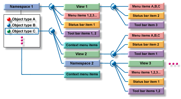
In this example, the namespace snap-in represents a set of object types, in this case several types. Registered to the namespace is a set of snap-ins: View 1, Menu Items 1,2,3..., Status bar item 1, Toolbar item 1,2, and Context menu items.
When Namespace 1 has focus, meaning one of the items it represents is selected in the object browser, then each of the first set of snap-ins are active. If View 1 is the active view, then the snap-ins registered to the view are merged alongside those of Namespace 1.
When an object of type C is selected, View 2 becomes available to the View menu, or becomes the active view. The snap-ins registered to View 2 then become active and merge with those of Namespace 1, replacing those of View 1 (because View 1 is no longer active). In addition, a set of context menu items are merged along with those registered to the namespace.
Optionally, Namespace 2 can be registered to Object type C. In this case when Object type C is selected, View 3 becomes the active view, because it is the only registered view to Namespace 2. With Namespace 2 the active namespace, the snap-ins registered to Namespace 2 become the active snap-ins alongside the snap-ins registered to the shell, replacing those of Namespace 1. The snap-ins registered to View 3 also become active, because View 3 has become active.
The accessibility and the availability of a particular snap-in is determined by how and at what level the snap-in is registered. If it is important that an option is always available when the snap-in is active, then it is more appropriate to register the snap-in to the namespace. If an option is only applicable to a particular object type, then it is more appropriate to register it to the object type than the namespace.
See Also:
2.4.3 Object Browser and Namespace Snap-Ins
The primary function of the object browser is to display the objects represented by namespace snap-ins. Other than presenting the objects represented by the namespace, the object browser cannot be modified by the snap-in developer.
Following are the requirements for namespace snap-ins:
- Each object or item must be represented by an image and a caption or label. When no image is provided, a default image will be displayed by the object browser.
- The default image size for the object browser is 16 pixels high by 16 pixels wide in GIF format.
- Image size can be wider than 16 pixels; however, all images should be uniform in width within the namespace.
- Images should use transparent backgrounds.
- It is recommended that each namespace developer provide an appropriate view for the namespace and not use the console view as the primary method to display subordinates.
Following are the guidelines for designing a namespace snap-in:
- The namespace should be readily understood. In other words, it should match real-world or other well-known models or paradigms.
- A namespace can be a hierarchical directory such as NDS or a file system, or nonhierarchical, such as a list of servers or possibly a list of URLs on the Internet.
See Also:
2.4.4 View Snap-Ins
In the simplest of terms, a view is a presentation of the selected item within the object browser. A view can simply be a listing of the subordinate items of the object browser selection, such as that provided by the ConsoleOne console view. The view is owned by the snap-in developer, hence the options are limitless. A view snap-in therefore provides the presentation of the objects from the selected namespace.
Following are the requirements for view snap-ins:
- When listing the subordinates of the selected object browser item, and where the namespace is capable of being navigated, the view must provide navigation capability within the view. That is, when an object that has subordinates is double-clicked, the view must refresh to list the subordinates and update the object browser to show the resulting containment or hierarchy.
- It is recommended that a view not be a form-type dialog. This typically presents usability issues when dealing with closure; that is, does the user know or can the user determine when the process is complete or whether the changes requested have been submitted.
Following are the guidelines for view snap-ins:
- One or more views can be registered to a namespace.
- Views can be maps, graphs, and so forth.
- Views should not contain a separate menu bar or separate toolbar from that of ConsoleOne.
See Also:
2.4.5 Property Book Page Snap-Ins
The property book is a multipage dialog, using a folder-tab metaphor to provide property viewing or editing capability. The property book provides multipage and multipage set (hierarchical) capabilities. The multipage format follows the familiar property page layout where a single tab represents a number of related properties, or in other words, a property page. The multipage set format allows several property pages to be grouped under a single tab. The tab provides a drop-down menu to access the individual pages within the page set. Following is an example of a property page book.
Figure 2-2 Property Page Book User Interface Example
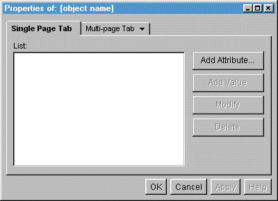
A property book page snap-in therefore provides access to the properties of an object. Properties can be exposed in a single property page, or as a set of pages. A set of pages represents common or related interfaces to attributes or properties of a system, view, or object.
Following are the requirements for property book page snap-ins:
- Currently, the page size is fixed at 640 pixels high by 480 pixels wide, and is not configurable.
- Use a layout manager so that the various elements on the page will be adjusted automatically based on localized string lengths.
Consider the following guidelines for property book page snap-ins:
- Logically group like or common sets of properties into property page sets.
- Limit the number of page sets to a maximum of 7.
- The property book should be used when presenting properties of an object where they cannot be reasonably grouped or organized into a single dialog page.
See Also:
2.4.6 Drop-Down Menu Snap-Ins
The default console snap-in provides a standard set of menus: File, Edit, View, Tools, and Help. They are always active, providing access to the minimal shell features and functions.
The menu snap-in interface provides the capability to merge menus and menu items into the console’s standard menu structure in order to provide access to actions, features or functions of a namespace or snap-in. Menu items can be cascading, radio button, or standard menu items. Optional menus can also be merged into the standard set; however, they should follow the guidelines set for them.
Each of the standard menus have a snap-in point. Menu items that are registered to each one of the standard menus will merge into the menu at the defined snap-in point. The standard menus supports three registration methods:
- Shell — Items are always active.
- Namespace — Items become active when the namespace becomes active.
- View — Items become active when the view becomes active.
See Also:
File Menu
The File menu contains commands that are global to all objects of the selected namespace, such as New, Delete, Move, or Rename. Commands that are global to all namespaces, such as Print and Exit (the default console snap-in provides these menu items), are also included in this menu. All other merged menu items snap in after the New menu item in the order listed in Table 1 below.
Following are the guidelines for merging items into the File menu:
- Include items that are global to the namespace and the objects that the namespace represents.
- When a namespace provides for the creation of new objects, the respective Create command should merge under the New cascading menu.
- Commands that are specific to an object type or class should be registered as menu items in the context menus.
Table 2-3 File Menu Item Merge Order
See Also:
Edit Menu
The Edit menu contains general purpose editing commands typically used to manipulate data and objects using the system clipboard. The Edit menu items are all optional. The developer must determine the use of the options within the context of the namespace, including when they are enabled and disabled. Edit menu items will merge into the menu in the order listed in Table 2 below.
Following are the guidelines for merging menu items into the Edit menu:
- The Edit menu should be used when actions or commands rely on the system clipboard.
- It is recommended that the editing functions not be used to manage objects in the namespace. For example, do not use the Cut and Paste functions with NDS as a method of moving objects.
Table 2-4 Edit Menu Item Merge Order
See Also:
View Menu
The View menu provides the ability to enable or disable interface components of the shell, change the active view for the selected namespace, or change the way information is presented in the active view. View menu items will merge into the menu in the order listed in Table 3 below.
Following are the guidelines for merging menu items into the View menu:
- If objects within a view have menu items hat affect them directly, do not include the menu items in the view menu.
- Include only items that affect the presentation of the view, such as the amount of data or the sorting of the data, and so forth.
Table 2-5 View Menu Item Merge Order
See Also:
Tools Menu
The Tools menu provides the ability to activate or launch tools or utilities from the shell. Tools menu items should merge into the menu in the order listed in Table 4 below.
Following are the guidelines for merging menu items into the Tools menu:
- Menu items can launch external executables.
Table 2-6 Tools Menu Item Merge Order
See Also:
Help Menu
Snap-in items cannot provide alternative access to the help system that would otherwise be provided by the standard Help menu items. All snap-ins must use the shell’s help system in order to provide a tightly integrated help environment. Help menu items should merge into the menu in the order listed in Table 5 below.
Table 2-7 Help Menu Item Merge Order
|
Menu Item |
Function |
Notes |
|---|---|---|
|
Index |
|
|
|
Contents |
|
|
|
Troubleshooting |
|
|
|
- |
Separator |
|
|
About ConsoleOne |
Shell-specific information |
|
|
About Snap-ins |
Registered Snap-in information |
Version, vendor, and so forth. |
See Also:
Additional Menus
Additional menus should be provided when the standard menus do not apply, or cannot logically contain the items that are required. Menus must use single-word titles. Any menus added as a snap-in follow the View menu and precede the Tools menu as in the following example:
File Edit View Menu1 Menu2 Menu3 Tools Help
Consider the following guidelines when adding additional menus:
- The number of additional menus should be limited to 3.
- The additional menus will only be active when the namespace or view to which they are registered is active.
- If you want to make these additional menus extensible by other developers, the default placement for the menu items will be at the bottom of the menu. An alternative menu placement can be specified by the developer. For more specific information on how this alternative placement can be done, see Adding New Menu Items.
- Only the placement of first-level menu items can be specified. Menu items that snap into cascading menus will automatically be placed at the bottom of the menu (no alternative can be specified).
See Also:
2.4.7 Pop-Up Context Menu Snap-Ins
The pop-up context menus provide access to the tasks, features, or functions specific to the types of objects within the namespace, as well as to the tasks, features, or functions that apply to all object types within the namespace. For example, Delete is a feature that can be applied to all objects within a particular namespace. As such, it should be registered as a Namespace menu item. Lock Account is a feature that usually applies only to User objects in the NDS namespace. It would be preferable to register it only to the user-type objects within the NDS namespace.
Two different pop-up context menus are provided within the shell.
- Object — available when right-clicking on an object or objects within the object browser or a view.
- View — available when right-clicking within a view with no object selected.
Menu items can be registered in one of four methods.
- Namespace (object single selection)
- Namespace, Type (object single selection)
- Namespace, Multiple (object multiple selection)
- Namespace, View (view — no selection)
Object Pop-up Menus
The object pop-up menu should be used to provide tasks, features, or functions that apply specifically to the objects represented by a given namespace. In some cases, a task, feature, or function might apply only to a specific object type within the namespace. Placing the menu item in the context menu makes it available only when interacting directly with an object or set of objects. The same task, feature, or function can also be registered as a menu item in the main menu, as long as it applies to all object types. It is also permissible to register an object specific menu item in the main menu (as a namespace item); however, the developer must determine when to enable and disable the item based on object selection.
If you place the menu item only in the object context menu, it might be less accessible to some users who are not comfortable with this method of access.
Use the following criteria to determine which menu registration method to use:
- Options applicable to all object types — Menu items registered as namespace only apply to all object types within the namespace. Therefore the menu items will appear in the context menu of all objects selected, whether in the object browser or a view.
- Options applicable to a specific object type — Menu items registered as namespace and type apply only to the type specified within the namespace. The menu item will appear in the context menu of the type specified in both the object browser and view.
- Options applicable to a set of selected objects — Menu items registered as namespace and multiple types are made available when more than one object is selected, whether of one type or multiple types. It is up to the developer, however, to determine the enabling or disabling of the menu item based on object type selection.
View Pop-up Menu
The View pop-up menu is used to provide access to options that apply only to the view. They can include such options as View Small Icon, View Large Icon, Sort by Name, Sort by Type, and so forth. These menu items should match menu items registered as namespace and view, which are made available when no objects are selected within a view.
See Also:
2.4.8 Toolbar Snap-Ins
The toolbar provides quick access to commonly or frequently used features (as determined by the user). The active toolbar and its available contents are determined by the active namespace and view; however, some actions or tasks are provided by the shell. The toolbar supports the typical button item as well as other types of controls, such as drop-down combo boxes, edit fields, and so forth.
The toolbar supports three registration methods.
- Shell — Items are always active.
- Namespace — Items become active when the namespace becomes active.
- View — items become active when the view becomes active.
Following are the requirements for the toolbar.
- Toolbar button images must be no larger than 24 by 24 pixels in GIF format.
- The height of the button should not exceed 28 pixels.
Following are the guidelines for adding items to the toolbar.
- Button images should be limited to no more than a 256-color palette. It is preferable to use the Netscape 216-color palette).
- The item can be included or excluded from the toolbar by the user; therefore the toolbar should not be the sole access to the feature.
- The item will only be active as determined by the registration method.
2.4.9 Status Bar Snap-Ins
The primary function of the status bar is to provide quick information on the status of ConsoleOne, the active namespace, or the active view.
Following are the requirements for status bar items:
- The height of the item should not exceed 25 pixels.
Following are the guidelines for adding status bar items.
- Include items in the status bar to provide useful information to the user, but if they are unnoticed by the user it would not hinder the performance of the user or the use of the application.
- Included items can support user interaction, such as a double-click to launch dialog boxes or other interface components.
- If a control in the status bar causes any changes to an object or view, the control should be directly applied.
2.4.10 Other Interface Components
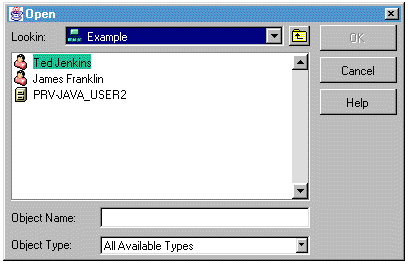
Object Entry Selector
Use the object entry selector when an object, path, or similar item must be selected. It provides navigation for all namespaces, based on the containment rules defined by the namespace. The item selector dialog box can be used as single-select or multiple-select.
Following are the requirements for the Object Entry Selector:
- Provide a caption that is consistent and indicative of the task.
Following is an example of an Item Selector dialog user interface.
Figure 2-3 Item Selector Dialog User Interface Example
2.4.11 Object Images and Icons
Fundamental to ConsoleOne is the representation of objects, network resources, and so forth. Good design principles should be used when designing icons or other graphical representations. Consider the services of a graphical designer when designing your icons or images.
Following are the guidelines for icons or images:
- Color should be used to enhance the image and not as a primary distinguishing element of the icon or image.
- Be consistent in the use of design elements, such as the light source, or the scale and orientation of the graphic.
- Use shape to distinguish between different icons.
- Avoid using text in the graphic unless it is an important element of the image.
- Use anti-aliasing where possible to improve the overall appearance of the image.
- Use no more than a 256-color palette.
- In general, large icons should be 32 by 32 pixels, small icons 16 by 16 pixels.
Consider the format of the ConsoleOne image as the foundation of your icon design.
- Use soft colors instead of bold or bright colors.
- Use isometric or perspective views of real objects instead of flat views.
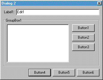
2.4.12 Dialog Box Layout and Design
The dialog box is a major user interface component through which many of the features of an application are presented. Through a consistent look and feel, the user is better able to interact and find closure with the dialog box. Labeling, button placement, juxtaposition of controls, and overall layout contribute to the usability of a dialog box.
Following are the guidelines for dialog box layout and design.
- Locate the primary interface element at the top and upper left of the dialog.
- Arrange the controls in order of importance and in related groups.
- Use left justification to align labels in vertical columns. Do not use right justification for labels.
- Balance the orientation of the buttons and other controls in order to maintain a visually pleasing layout.
- Short, wide dialogs tend to look and feel better than tall, narrow dialogs, as in the examples below.
Following are the preferred layouts for the major command buttons in dialogs within ConsoleOne.
- Orient the major command buttons in a vertical column (see Figure 8), or
- Orient the major command buttons across the bottom, right justified to the dialog (see Figure 9).
Figure 2-4 Layout 1
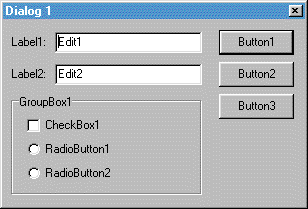
Figure 2-5 Layout 2
2.4.13 Layout Managers
Dialog box controls should follow a standardized layout. Although standardized layouts will not meet the needs of every dialog box, following good principles of design will provide for ease of use and predictable behaviors. Using a layout manager will improve the ability to maintain a standardized, predictable layout when resizing a dialog box.
2.4.14 Drag and Drop
ConsoleOne 1.0 does not support drag and drop capability. Drag and drop support will be implemented when the JDK provides support for drag and drop operations.
2.4.15 Providing Feedback to Users
Providing good feedback is a fundamental and important function of any user interface. ConsoleOne provides four standard message types that are used to provide critical information to the user:
Each of the message types includes the capability of linking to a help topic to further inform or educate the user, or clarify the message.
When using any of the four message types, make sure the message is complete by including the following:
- Include the source of the message, such as the module or program name, in the dialog caption.
- Include a statement in the body of the message about the condition, system status, or error that is clear to all possible readers (administrators, network users, and so forth).
When writing messages, do the following:
- Ensure that all messages make sense in English.
- Make the message simple.
- Create answers that make sense as English responses to questions.
- Create answers that are easily distinguishable from each other.
- Make sure the message is complete.
- Make sure the message contains all relevant information.
Informational Messages
Figure 2-6 Informational Message Dialog User Interface Example
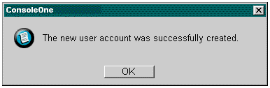
Use an Informational message to provide information resulting from commands or actions when no other notable feedback is provided. The message can only be acknowledged by selecting OK. A Help button can be included if necessary.
Buttons: OK, Help
See Also:
Warning Messages
Figure 2-7 Warning Message Dialog User Interface Example
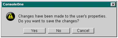
Use the warning message to alert users to conditions that require a decision from the user before proceeding when the task cannot be completed without user intervention, or to warn user that an impeding action can be destructive or irreversible.
Buttons: Yes, No, Cancel, Help
When writing a warning message, phrase the question so that a Yes or No answer is the most appropriate response.
See Also:
Error Messages
Figure 2-8 Error Message Dialog User Interface Example
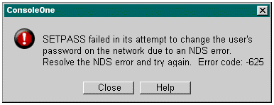
Use an error message to inform the user of serious system or application related conditions, causes, and solutions.
Buttons: Close, Help
Within the error message, make sure to communicate the following to the user:
- Status of the back-end system or application as a result of the error
- One or more possible causes for the error
- One or more possible actions the user can take to deal with the error
In some cases, this would be too much information to include in a message box. In these cases, provide as much information as possible, and then include the information in the Help topic linked to the message.
When writing an error message:
- Avoid placing the blame on the user, especially when the system is at fault.
- Avoid using the word error, particularly when it implies that the user has done something wrong.
If the message is generated due to an API error code being returned to the application, do the following:
- Include the error code number as part of the error message at the end of the message text, for example, "An internal application failure occurred. Error Code: code."
- Link the Help topic for the error code to the Help button.
See Also:
Question/Confirmation Messages
Figure 2-9 Confirmation Message Dialog User Interface Example
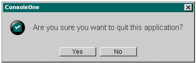
Use a confirmation message when a decision is required from the user and the decision is not related to any error or condition that would have an adverse affect on the system or application.
Buttons: Yes, No, Help