Tools Guide
Chapter 2 Page Designer
The Page Designer makes creating interactive Web pages quick and easy. It supports most HTML features, as well as selected browser-specific features.
This page describes the following about the Page Designer:
About the Page Designer 
The Page Designer makes creating interactive Web pages quick and easy. It supports most HTML features, as well as selected browser-specific features. You can create both static Web pages and pages that contain HTML forms. The HTML form page is useful for creating Internet applications because HTML forms allow users to perform complex business transactions without having to wait to download Java classes to their local machines.
Also, the Page Designer enables you to create Web pages that contain SilverStream forms and views. Web browsers can access SilverStream forms and views only if they are placed on a Web page.
The Page Designer includes the following features:
-
Full support of most HTML capabilities, including frames, tables, styles, graphics, numbered and bulleted lists and links.
-
Support for SilverStream forms and views.
-
A simple user interface that allows you to add tables, graphics, and other HTML elements simply by picking them from the toolbar and dropping them on the page.
-
Image map creation.
-
An easy to use Property Inspector that lets you select and edit properties for the components of your Web page.
Concepts you should know
The following are some basic concepts that you should know before you use the Page Designer.
Internet addresses
A Uniform Resource Locator (URL) is an address for locating a resource on the Internet. A URL has three parts:
-
The access protocol. For example, "http" (hypertext transfer protocol) and "ftp" (file transfer protocol) indicate that the resource is located on the Internet. If the protocol is "file", the resource is in a local file system, not on the Internet. The protocol is always followed by a colon, for example:
http:
-
The host information. The host information begins with a double slash ("//") if the file is an Internet application, such as ftp or http, otherwise, it begins with a single slash ("/"). Host information is itself divided into parts:
-
Host domain name (if the resource resides on the Internet. If the resource is a local file, there is no host name, just the file path).
-
User login name and password, if needed.
-
Port number, if needed. A port number follows the host name and a colon.
-
Access path. This path gives the final destination in the address. It is usually an .htm/html name or a reference within a .htm/html location.
Here are a few examples:
  ftp://javasoft.com/docs/JDK-1_apidocs.zip
  http://silverstream.com/products/whitepaper.html
  file:/home/nancy/docs/tutorial.html
  http://java.sun.com:80/doc/tutorial.html
Frames
Frames divide Web pages into multiple, scrollable regions. You use frames to present information in a more flexible and useful fashion. Each region or frame can:
-
Use an individual URL, so that it can load information independent of the other frames on the page.
-
Use an individual name so that you can target it through other URLs.
-
Resize dynamically if the user changes the window size. (You can also disable resizing, which ensures a constant frame size even if the user resizes the window.)
Frames are an enhancement to basic Web page design. Here are some examples of good uses for frames:
-
If a section of text should always be on-screen, for instance a copyright notice or a navigation bar, you can put the text in a static frame. This way when the user navigates the site in "live" frames, the contents of the static frame remain fixed, even though adjoining frames redraw.
-
You can build a table of contents (TOC) in a frame. One frame can contain TOC links that, when selected, display results in adjoining frames.
-
If you use frames in a side-by-side design, you can query in one frame and show the result right next to it in another. Some search engines use frames this way.
NOTE The SilverStream help system uses frames.
To learn more about creating and using frames, see
Creating framesets.
Image maps
You can use graphics as links to other Web pages, views, or forms by creating "hotspots" on an image and then mapping the hotspots to a URL. Images that link to other Web pages are referred to as image maps. Hotspots are selectable areas of a .GIF or .JPG file that you define.
To learn about creating an image map and using images in a page, see
Creating image maps.
Dynamic HTML versus dynamically generated HTML
SilverStream supports dynamically generated HTML by modeling an HTML page in server memory. Every element of a page, including the text and input controls, is modeled on the server by objects that have methods, properties, and events associated with them. You can set these object properties either visually, in the Page Designer, or programmatically, using the Programming Editor.
Dynamic HTML currently, is a browser-dependent form of HTML that enables you to dynamically modify displayed HTML at the browser level using JavaScript or VBScript. It uses the Dynamic HTML Object Model, which is an extension of the traditional static HTML document. When you use dynamic HTML, your documents have the ability to automatically tailor themselves to your needs.
Dynamically generated HTML and dynamic HTML fulfill two different purposes: Dynamic HTML is good for creating interactive browser user interfaces. Dynamically generated HTML provides a platform-neutral way of creating middle-tier applications. The SilverStream server supports both.
JavaBeans
JavaBeans are reusable. They are defined by an application programming interface (API) and the JavaBeans component model. This means that they can be used and reused in any application that supports the component model. For example, if you develop a JavaBean that calculates dates, anyone else can take your Calendar Bean and use it in any Java application using the JavaBean specification.
The JavaBean component model is not platform-specific and carries its own properties and methods. It also supports inheritance (the ability to borrow properties and methods from other Beans).
Page controls are JavaBeans
The controls that you can place on a page (button, choice control, file attachment control, and so on) are actually server-side JavaBeans that collectively produce HTML at runtime to form an entire page. This architecture is based on the Java Servlet model and allows for third-party controls to be placed on pages. The Page Designer allows you to add HTML-producing JavaBeans that behave like the other controls on the page. These JavaBeans can be modified using the SilverStream Property Inspector. Also, these JavaBeans can interact programmatically with other controls on the page.
Using this model, it is easy to create an HTML JavaBean that will work in the SilverStream environment, thereby extending the standard controls provided by SilverStream for use in dynamically generated HTML pages.
Subpages
Subpages allow you to reuse specified sets of page elements. All you have to do is select the subpage you want from the Page Designer gallery and drop it onto your page. Every time you update the subpage, every master page that references it is automatically updated as well.
Subpages are good places to store common page headers, navigation icons, and lists. You can also use subpages to display HTML content that is stored in a database.
NOTE You can either use controls or subpages on a master page. You cannot use both.
Containers
The Page Designer uses controls called containers to display data on a page. There are three container controls:
-
Text area controls
-
Layout control
-
Tab panel control
These controls determine what information appears on the page and how it looks. For example, you can use the Property Inspector to bind the text area controls to specific columns in a database. You can use the layout and tab panel controls to specify where information appears on the page.
The layout control creates a table that enables you to contain and align the controls you want to use on a page.
NOTE Once you place a control inside a layout area, you cannot then move to an area outside the layout area.
You can use the tab panel control as a conditional container. You can use it to insert applets and plug-ins within the HTML control.
Data views
You can use HTML data views to create master/detail pages in much the same way that you can use views within a form. The Page Designer data views contain headers, footers, bands, and subbands like the views you create using the SilverStream View Designer.
A data view looks like a table when you drop it onto a page. It contains cells that behave like table cells. You can drop data labels inside the data view cells to acts as tags. Use the Property Inspector to create links between data view cells and database table columns. You can also use the Property Inspector to create a Link clause between the table, the data view, and the page.
HTML support
The Page Designer supports most of the features of HTML. The Page Designer interface makes HTML tags invisible when you are constructing a page or a layout. This means that you do not have to be an HTML expert to design Web pages. Instead of inserting HTML tags to create formatting, you use the Page Designer toolbar buttons. These buttons supply the appropriate formatting on any marked text or at the appropriate cursor location. For example, if you want some text on your Web page to appear as bold, in HTML you would have to insert the tags for bold both before and after the text, as shown here:
<B>For Your Information</B>
With the Page Designer all you have to do is highlight the text and select the Bold button from the Page Designer toolbar.
The Page Designer supports the following HTML features:
HTML feature
|
Page Designer implementation
|
Description
|
|---|
Frames
|
From the File menu, select Create Frameset.
|
Frames are fully implemented.
|
Tables
|
Use the table icon in the Page Designer toolbar.
|
Tables are fully implemented.
|
Font Styles
|
Use the style toggle buttons located in the Page Designer toolbar.
|
By eliminating the need to use HTML tags, the Page Designer makes text formatting quick and easy.
|
Graphics
|
Use the Image button in the Page Designer toolbar.
|
Insert graphics from the specified location into your Web page. You must upload images that have been converted to .GIF or .JPG format.
|
Colors
|
Use the Property Inspector to select colors for the whole page, selected text, and paragraphs.
|
You can choose colors from the color chart.
|
Lists
|
Use the appropriate buttons in the Page Designer toolbar.
|
You can create bulleted and numbered lists.
|
Links
|
Use the Link button in the Page Designer toolbar.
|
You can create links to other Web pages containing views or forms.
|
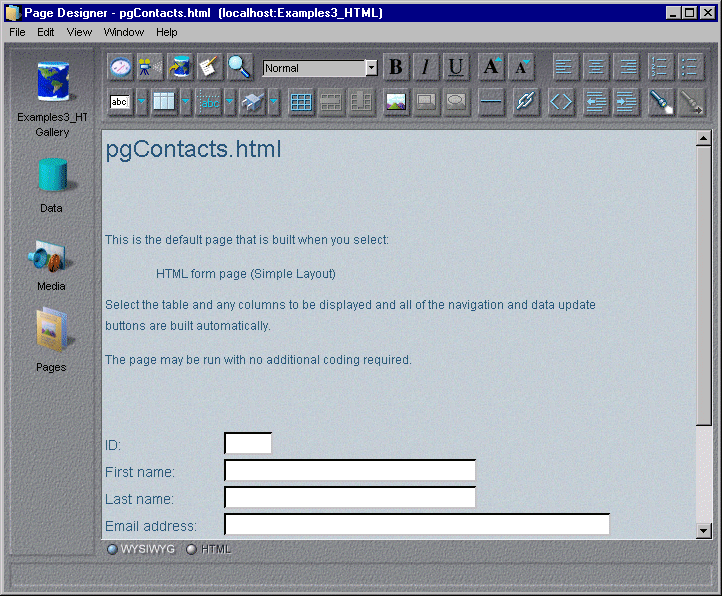
Using the Page Designer
Accessing the Page Designer
 To access the Page Designer from the SilverStream Designer:
-
Select the database where you want to store the Web page in the SilverStream Designer by choosing the Database icon.
-
Choose the Page icon from the left pane. A list of existing Web pages for that database appears in the right pane.
-
To create a new page, choose the New icon from the action gallery in the right pane. A pop-up menu appears. Select either New Page or New Frameset, depending on the type of page you want to create.
-
To edit an existing page, highlight the page name in the right pane of the SilverStream Designer and either double-click it or choose the Designer action icon.
The SilverStream Page Designer makes the creation of Web pages easy by providing toolbar buttons to generate HTML.
Using the Page Designer toolbar
The Page Designer enables you to apply formatting to text in the same way that standard word processing packages do. Simply type in text, highlight it, and select the appropriate formatting button from the toolbar. Using the toolbar buttons takes the place of inserting HTML tags into the text. For example, if you were coding raw HTML and wanted a word bolded, you would have to enter:
<B>WARNING</B>
To bold text in the Page Designer, all you have to do is highlight the text and select the Bold button.
Use the toolbar buttons to:
-
Align text on the page
-
Create tables
-
Search for strings
-
Create bulleted and numbered lists
-
Insert graphics
-
Create links
Page Designer keyboard shortcuts
Use these keyboard shortcuts:
Keystroke
|
Description
|
|---|
Ctrl+S
|
Save
|
Ctrl+Z
|
Undo
|
Ctrl+Y
|
Redo
|
Ctrl+X
|
Cut
|
Ctrl+C
|
Copy
|
Ctrl+V
|
Paste
|
Ctrl+G
|
Goto line number
|
Ctrl+F
|
Find/Replace
|
Ctrl+Spacebar
|
Turns off all styles including the link.
|
Shift+Newline
|
A <br>.
|
F1
|
Help
|
F3
|
Find again
|
F4
|
Property Inspector
|
F5
|
Run (test) page
|
F7
|
Invoke Programming Editor
|
Creating pages
Creating static HTML pages
Create a static page when you do not want to bind the page or any of the controls on the page to a database table or DSO.
To create a static HTML page using the New Page Wizard:
-
Select New Page in the SilverStream Designer to access the New Page Wizard.
The first New Page Wizard screen appears.
-
Select Static Page to create a static HTML page that can contain Java components (such as forms and views) as well as subpages.
-
Press Next.
A screen appears prompting you to enter a name for your page.
-
Enter the page name and press Finish to access your page in the Page Designer. From here, you can add controls, Java forms and views, and subpages to your page.
Creating dynamic HTML pages
To create a dynamically generated HTML form page using the New Page Wizard:
-
Choose one of the following from the first New Page Wizard screen:
Choice
|
Description
|
|---|
HTML form page (simple layout)
|
Lets you create a simple data-bound HTML page where you can insert controls as part of the text flow.
|
HTML form page (table layout)
|
Lets you create a data-bound HTML page that uses a table layout for aligning controls and buttons.
|
HTML form page (absolute positioning)
|
Lets you create a data-bound HTML page that uses snap-to-grid mode to align controls on the form page.
NOTE Absolute positioning does not support overlapping of controls. This means that you have to be careful when you place controls on the form. It is important to keep in mind that absolute positioning is only an approximation. Different browsers may use different default fonts or may size controls differently.
|
-
Press Next.
A list of tables and data source business objects (DSOs) contained in the current database appears. Choose a table or a DSO to provide the primary data for the form page.
NOTE For more information, see the chapter on DSOs in the Programmer's Guide.
-
Press Next.
The relational data palette appears. It contains a list of the columns contained in the primary table or a list of columns in the DSO.
If you select a table, the relational data palette also lists tables that are related to the primary table (relationships are defined in the Relationship Designer; for more information, see the
Relationship Designer). If you pick fields from related tables, the fields will appear in a data view. For more information, see
Using data views.
-
Choose the fields that you want to include in your form page.
-
Press Next. Select your form page style.
-
Enter the form page name and press Finish.
The form page appears in the Page Designer.
What happens
SilverStream generates a page with fields corresponding to the data you specified. Also, depending on the style you chose, SilverStream adds buttons to the page, allowing users to navigate through the data and update the data (if the data source is updatable).
If you chose a DSO as the primary data source, SilverStream also adds an AgpData control to the page. The AgpData control specifies which DSO the page loads data from.
Refining the query
By default, all rows will be retrieved from the database and sent to the client. If you have large tables, you will want to specify a query that restricts which rows are retrieved. For more information, see
Building queries.
Creating framesets
The Page Designer makes creating framesets fast and easy.
For a description of frame pages, see
Frames.
To create a frameset:
-
Choose the Pages icon from the left pane of the SilverStream Designer and click on the New action icon in the Action Gallery.
A popup menu appears.
-
Choose New FrameSet from the pop-up menu.
The first New Frameset Wizard screen appears.
-
Choose the type of frame page that you want to create and press Next.
The second Frameset Wizard screen appears.
-
Choose the URLs for the pages that you want to appear in the frame page. You can either enter the URLs directly or click on the ellipses in each field to access the Page URL dialog box. You can choose pages from one of your SilverStream databases, your local drive, or the Internet.
The dialog box changes depending on the location you specify.
-
Press OK when you finish selecting your pages.
The URLs appear in the Frameset Wizard screen.
-
Press Next. Enter a name for your frame page and press Finish.
The frame page appears in the Page Designer.
Changing text colors
To specify colors for the background of your Web page, the text, and active or visited links:
-
Select the Property Inspector button from the Page Designer toolbar.
-
Select the Page tab.
-
Select Background and colors to specify a background color for your Web page. Select the down arrow in the Background choice box to choose a color from the color palette. You can also select an image to serve as the background for your Web page by clicking on the ellipses next to the Image box.
-
Select the down arrow that appears next to the Text box to set the color for text.
-
Optionally, select the down arrow that appears next to the Link, Active Link, and Visited Link boxes to set the colors for links, active links, and visited links on the page. When you return to the Page Designer, the colors you selected appear on your page.
Implementing interfaces on a page
To implement an interface on a page:
-
Open the Programming Editor.
-
Choose Java Interfaces from the File menu.
-
Click the Add button.
-
Select the interface you want to implement in the Enter Interface Name choice box.
-
If you want SilverStream to create a stub for the interface methods, select the Create Stubs for Method Interfaces checkbox.
-
Click OK to close the Add Interface dialog box.
-
Click OK to close the Java Interfaces dialog box.
-
In the Programming Editor, code the implementation for each method associated with the interface.
If you select the Create Stubs for Method Interfaces checkbox on the Add Interface dialog box, SilverStream adds each interface method to the list of methods in the General section for the page in the Programming Editor. If you do not select the Create Stubs for Method Interfaces checkbox, you need to define the method in the User Code block in the General section for the page.
Specifying URLs for a page
A page you create in SilverStream can serve an arbitrary set of URLs. Therefore a single page can satisfy multiple URL requests. To specify the URLs associated with a page:
-
Open the Property Inspector for the page.
-
Click the URLs button on the Page tab.
-
For each URL, click the Add button, type a relative URL, and click OK.
Each URL you specify is relative to http://server/database, not http://server/database/SilverStream/Pages, as is the case with the default URL for a SilverStream page.
-
When you've finished adding URLs, click OK.
NOTE When you specify one or more URLs for a page explicitly, the default URL for the page will no longer work.
Displaying your page in a browser
When you have finished designing your Web page, select the Test button from the Page Designer toolbar to launch a browser and see what the finished page looks like. The test button activates run mode. Once the page is loaded, you can test any links, image maps, forms, or views that you have included.
Using the Component Gallery and the Component Palette
The Page Designer provides two facilities for adding components to a page:
-
Component Gallery
-
Component Palette
The Component Gallery, which appears on the left side of the Page Designer, lets you add components from the Relational Data Palette, the Media Store, and the Pages gallery. The list of available components is determined by the currently selected database. You can hide the Component Gallery to increase the amount of space available for displaying your page.
The Component Palette is an alternative to the Component Gallery that uses less screen space. When the Component Gallery is hidden, you can use the Component Palette to add components to a page. The Component Palette gives you access to all of the items in the Component Gallery, except the Relational Data Palette, which you can display separately.
NOTE To display the Relational Data Palette, select View>Relational Data Palette.
To use the Component Gallery:
-
If the Component Gallery is not visible, select View>Show Component Gallery to display it.
NOTE You can hide the Component Gallery by selecting View>Hide Component Gallery.
-
Select the database you want to work with by clicking the Database icon in the top left corner of the Component Gallery.
A list of resources in your current database appears.
-
To add data-bound fields from the Relational Data Palette:
-
Select the Data icon from the Component Gallery.
-
Select the table you want to work with in the dropdown list box at the top of the palette.
-
Select a database column by double-clicking it or by dragging it to the surface of the page. SilverStream adds a field to the page that is bound to the selected column.
-
To add items from the Media Store:
-
Select the Media Store icon from the Component Gallery. You can choose from General, Images, JavaBeans, and Sounds.
-
Select the plus sign that appears next to each of these items to see a list of available resources.
-
Select an item by double-clicking it or by dragging it to the surface of the page. You can add or delete Media Store objects from the SilverStream Designer.
-
To add a subpage:
-
Select the Pages icon from the Component Gallery. A list of pages in your current database appears.
-
Select a page by double-clicking it or by dragging it to the surface of the page. SilverStream adds the selected page as a subpage.
To use the Component Palette:
-
If the Component Palette is not visible, select View>Component Palette to display it.
-
Select the database you want to work with by selecting it in the dropdown list box at the top of the palette.
A list of resources in your current database appears.
-
To add items from the Media Store:
-
Select the plus sign that appears next to the EJB Jars & Media branch in the Component Palette. You can choose from General, Images, JavaBeans, and Sounds.
-
Select the plus sign that appears next to each of these items to see a list of available resources.
-
Select an item by double-clicking it or by dragging it to the surface of the page. You can add or delete Media Store objects from the SilverStream Designer.
-
To add a subpage:
-
Select the plus sign that appears next to the Pages branch in the Component Palette. A list of pages in your current database appears.
-
Select a page by double-clicking it or by dragging it to the surface of the page. SilverStream adds the selected page as a subpage.
Including controls on your page
This section contains the following information:
Using text fields
The Page Designer lets you add Text Field controls to your pages. Text Field controls are instances of the AgpTextField class.
To add a Text Field control:
-
Select the Text Field button from the Page Designer toolbar.
The control appears on the page.
-
Select the Property Inspector button from the Form Designer toolbar to specify properties for the field. For example, you can specify the background color, the font style, and size.
Specifying data typing and formatting for text fields
SilverStream allows you to assign a data type to and format the display of text field controls on a page. You can specify these characteristics of a text field at design time in the Property Inspector or programmatically at run time.
NOTE Text fields on pages you create in SilverStream can also specify the HTML type attribute. Do not confuse the data type of a field with the HTML type for the field. The HTML type attribute allows you to indicate whether the field is Text, Hidden, or Password. To specify the type attribute for a text field, you select one of these options in the Type control in the Property Inspector.
Text fields in a page can have the following data types:
- String
- Integer
- Double
- BigDecimal
- Date
- Time
- Timestamp
At design time, you specify the data type for a text field in the Data Type control in the Property Inspector.
You can specify display formatting for all data types except String. To tell SilverStream how to format a text field, you can select from a predefined set of named display styles or create your own display pattern. At design time, you specify display formatting for a text field in the Display Format control in the Property Inspector.
Using links
You can make words or phrases in your page act as links to Web pages. Either use the Link button from the Page Designer toolbar or specify the target page using the Property Inspector.
To create text links:
-
Highlight the text that you want to use as the link.
-
Select the Create Link button from the Page Designer toolbar.
The Insert Link dialog box appears.
-
Specify the location of the page you want to link to by selecting Database, File, or URL.
-
If you select Database, a list of Web pages that reside in your current database appears.
-
If you select File or URL, the dialog box prompts you to enter the pathname or Internet address.
-
Select OK. The text you highlighted appears in the page's link color. You can choose the colors for text, active links, and visited links by selecting the Page tab from the Property Inspector.
You can also use the Property Inspector to make a word or phrase act as a link. Select the text and bring up the Property Inspector. The Link and Frame fields at the bottom of the Text property sheet let you specify the target page and frame for this link.
Using images
The Page Designer allows you to add images to your page. It accepts images in Web-compatible formats such as GIF and JPEG. It does not automatically convert bitmaps or graphics created using other graphics packages (such as PowerPoint or Visio) into Web-compatible formats. You have to do this yourself.
To include an image in the Web page:
-
Select the Insert Image button from the Page Designer toolbar. The Insert Image dialog box appears.
-
Specify the location of the image file by selecting Database, File, or URL.
A list of available images appears in the list box on the left side of the dialog box. When you select an image from the list, a preview of the image appears in the Preview field.
-
Select OK. The image appears on your page.
Creating image maps
Image maps are .GIF or .JPG files that contain links to other Web pages. You create an image map by selecting parts of the graphic and specifying the URL that you want it to link to.
For a more detailed description of image maps, see
Image maps
To create an image map:
-
Place an image on your page and click on it.
-
Select either the oval hotspot or the rectangular hotspot button from the Page Designer toolbar.
A hotspot outline appears at the top left hand side of the image.
-
Drag and resize the hotspot frame so that it surrounds the part of your image that you want to include in the hotspot.
-
To specify the target link for this hotspot, open the Property Inspector and select the ellipses that appear next to the Hotlink field.
The Edit Property dialog box appears.
-
Specify the location of the file or page that you are creating the link for by selecting Database, File, or URL.
-
If you select Database, a list of Web pages stored in your current database appears.
-
If you select File or URL, you are prompted to enter a pathname or Internet address.
-
Select OK.
You return to the Page Designer.
You can test your new image map by selecting the Test button from the toolbar. SilverStream displays your page in a browser.
Using Tab Panel controls
The tab panel control is a container control that allows different panes of information to appear interactively. You can place any other control on a tab panel, including data views and layout regions. You can also incorporate a tab panel control into a Layout Region.
To add a tab panel control:
-
Select the Tab Panel icon from the Page Designer toolbar by selecting the down arrow next to the layout region icon.
The tab panel appears on your page.
-
Click on the tab to add controls or HTML to the pane. Double-click on the tab to add images to the tab itself.
-
Open the Property Inspector either by selecting the Property Inspector icon from the toolbar or, by selecting the tab panel on the page.
To specify attributes for the Tab Panel control:
-
Enter a name for the control in the Name field. This name also acts as the property ID. To use client-side JavaScript and style sheets you only need to name the control if you do not plan to use these features.
-
Select the Programmable checkbox if you are going to make the region programmable to the server at runtime. Making the page programmable allows you to modify page properties dynamically.
-
Select the show tab in runtime if you want that particular pane to appear when you view the page at runtime. If you want to use the tab pane as a switch to show different content at runtime, deselect the checkbox.
You can also switch to a different tab programmatically by giving the control a name, selecting the Programmable checkbox in the Property Inspector, then selecting the Programming Editor icon from the Page Designer toolbar. The name you give the control appears in the Programming Editor. Invoke setCurrentPane() and then write code to switch to different panes in the control.
-
Specify the appearance and layout of the tabs by entering values in the Layout field. You can specify tab alignment, size (Padding), and spacing.
-
Specify the control's dimensions in the Minimum Dimension field by entering values in the Width and Height fields. You can choose to express the width in either pixels or as a percentage. If you specify a percentage, the size of the control will vary depending on the size of the browser window. You can only express the height in pixels.
-
Specify the background color for the tab control in the Background field by selecting the down arrow in the Color field. The Color palette appears. Deselect Transparent.
You can use an image instead of a background color. When you select the ellipses in the Image field, the Image Picker dialog box appears. This dialog box lists the image files stored in the current database. Select an image from the list click on OK.
-
Specify a color or image for the inactive tabs on the control by making selections in the Inactive Background field.
-
Specify the size and color of the tab control borders in the Borders field.
-
Select the Extended Attributes button in the Advanced field to further define the tab control by adding HTML tags in the dialog box that appears.
Using HTML Edit controls
The HTML Edit control lets you embed HTML pages stored in your database into your dynamic HTML page. The most common use is to display HTML data created using the Form Designer's HTML Edit control. You can bind data to the HTML Edit control. The HTML Edit control acts like a dynamic subpage: it processes the HTML in the same way that a page does which means that you can have interactive elements within the control. You can also dynamically change the properties of the elements contained in the control.
You can only display the data contained in the HTML Edit Control; you cannot edit the data as you can with the Form Designer's HTML Edit control.
NOTE The data inside the HTML Edit control must be formatted correctly. If any illegal HTML syntax contains the data displayed in the control the HTML will not process successfully at runtime.
To place an HTML Edit control on your page:
-
Place your cursor at the spot on your page where you want to position the HTML Edit control.
-
Select the HTML Edit Control icon from the Page Designer toolbar by clicking on the down arrow next to the Text Field icon. The control appears on the page.
-
Right click on the control. A pop-up menu appears.
-
Select Properties to open the Property Inspector.
-
Select the HTML Control property sheet.
-
Enter a name for the control in the Name field.
-
Size the control by entering values in the Width and Height fields.
-
Specify a value that will appear in the edit control at runtime in the Value field.
-
Click on the ellipses in the Database Column field to access the Relational Data palette and bind the control to a table column containing HTML data.
-
Select the Enable HTML Generation checkbox to ensure that the control processes HTML in the same way that a page does.
-
Select the Process value as a complete HTML page to ensure that the control processes the value you specified as an HTML page.
-
Select the Embed HTML in a table checkbox to display your data in a table for alignment.
Using data views
The Page Designer lets you create data views. Data views are similar to the views you create using the View Designer, that Page Designer data views present data in the form of an HTML table. You can bind them to table data using data tags.
To create a data view using the New Page Wizard:
-
Select the Page icon in the left pane of the SilverStream Designer and then select the New action icon from the Action gallery. A pop-up menu appears.
-
Choose New Page. The first New Page Wizard screen appears.
-
Choose HTML form page (table layout) to create a data view and then press Next.
The next New Page Wizard screen appears.
-
Select the primary table for your data view from the list of tables contained in the current database. Press Next.
The next New Page Wizard screen appears.
-
Select the table columns that you want to use in your view. Press Next.
NOTE In order to create a data view on your form page, you must also select columns from a table that is related to your primary table in a one-to-many relationship.The next New Page Wizard screen appears.
-
Select the style for your view and press Next.
The next New Page Wizard screen appears.
-
Specify the initial behavior of the page and press Next.
The next New Page Wizard screen appears.
-
Enter a name for your data view page and press Finish.
The new page containing the data view appears in the Page Designer.
To create a data view manually:
-
Select the Data View icon from the Page Designer toolbar.
A table grid appears on your page. It consists of two rows containing three cells each. The first row is called the Header row. Its purpose is to show the header labels for the column. The second row is called the repeating or data row. This is where your data appears.
-
To add cells to the view:
-
Position your cursor in one of the data view cells. Select the Data Tag icon from the Page Designer toolbar.
A data tag (label) appears in the cell you selected.
You can use data tags as column headers or you can use them to bind data from a table to the view.
-
Choose the Show Properties icon or right-click on the data tag to access the Property Inspector.
The Label properties sheet appears.
When you enter a name for the data tag in the Name field, that name automatically appears in the data view.
-
Select the ellipses in the Expression field to access the Expression Builder. The primary table columns appear in the Variables pane. Select the column to bind to the data tag and press OK. You can also combine columns and their variables to create an expression.
-
Select the Test icon from the Page Designer toolbar to test the data view.
Unlike Views created in the View Designer, Page Designer views do not support the creation of hierarchical views. You can create a hierarchical effect, however, by arranging data views on multiple Web pages or, by adding them to frame pages.
To modify data view attributes:
-
Open the Property Inspector for the data view by right clicking on the view.
A popup menu appears.
-
Select Properties from the menu. The Property Inspector appears.
-
Select the Data View property sheet.
-
Enter a name for the data view in the Name field.
-
Select the Data field to change the data options for the view. Use the down arrow in the Table Name field to display a list of tables contained in the current database. Select one to use as the primary table for your view.
Select the ellipses in the Link clause field to access the Expression Builder and create a clause linking the data view with data displayed by another control on the page.
For more information, see
Creating a Link clause.
You can limit the rows returned by the query by selecting the Limit Number of Returned Rows checkbox. You can specify the number of rows to return by specifying a value in the Maximum Rows box.
-
Select the Distinct checkbox to eliminate table rows that contain duplicate values from your result set.
-
Select the Limit Number of Returned Rows checkbox to limit the rows returned by the query. You can specify the number of rows to return by specifying a value in the Maximum Rows box.
-
Select the Automatic Query checkbox to fill the view with data whenever the page is shown. If you do not select this checkbox, data will not appear automatically. You will have to create a query using Java code in the Programming Editor.
-
Select Order By to specify the order in which you want the result set values to appear.
-
Select Display Options to specify how you want your data view to appear. The Limit Rows Per Page checkbox is selected by default. To remove this limitation, deselect the checkbox. You can change the number of rows that appear at one time in the view by specifying a value in the Rows box. The default number is 10.
-
Select Layout to specify how the data view should look. You can specify the view's alignment and enter values in the cell padding and cell spacing fields.
-
Select the Minimum dimension field options to specify the width of the data view. You can specify the width either in pixels or as a percentage.
-
Change the widths of the data view columns by selecting the Minimum column widths field. Specify the column to be changed by selecting a number from the Column spinbox. Select the Specify Width checkbox and select a value from the Width spinbox. You can also specify whether the width is measured in pixels or as a percentage.
-
Specify a background color or image by selecting options in the Background field. When you select the down arrow in the Color field, the Color palette appears. When you select the ellipses in the Image field, the Image Picker dialog box appears. Deselect transparent, otherwise the colors or image you selected won't appear.
-
Specify the size and color of the data view borders by selecting options from the Borders field.
-
Select the Extended Attributes button in the Advanced field to further tailor your data view by entering HTML tags in the dialog box that appears.
Creating a Link clause
When you drop a data view on a data-bound form page, you can link the data in the view.
To link data to the view:
-
Select the data view and open the Property Inspector.
-
Select the Data View property sheet.
-
Specify the primary table for the data view by selecting the down arrow in the Table name field.
A list of tables contained in the current database appears.
-
Select the ellipses in the Link clause field.
The Expression Builder appears.
-
Select a column from the data view by double-clicking on it in the Variables pane.
It appears in the bottom pane of the Expression Builder.
-
Select the equals (=) sign relational operator from the Operators pane.
-
Select a column from the form's primary table by double-clicking on it in the Variables pane.
The following example shows a Link clause connecting the foreign key of the Employees table to the primary key in the Departments table.
employees.departmentid = departments.departmentid
-
Press OK.
You return to the Property Inspector where the Link clause you just created appears.
Creating a Link expression
Link expressions let you pass query information and parameters from one page to another. They are most commonly used with data tags to create master/detail data views. For example, if you created a data view that displayed employee names, you could use one of the data tags to create a Link expression that enables a user to view detailed information for a specific employee simply by clicking on the employee name.
To create a link expression:
-
Select the data tag in your data view that you want to use to contain the Link expression and open the Property Inspector.
-
Select the Label property sheet.
-
Click on the down arrow in the Type field and select Expression Link from the dropdown list that appears.
-
In the URL Expression field enter the name of the page to which you want the data tag to pass the query.
NOTE Be sure to surround the page name with double quotes ("), otherwise your query will not work.
-
Enter the target frame for the query in the Target Expression field.
-
Expand the Parameters option list and select Add New Parameter.
The Name and Expression fields appear.
-
To create a query, specify query in the Name field. This tells SilverStream what kind of parameter you are creating. If you wanted a value to be passed between pages, you would enter Param1 in this field.
-
Click on the ellipses in the Expression field to access the Expression Builder and build your query.
For example, if you wanted to create a query that displayed detailed information about an employee, your query might look like this:
"Employees.Name='"+Employees.Name+"'"
Using forms and views
Forms and views created using SilverStream must be embedded in a Web page if they are to run in a browser.
NOTE Including forms and views in pages is not supported in SilverStream Version 3.0 due to limitations of the Sun Java 1.2 browser plug-in. We hope to re-enable this support in SilverStream in the future. See the release notes for updated information.
To include forms and views in your page:
-
Select the Form or View icon from the Page Designer gallery.
A list of the forms or views in your current database appears.
-
Select one by clicking on it. It will be inserted into your Web page at the current cursor location.
Using file attachments
The file attachment control lets you use your browser to upload a file to your page.
To place a file attachment control on a page:
-
Select the File Attachment icon from the Page Designer toolbar.
A text box and a Browse button appear.
-
Open the Property Inspector for the file attachment control and select the File property sheet. You can set the following parameters for the control:
-
Name. You can enter a name for your control. This name is used to access the control programmatically using Java code.
-
Maximum path length. Enter the maximum number of characters that the text box will accept.
-
Size. Specify the width in characters of the text box as it appears on the form page. This becomes the value of the Size attribute in the generated HTML.
-
Check the Generate HTML check box if you want the control to be visible at runtime.
-
Close the Property Inspector when you have finished specifying information.
You return to the page.
When you submit the page, three pieces of information are submitted to the attachment control:
-
The original pathname of the file you are uploading
-
The file type (for example a MIME-type string)
-
The file contents as an array of bytes
NOTE If you select a file from a database, you must preserve the file's MIME-type and its contents.
Using subpages
You can embed a Web page within another Web page to create master/detail pages in the same way that you embed views and forms on a page.
To use subpages:
-
Select the Pages icon from the Component Gallery on the left side of the Page Designer.
A list of pages contained in the current database appears.
-
Click on a page in the list to embed it in your current page. A bar appears on the master page.
-
Select the Show Properties icon from the Page Designer toolbar or right-click on the subpage to access the Property Inspector. The Subpage property sheet appears. You can use the Property Inspector to set the properties of the subpage.
Using layout regions
The Layout region control enables you to create a layout area on your page for other controls. Using a layout region enables you to create an absolute positioning area on your page. You can create multiple layout regions on the same page.
NOTE Once you place a control inside a layout area, you cannot drag it to an area outside the layout control.
To create an absolute positioning area:
-
Select the Layout Region control from the Page Designer toolbar. The cursor changes to a blinking or "shadow" cursor.
-
Size the control by clicking on its outline and dragging the cursor until the layout area is the size you want. You can also size the control by right clicking on the layout area and selecting Properties from the pop-up menu that appears.
-
Place other controls such as data views, text input fields, and buttons inside the layout area. You can do this by placing your cursor in the layout region where you want the control to appear and then selecting the control from the Page Designer toolbar. Use the same method for entering text. Place your cursor in the layout region and begin typing.
To modify the layout region settings:
-
Right click on the layout region.
A popup menu appears.
-
Select Properties from the popup menu.
The Property Inspector appears.
-
Select the Region property sheet from the Property Inspector.
-
Enter a name for the control in the Name field. This name also acts as the property ID. It enables you to use client-side JavaScript and style sheets.
-
Select the Programmable checkbox if you are going to make the region programmable to the server at runtime. This means that you can modify the page properties dynamically using Java code that runs on the server.
-
Select the Show grid checkbox to have the grid appear in the layout area. You can specify the size of the grid by selecting a value from the Size spinbox.
-
Select the Snap to Grid checkbox to align controls in the layout area according to the grid pattern.
-
Specify the minimum dimensions of the layout area by entering values in the Width and Height fields. When you enter a value in the Width field, you can specify that the value be measured in either pixels or as a percentage of the browser window size. If you specify pixels, the width of the control may vary according to the type of browser you use. You can only express the height in pixels.
-
Specify whether you want a color or an image as the background to the page in the Background: field.
-
Select the Advanced button to use HTML tags to further define your layout region.
Using custom page controls
Custom page controls are JavaBeans that implement one or more SilverStream-defined interfaces. Before you can use custom page controls to extend the Page Designer's capabilities, you must package the controls in a JAR file and upload the JAR file to the SilverStream server.
 For more information about this procedure, see
Importing JavaBeans into your database.
For more information about this procedure, see
Importing JavaBeans into your database.
Once you have uploaded the JAR file, you can use the custom controls on your page.
To use custom controls:
-
Place your cursor on the page in the Page Designer where you want to put your custom control.
-
Select the Media store icon from the left margin of the Page Designer. A list of items contained in the Media store appears.
-
Select JavaBeans.
A list appears that shows all of the page control JavaBeans contained in all of the JAR files installed on your current server.
-
Drop a JavaBean on your page by clicking on it. Once you have dropped the JavaBean onto your page, you can open the Property Inspector to look at or modify its properties, or you can access the Programming Editor to write code for it.
NOTE You can create your own page controls using the Business Object Designer.
Using plug-ins
You can use plug-ins to enhance your page design. Plug-ins are usually used to specify viewers for special media types. For example the Shockwave and Real-Audio players are usually available as plug-ins. Most plug-ins must be installed separately. The most common method for doing this is to provide a text link from your page to the plug-in so that people visiting your site can click on the link and download it from there. Put the media that the plug-in uses in the Media Store. You can specify the media's location in the Property Inspector.
To include a plug-in in a page:
-
Select the Plug-In icon from the Page Designer toolbar and place it on the page. A blank square appears.
-
Select the square and press your right mouse button. A pop-up menu appears.
-
Select Properties to access the Property Inspector for the control.
-
Select the Plug-in property sheet.
-
Enter a name for the plug-in in the Name field.
-
Select the Programmable checkbox if you plan to pass parameters dynamically to the control.
-
Enter the URL for the plug-in (if it has one) in the Source field.
-
Specify where and how the plug-in appears in the control by specifying its size, width, and height.
Using Java applets
Java applets are elements that you can embed on a page. They provide graphical and interactive enhancements to your page design. Before you can use an applet on a page in the Page Designer, you must first upload the applet files to the SilverStream media store. You can make your applet programmable at runtime, allows you to pass parameters to the applet. You can also use JavaScript to access the applet.
To add a Java applet to a page:
-
Select the down arrow next to the Plug-in icon in the Page Designer toolbar. A dropdown list of icons appears.
-
Select the Applet icon from the list.
A blank square appears.
-
Right click on the square.
A popup menu appears.
-
Select Properties from this menu.
The Property Inspector appears.
-
Select the Applet property sheet.
-
Enter a name for the applet in the Name field.
-
Select the Programmable checkbox if you are planning to pass parameters to the applet programmatically.
-
Enter the name of the class that the applet is derived from in the Class field. For example:
myapplet.class.
-
In the Code Base field, specify an URL that specifies the location of the applet file that you uploaded using the Media Upload feature.
For example:
http://myserver:8181/myoracledb/SilverStream/Objectstore/General/
-
Specify where and how you want the applet to appear by entering information in the Layout and Size fields. You can use either pixels or a percentage as the standard of measurement. Use pixels when you want your size information to be absolute regardless of the type of browser you are using. When you specify a percentage, the size of the control changes, depending on the type of browser you are using.
NOTE Once you insert your applet into a page, you may have to use the Edit HTML pop-up dialog to set up its parameters. For more information, see your applet provider's documentation.
Using ActiveX controls
ActiveX objects are platform-dependent, compiled binaries that work like Java applets. They are usually available in CAB files. Before you can use ActiveX objects as part of a page, you have to upload them to the SilverStream Media Store. You can make your ActiveX programmable to the server at runtime which allows you to pass parameters to the ActiveX elements programmatically. You can also access them using JavaScript.
To add an ActiveX control to your page:
-
Select the down arrow next to the Plug-in icon in the HTML Edit control toolbar.
A dropdown list of icons appears.
-
Select the ActiveX icon.
A blank square appears.
-
Right click on the square.
A popup menu appears.
-
Select Properties from the menu.
The Property Inspector appears.
-
Select the ActiveX property sheet.
-
Enter a name for the ActiveX control in the Name field.
-
Select the Programmable checkbox if you are planning to pass parameters to the control dynamically.
-
Enter the name of the class that the control is derived from in the Class field.
-
Specify the file's location in the Code Base field. You must also specify a class ID. Consult your ActiveX provider for more information.
-
Specify where and how you want the control to appear by entering information in the Layout and Size fields. You can choose to enter this information using either pixels or a percentage as the standard of measurement. Use pixels when you want your size information to be absolute, regardless of the type of browser you are using. When you specify a percentage, the size of the control changes, depending on the type of browser you are using.
NOTE Once you insert your ActiveX control into a page, you may have to use the Edit HTML pop-up dialog to set up its parameters. For more information, see your ActiveX documentation.
Creating validation rules for page fields
There are several ways to validate data entered by the user in a page before accepting the input:
-
Use JavaScript to provide immediate feedback to the user
-
Use the validationTest and validationFailed events, which occur after the user submits the page
-
Define a validation rule in the Expression Builder
The first two techniques involve coding and are described in the Programmer's Guide. Using the Expression Builder is described next.
For more information about the Expression Builder, see
Expression Builder.
To create a validation rule:
-
Select a field corresponding to a table column on your page.
-
Select the Property Inspector by either pressing the right mouse button or selecting the button from the toolbar.
-
Select the Field property tab.
-
Select the plus sign that appears next to Validation rules to expand the section.
-
Select Add New Rule. The Rule1 box appears.
-
Select the ellipses that appear next to this box. The Expression Builder appears.
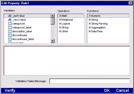
-
Use the Expression Builder functions and operators to create a data validation rule for the field.
Use the special value _newValue to refer to the value that the user just entered; use the special value _lastValue to refer to the previous value in the form.
For example, if you want to prevent someone from entering a value less than zero in a field, specify the following validation rule for the field:
_newValue >= 0
Validation expressions can also refer to other fields in the form. The Expression Builder shows other fields in the form with this icon:  . For example, if you want to make sure that the date a user enters in the shipDate field is later than the value entered in orderDate, specify this rule for the shipDate field:
_newValue > orderdate
You can also refer to values in the database for the current row by selecting database columns, which are listed last in the Variables pane. The primary table is listed at the top level in the Variables pane. Click + to expand the display to list all columns. Also, any tables related to the primary table are listed. You can pick columns from these tables to include in your validation rule.
For more information about relationships between tables, see
Relationship Designer.
-
In the Validation Failed Message box, enter a message that is displayed when the user enters invalid data.
-
Select Verify to test your expression when you finish building it. If there is a syntax error, a message box appears.
-
Select OK to save your expression (if it is correct) and return to the Page Designer.
What happens
This type of page validation is processed on the server, not in the browser. When the user submits the page (for example, by clicking a Save button), the validation rule is evaluated on the server. If the new entry doesn't pass validation, the value will not be stored in the database.
Programmatic validation checking
You can perform sophisticated validation testing, notification, and processing by writing code in validation-related events. For information, see the Programmer's Guide.
Working directly with HTML
The Page Designer supports two editing modes: WYSIWYG and HTML. You can switch from one to the other at any time by selecting either the WYSIWYG or HTML radio button at the bottom of the Page Designer window.
HTML editing mode is useful when you want to access HTML tags or the attributes in the tags that are not exposed when you are in WYSIWYG mode. HTML editing mode gives you access to a page's underlying HTML code. You cannot use it to change the properties page control or to edit Java code.
When you switch from HTML to WYSIWYG mode, the changes you made while in HTML mode are preserved. If you use HTML tags that are unfamiliar to the Page Designer, they are ignored when you switch to WYSIWYG mode. They appear on your page as tag objects.
Inserting raw HTML
You can enter HTML tags and insert them into your Web page.
To insert HTML tags at a particular place in the page:
-
Place your cursor in the area of your Web page where you want to insert the HTML tags.
-
Select Insert Raw HTML from the Edit menu.
The Raw HTML window appears.
-
Enter the HTML tags in this window. Select OK.
An icon appears on your page. Double-click on it to see or to edit the code. When you save the page to your database and then reopen the page later, the formatted text appears instead of the icon.
NOTE It is recommended that you only insert one HTML tag per icon.
Using advanced options for dynamic page behavior
To use the Page Designer's advanced options:
-
Select the Show Properties icon from the Page Designer toolbar.
The property sheet for your page appears.
-
Select the plus sign that appears next to Input Processing to expand the list.
-
Specify the type of processor you want the page to use. You have three options:
-
This page. This is the default. It sends an event to the page object on the server. The page's event handler then fires and invokes the code you write in the Programming Editor.
-
Subpage. You can create a subpage to handle a specific page component such as a search engine, and drop it onto the main page. You can then send specific information to that subpage.
-
Action URL. This process enables you to Post or Get to a specific URL. This option is useful if you want to send an action to a specific frame page.
-
Select either Post or Get as the method to use.
-
Specify the action you want associated with the page. You can specify that the action take place in a specific frame page.
-
Access the Programming Editor to write the code that you want to be associated with the page.
For more information about Dynamic HTML, see
Dynamic HTML versus dynamically generated HTML.
Working with style sheets and JavaScript
You can create style sheets from within the Page Designer to use on a whole Web page. Style sheets contain components that define the way your Web page appears.
Creating a style sheet
To create a style sheet:
-
Create a new page or open an existing one.
-
Open the Property Inspector for the page. Select the plus sign next to Scripting to expand the list.
-
Press the Style Sheet button. The Style Sheet dialog box appears. Enter the style sheet components and their associated values. When you define a component, you must start with the component name followed by a left bracket({). After the component name, you specify the values that you want the component to have. The following example defines the BODY text component:
  BODY{

  font-family: Arial;
  font-size: 10pt;
  color: #086B8C;
  background: white;
  margin-left: 4%pt;
  }
Creating JavaScript for a page
To create JavaScript for individual controls on a page:
-
Select the Button icon from the Page Designer toolbar.
A button appears on your page.
-
Right click on the button.
A popup menu appears.
-
Select JavaScript from the pop-up menu.
A cascading menu appears.
-
Select onClick.
The JavaScript box appears.
-
Enter the JavaScript for the button and press OK.
-
Select the Tests icon to view the page in a Web browser and test the button.
Linking to existing stylesheets or JavaScript scripts
You can use a cascading stylesheet (.CSS) or JavaScript code that you created outside of SilverStream in a page that you create in the Page Designer.
To use a stylesheet or JavaScript:
-
Select the EJB Jars & Media icon in the SilverStream Designer.
A list of objects contained in the Media store appears in the right pane.
-
Select General and the New action icon from the Action gallery.
A popup menu appears.
-
Select Upload Media Item.
The Upload Media Item dialog appears.
-
Select the directory that contains your stylesheet or JavaScript file and press OK. The file will be uploaded to the SilverStream Media Store.
-
Open the Page Designer.
-
Select the Insert Raw HTML icon from the toolbar.
The Insert Raw HTML dialog appears.
-
Create a Link tag that contains the relative path name to the stylesheet or JavaScript file that you want to use. The following example shows the relative pathname for a stylesheet:
LINK REL="../ObjectStore/General/help.css"
-
Press OK to return to the Page Designer.
An icon appears at the top of the page. This icon contains the source tag you just created.
Copyright © 2000, SilverStream Software, Inc. All rights
reserved.