Tools Guide
Chapter 3 Form Designer
The Form Designer gives you an object-oriented, visual environment for creating graphical forms and other user interface elements. You can create a form using either the Form Wizard or the Form Designer without the wizard. You can also create subforms to include in your forms.
Without SilverStream, building an interface to your application can be laborious and time-consuming. SilverStream makes it easy with a powerful Form Designer and Property Inspector.
This page describes:
Concepts you should know 
You should understand the following concepts before you use the Form Designer.
Forms
A form is an interface between the user and the data the user wants to access. There are basically two kinds of forms:
Database forms
Forms are attached to one or more database tables, depending on the table relationships. Only the primary table associated with the form is updateable. The Form Designer enables you to select not only the table you want your form to use, but also the data fields to include in the form. These data fields are data-bound to database columns and changes the user makes can be updated in the database. The Form Designer lets you arrange the data fields and labels as needed.
Your form can also get its data from a data source business object (DSO). For more information, see the chapter on DSOs in the Programmer's Guide.
Dialog/message box forms
A dialog box is a form that requires a response from the user before the user can continue with the application. For example, you could design a form that asks the user to respond to a prompt before continuing on to another activity. The way you display the form determines whether it is a dialog box.
Subforms
A form that you include within another form is called a subform. Using subforms allows you to design reusable interface components. A subform can be content that you want to repeat on all your forms, like a footer or a menu bar, or it can be associated with another database table, enabling you to update multiple tables in the form.
 To learn more about subforms in forms, see
Including subforms and views in your form.
To learn more about subforms in forms, see
Including subforms and views in your form.
The HTML Edit control
The Form Designer HTML Edit control is a Java-based HTML editor that enables you to include rich text and structured data on the same form. The HTML Edit control and the Page Designer are similar in that you do not have to know HTML to be able to use them. The HTML Edit control contains a toolbar that enables you to graphically apply formatting instead of coding HTML tags, although you can insert raw HTML into the document if you want. You can also insert GIF or JPEG files into the rich text field and create image maps.
To learn more about what the control can do, see
Inserting HTML Edit controls. To include the control in your form, see
The HTML Edit control.
Embedded views
When you embed a view in a form, the Form Designer automatically creates a link clause that links the data in the view to the form. One form can contain several views or one view that contains data hierarchies.
To learn more about embedded views, see
Including subforms and views in your form.
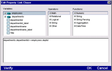
Link clauses
Link clauses join information from different sources together. For example, you can embed a view created with data from one table inside a form that takes its data from another table. You can also create or modify a Link clause using the Property Inspector.
Objects
The Form Designer has two kinds of objects that you can include in your form:
Pre-defined objects are controls that SilverStream provides automatically, such as an input field or combo box. You can use these controls as part of the form you are creating. You can also bind them to data.
User-defined objects are objects that you have created or defined. These objects can include Java Beans, image files, and existing forms and views.
Form Designer keyboard shortcuts
Use these keyboard shortcuts:
Keystroke
|
Description
|
|---|
Ctrl+S
|
Save
|
Ctrl+Z
|
Undo
|
Ctrl+Y
|
Redo
|
Ctrl+X
|
Cut
|
Ctrl+C
|
Copy
|
Ctrl+V
|
Paste
|
Ctrl+G
|
Go to line number
|
Ctrl+F
|
Find/Replace
|
Ctrl+T
|
Test
|
Ctrl+A
|
Select all controls
|
F1
|
Help
|
F3
|
Find again
|
F4
|
Property Inspector
|
F7
|
Invoke Programming Editor
|
Creating forms
The Form Wizard enables you to generate a form in a few easy steps. After you've created the form, you use the toolbars and gallery to add controls to the form; the Property Inspector to set initial values for the form and the controls; and the Programming Editor to write code for events.
Creating a form
 To create a form:
-
In the main SilverStream Designer, select the database you want to use. To see a list of resources associated with the database, click the plus sign next to the database icon.
-
In the list of database resources, select the Forms icon. A list of available forms appears in the right pane of the main window.
-
To create a new form, select the New icon in the action gallery at the bottom of the right pane. The first Form Wizard window appears.
NOTE If you want to create a blank form, click Cancel. You can add controls to the form and use the Relational Data Palette later to choose a database table for the form, if you want. To use the Form Wizard for selecting data and style settings, continue with these steps.
-
In the Form Wizard window, select the primary table or data source object (DSO) that you want to use with your form.
NOTE For more information, see the chapter on DSOs in the Programmer's Guide.
-
Select Next>. The Relational Data Palette appears.
-
Select the data columns to use in your form. The Relational Data Palette lists the data columns contained in the table or DSO you selected. If you selected a table, the Relational Data Palette also lists tables that are related to the primary table (relationships are defined in the Relationship Designer; for more information, see the
Relationship Designer).
You can select the columns in any order you want. To select individual columns, highlight the column and click >. To select all the columns, highlight the table name, and click >>. To remove the column or columns, click < or << respectively.
-
Press Next. Select your form style.
-
Press Next. Enter the form name. Use a name that conforms to your naming conventions, such as using the prefix frm. Press Finish.
The form page appears in the Form Designer.
NOTE The General Reference has more information about naming conventions.
What happens
SilverStream generates a form with fields corresponding to the data you specified. Also, SilverStream adds buttons to the form, allowing users to navigate through the data and update the data (if the data source is updatable). SilverStream specifies appearance settings according to the form style you select. For some styles, the buttons are on subforms stored in the SilverMaster database.
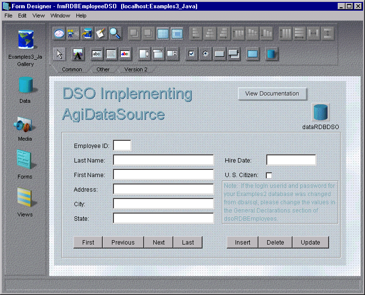
If you chose a DSO as the primary data source, SilverStream also adds an AgcData control to the form. The AgcData control specifies the DSO the form uses to load data.
Refining the query
By default, all rows will be retrieved from the database and sent to the client. If you have large tables, you will want to specify a query that restricts which rows are retrieved. For more information, see
Building queries.
Displaying the Property Inspector
The Property Inspector is available throughout SilverStream. It displays information about the selected object. Sometimes the information is read-only, but in the Form Designer, you use the Property Inspector to specify initial values for the form and its controls.
To open the Property Inspector from the Form Designer, you can:
-
Select the Show Properties button from the toolbar.
-
Select Property Inspector from the View menu.
-
Right-click the form background or any control on the form and select Properties from the popup menu.
The Property Inspector has one or more tabs depending on the containment hierarchy of the currently selected object. For example, if a field is selected, there are tabs for the Form and the field. Choose a different tab to display the property sheet for another object in the containment hierarchy, as needed.
While the Property Inspector is open, you can display properties for different objects by selecting the objects in the form. The tabs change according to the current selection.
You can also display the Programming Editor to write code for events of the form and its controls. For more information, see
Programming Editor.
Saving a form
Forms are saved in the database. It's a good idea to save periodically while you are designing your form and before you test it.
To save a form:
Testing a form
Once you are finished adding data, controls, and buttons to your form, you are ready to test it to make sure everything works the way it should.
To test a form:
-
Select the Test button from the Form Designer toolbar to initiate Test Mode.
The compiled Java version of your form appears. If there are compilation errors, the Programming Editor displays the problematic code.
-
While you are in Test Mode, the button changes to the Design mode button. Select it to return to Design mode and make changes to the form.
Viewing a form using SilverJRunner
SilverStream contains an executable file called SilverJRunner that allows you to view a form without having to either launch a browser or put your form in a Web page. SilverJRunner runs from the MS-DOS prompt instead of the SilverStream Designer environment, although it still connects to the SilverStream Application Server to download the form and the necessary Java classes. You install SilverJRunner separately from SilverStream.
For more information see the deployment chapter in the Programmer's Guide.
To view a form in SilverJRunner:
NOTE Before you can run SilverJRunner successfully against a SQL Anywhere database, you must access the ODBC settings for your database, and specify the -c and 4m flags in the Startup Options dialog box.
Using the Component Gallery and the Component Palette
The Form Designer provides two facilities for adding components to a form:
-
Component Gallery
-
Component Palette
The Component Gallery, which appears on the left side of the Form Designer, lets you add components from the Relational Data Palette, the Media Store, the Forms gallery, and the Views gallery. The list of available components is determined by the currently selected database. You can hide the Component Gallery to increase the amount of space available for displaying your form.
The Component Palette is an alternative to the Component Gallery that uses less screen space. When the Component Gallery is hidden, you can use the Component Palette to add components to a form. The Component Palette gives you access to all of the items in the Component Gallery, except the Relational Data Palette, which you can display separately.
NOTE To display the Relational Data Palette, select View>Relational Data Palette.
To use the Component Gallery:
-
If the Component Gallery is not visible, select View>Show Component Gallery to display it.
NOTE You can hide the Component Gallery by selecting View>Hide Component Gallery.
-
Select the database you want to work with by clicking the Database icon in the top left corner of the Component Gallery.
A list of resources in your current database appears.
-
To add data-bound fields from the Relational Data Palette:
-
Select the Data icon from the Component Gallery.
-
Select the table you want to work with in the dropdown list box at the top of the palette.
-
Select a database column by double-clicking it or by dragging it to the surface of the form. SilverStream adds a field to the form that is bound to the selected column.
-
To add items from the Media Store:
-
Select the Media Store icon from the Component Gallery. You can choose from General, Images, JavaBeans, and Sounds.
-
Select the plus sign that appears next to each of these items to see a list of available resources.
-
Select an item by double-clicking it or by dragging it to the surface of the form. You can add or delete Media Store objects from the SilverStream Designer.
-
To add a subform:
-
Select the Forms icon from the Component Gallery. A list of forms in your current database appears.
-
Select a form by double-clicking it or by dragging it to the surface of the form. SilverStream adds the selected form as a subform.
-
To add a view:
-
Select the Views icon from the Component Gallery. A list of views in your current database appears.
-
Select a view by double-clicking it or by dragging it to the surface of the form.
To use the Component Palette:
-
If the Component Palette is not visible, select View>Component Palette to display it.
-
Select the database you want to work with by selecting it in the dropdown list box at the top of the palette.
A list of resources in your current database appears.
-
To add items from the Media Store:
-
Select the plus sign that appears next to the EJB Jars & Media branch in the Component Palette. You can choose from General, Images, JavaBeans, and Sounds.
-
Select the plus sign that appears next to each of these items to see a list of available resources.
-
Select an item by double-clicking it or by dragging it to the surface of the form. You can add or delete Media Store objects from the SilverStream Designer.
-
To add a subform:
-
Select the plus sign that appears next to the Forms branch in the Component Palette. A list of forms in your current database appears.
-
Select a form by double-clicking it or by dragging it to the surface of the form. SilverStream adds the selected form as a subform.
-
To add a view:
-
Select the plus sign that appears next to the Views branch in the Component Palette. A list of views in your current database appears.
-
Select a view by double-clicking it or by dragging it to the surface of the form.
Including controls on your form
About form controls
Here are some of the things you can do with form controls:
-
Many of the controls are data-aware. You can easily bind a control to a database field by setting its Data Column property.
-
Attach validation rules with your own error messages.
-
Fill list controls with data from a database table to ensure that only valid data is entered.
-
Associate a tool tip with each control. The tool tip automatically appears when the mouse moves over that control.
-
Associate a help page with each control. The control launches a browser and displays the help page when the user presses F1 while the control has focus.
-
Use the Property Inspector to assign properties including colors, fonts, property values, validation rules, and Tool Tips to the controls.
Swing vs. AWT controls and the Form Designer toolbars
Beginning with Version 3.0, SilverStream supports both Swing and AWT controls. Swing controls were introduced in Java 2 (JDK 1.2.1) and provide several benefits over AWT controls, such as more flexible cross-platform support and control over the look and feel of your application, improved screen painting, data models for separating data and its presentation, and support for access by disabled users.
In the Form Designer, use the Common and Other toolbars to add Swing-based controls to your form. Many of the controls are extensions of the standard Swing controls; they provide support for data binding. The toolbars include some standard Swing controls, such as JProgressBar. Class names for Swing-based controls in SilverStream begin with the prefix AgcJ.
The Version 2 toolbar contains AWT-based controls. Use these controls for maintaining existing applications. Class names for AWT-based controls in SilverStream begin with the prefix Agc. In general, you should not mix controls based on AWT (Version 2 toolbar) with those based on Swing. If you mix both types, your form may not paint correctly. For more information, see the Java documentation from Sun.
The controls discussed in the rest of this chapter are Swing-based controls.
For more information about the Form Designer controls and what you can do with them, see Working with Swing and AWT controls in the Programming Forms chapter of the Programmer's Guide. There are many examples of using controls in the Java Client section of Application Techniques.
Naming conventions for controls
When you name objects you define in SilverStream, you will make your code easier to understand if you use a naming convention that identifies the object type. The General Reference provides a a list of suggested prefixes that you can use as a starting point for your naming conventions.
Including Text Edit controls
The Form Designer lets you incorporate the following types of text edit controls into your form:
-
The Single Line Text Field control (JTextField button) is primarily for data entry. You can use it for columns in a table. Use the Property Inspector to specify the kind of data users can enter and how they can enter it.
-
The Multiple Line Text Area control (JTextArea button) is for block text fields in your form that do not use HTML.
To add a Text Edit control:
-
On the Common tab of the Form Designer toolbar, select the button for the edit control you want to use.
-
On the form, click and drag your cursor to size the control.
-
Open the Property Inspector to specify properties for the field. For example, you can specify the background color, the font style and size, and a database column for data binding.
Specifying data type and formatting data
You can restrict the kind of data users can enter into text fields. With single-line text fields, you can also format the data displayed in the form. The Form Designer provides several named display styles, plus it allows you to specify patterns of characters.
For information on characters in display patterns and named display styles, see Formatting Patterns and Styles in the online General Reference.
Including Tab Panel controls
You can include any number of controls in your form. While this section describes adding a tab panel control, the procedure is basically the same for adding any control to a form. Tab panels are useful for organizing your user interface. You can use the tab panel control to group other controls such as radio buttons, and database navigation buttons. The tab panel also supports several events that are fired when the user navigates through the panels in your form.
NOTE You must select the tab panel before you can place other controls on it. Use Cut and Paste on the Edit menu to move controls from one tab panel to another.
To add a Tab Panel control:
-
On the Other tab of the Form Designer toolbar, select the JTabbedPane button.
-
On the form, click and drag your cursor to size the control. When you release the button, a tab panel control appears.
-
Open the Property Inspector for the control and select the Tab tab, if necessary.
-
Enter a name for the tab control in the Name field. This name does not appear on the tab itself. It is used for programming purposes only.
-
Enter the number of panes (or tabs) that you want the control to display in the Panes field. You must specify at least one.
-
To display or edit the caption for each tab pane, select the plus sign (+) next to Pane Captions. The number of caption fields that appear corresponds to the number of panes you select.
-
To select images to be displayed on the tabs, click the plus sign beside Pane images and select images for each tab.
-
To change the way the tab panel looks, select the plus sign next to Appearances and change colors and fonts.
-
Double click on the control to access the Programming Editor. You can choose from a list of methods and events provided by SilverStream or you can create your own.
Using AgcView controls
AgcView is a programmable control that enables you to create views that you can adjust at runtime. This is a useful feature if you are creating a form but you do not know what the data structure underlying the form will be. For example, you could be creating a form that users are going to populate with data from classes they create. You can also use the AgcView control to hide sensitive data from unauthorized users.
To set up an AgcView control:
-
On the Other tab of the Form Designer toolbar, select the Dynamic View button.
-
On the form, click and drag your cursor to size the control. When you release the button, a rectangle appears.
-
Open the Property Inspector and select the View tab, if necessary.
-
Enter a name for the control in the Name field.
-
Set other properties for the control, as desired. You can specify:
-
A brief description of the control that appears when users pass their mouse over the control. Enter the text in the Tool tip field.
-
An HTML help page for the control. Click the ellipses beside the Help page field to select an HTML page from a SilverStream database on your server or specify an URL.
-
Whether the control is visible or enabled when the form is first displayed. Select True or False in the Visible and Enabled fields.
-
The position of the control on the form. Enter coordinates in the Position field or drag the control to a new position on the form.
-
The size of the control. Enter values in the Width and Height fields or select the control and drag a handle.
-
Access the Programming Editor either by selecting the Programming Editor icon in the Form Designer toolbar or by pressing the right mouse button and selecting Programming Editor from the pop-up menu. You can then write code to initialize and format the AgcView control. This code could be placed in a form-loaded event, on a button, or anywhere else appropriate.
-
Press the Java button to see the code for the control. The Simple Action icons in the right margin of the Programming Editor are replaced with panes listing the controls on the form and the methods associated with them.
-
Select the AgcView control from the list and then the event you want associated with it. The following example shows the code written on the viewHeaderRowClick event to sort table rows when a user clicks on a view header:
  AgoHeaderRowClick h = (AgoHeaderRowClick) evt.getArgument();
boolean shift = h.shiftDown();
int idx = h.getColumnIndex();
try
{
viewname.sort(idx, shift);
}
catch (Exception e) {}
where viewname is the name you gave the AgcView control.
-
Check your Java syntax by selecting the Check Syntax icon or selecting Check Syntax from the File menu.
Inserting HTML Edit controls
The HTML Edit Control is a WYSIWYG editor that you can use to create and maintain HTML content on a form in SilverStream. Using the Form Designer and the HTML Edit Control, you can combine structured data with a rich text field.
The Page Designer and the HTML Edit Control are similar in that you do not have to know HTML to use either one of them. The HTML Edit Control contains a toolbar that allows you to select text formatting icons instead of coding HTML tags, although you can insert raw HTML if you want to.
To learn about how the user interacts with the control, see
Using the HTML Edit Control.
To add an HTML Edit Control to your form:
-
On the Common tab of the Form Designer toolbar, select the HTML Edit Control button.
-
On the form, click and drag your cursor to size the control. To make the full HTML Edit toolbar visible, the control must be quite wide. When you release the button, the control appears.
-
Open the Property Inspector and select the HTMLEditControl tab, if necessary.
-
Enter a name for the control in the Name field. The initial value shown in the field is the default.
-
To specify data binding for the control, select the ellipses to the right of Data column. The Edit Property dialog box appears. It lists the form's primary table and its associated columns. Select the column that you want to bind to the HTML Edit control and click OK.
-
If you want the HTML editing toolbar to appear in the HTML Edit Control, specify true in the Toolbar field. The toolbar enables users to format text, create links to other pages, etc.
-
To specify the names of custom forms that appear when users press the Insert Image, Insert Link, or Insert Raw HTML buttons, select the plus sign next to Dialogs.
-
Set other properties for the control, as desired. You can specify:
-
A brief description of the control that appears when users pass their mouse over the control. Enter the text in the Tool tip field.
-
An HTML help page for the control. Click the ellipses beside the Help page field to select an HTML page from a SilverStream database on your server or specify an URL.
-
Whether the control is visible or enabled when the form is first displayed. Select True or False in the Visible and Enabled fields. You can programmatically show the control later.
-
Select the Test button from the Form Designer toolbar to see the HTML Edit Control with the toolbar.
For information on how the user interacts with the HTML Edit Control include how to interact with it in Test Mode, see
Using the HTML Edit Control.
Using file attachments
The file attachment control is a data-bound control that allows you to upload a file to a database table. When you are testing your form or running a SilverJRunner application, you can also download the file from a database to your local drive and edit the file contents. You can bind the file attachment control to a field with any data type, but the size of the file you can store is limited by the database unless you bind it to a field with the longvarbinary or longvarchar type.
You can see the file attachment control on your form when you are in Design mode. The control becomes invisible when you look at the form in Test Mode.
NOTE You cannot view file attachments from a browser unless the user adjusts the browser's security settings.
In order to use a file attachment control, you must write Java code in the Programming Editor. You'll need to decide when the code should run. You may, for example, wish to put Upload and Download buttons on your form so that the user controls when the file is uploaded or downloaded. When you upload a file, you can specify that the local copy of the file is deleted. When you download a file from the database to the local drive, you can specify that it be opened in a local editor.
To associate a File Attachment control with a database column:
-
On the Other tab of the Form Designer toolbar, select the File Attachment button. Click and drag to drop the file attachment icon on your form. It has a fixed size.
-
Open the Property Inspector and select the FileAttachment tab, if necessary.
-
To select a database column, click the ellipses next to Database Column. A dialog box appears listing the primary table associated with the form and its columns.
-
Select the column that you want to contain the data and select OK.
To upload a file from your local drive to the database:
-
If desired, add a button or some other control to the form for starting the uploading.
-
Double-click the control to open the Programming Editor to the control's action event.
-
Write code that calls the upload() method on the control. Arguments include a Java file object pointing to a file on your local disk and a Boolean flag indicating whether the file should be deleted after it is uploaded. This example uploads file.txt and doesn't delete the local copy of the file.
fileattachment1.upload(new File("c:\\temp\\file.txt"), false);
When you test the form and click the Upload button, a message appears telling you that SilverStream is uploading the file from the location you specified. When the file is uploaded and the boolean flag is true, SilverStream deletes the local copy of the file after it has been uploaded.
To download a file attachment from a database table column to your local disk:
-
If desired, add a button or some other control to the form for starting the uploading.
-
Double-click the control to open the Programming Editor to the control's action event.
-
Write code that calls the download() method on the control. Arguments include a Java file object identifying the path and file name on your local disk where you want to store the file. The second argument is a Boolean flag indicating whether the file should be opened in an editor after it is written. The sample code downloads a file, names it file.txt, but doesn't open it in an editor.
fileattachment1.download(new File("c:\\temp\\file.txt"), false);
When you test the form and click the Download button, a message appears telling you that SilverStream is downloading the file to the path you specified. If the boolean flag were true, SilverStream would launch a local editor for the file based on the registry entry for the file extension.
Binding data to controls
The controls on your form can display data from database tables. You can set up data binding in the Property Inspector without writing any code. When the form is displayed, you can choose to have data from the database automatically displayed. Data the user enters or selects in fields bound to the form's primary table are updated when you call the update method.
For more information about displaying data in a form, see the data access information in the discussion of form basics in the Programmer's Guide.
To bind a control to a database column:
-
Open the Property Inspector and select the tab for your control, if necessary.
-
To specify a data column, enter a column name in the Data Column field.
or
If you do not know the exact name of the column you want to include:
-
Click the ellipses next to the control. The Edit Property list box appears. It displays the columns from the primary table for the form and any tables that are related to the primary table.
-
Select the table column and choose OK. The column name appears in the Data Column field in the Inspector.
Aligning controls on your form
There are two ways to align controls. You can align individual controls to a grid when you add or move them. Grid alignment is on by default. After placing controls on your form, you can align groups of controls with each other with the alignment buttons or the Edit menu options Distribute and Align.
To enable or disable automatic grid alignment:
-
Turn the grid on or off by clicking the Alignment Grid button in the top toolbar.
-
Turn automatic grid alignment on or off by clicking the Snap to Grid Mode button in the top toolbar. The grid does not have to be visible for automatic alignment to work.
To align a group of controls:
-
Select all the controls that you want to align on your form. To select multiple controls, you can:
-
Drag a rectangle on the form that touches the controls you want to select
-
Hold down the Ctrl or Shift key and click controls to add them to the selection
-
Select one of the alignment buttons from the Form Designer toolbar or choose either Distribute or Align from the Edit menu. The options on the Distribute submenu enable you to distribute the controls evenly. The Align submenu options match the align buttons in the toolbar.
Setting tab order
You can specify the way focus changes when the user presses the tab key. The default order is the order the fields were created.
To change the tab order:
-
Select Edit>Set Tab Order. Bold numbers appear on the controls indicating their positions in the tab order.
-
Click the number for the control you want to be first in the tab order. Then click the rest of the controls, in sequence.
or
Click the number for the first control you want to change. Then click the controls that will follow it, in sequence.
or
Right-click the number that you want to change and enter a new number in the dialog box. Click the controls that will follow it, in sequence.
As you change the tab order, the order number of other controls will change to avoid conflicts.
-
Leave tab order mode by selecting Edit>Set Tab Order again.
To remove a control from the tab order:
-
Set its Enabled property to false in the Property Inspector.
You can also set tab order programmatically by calling the setUserDefinedTabOrder() method. SilverStream calls this method in the code it generates for init(). If you call it in the formActivate event, your tab-order array will override the tab order set in the Designer.
Providing a list of values for list, combo box, and tree controls
There are two ways to load a list of values into a list control:
-
Statically enables you to specify the list values while you are designing your form. This method works best when the list is relatively short, you know what the values are, and the values won't change.
-
From Table enables you to specify that the list values come from a database table. Use this method when the information is located in a database table. Creating the list in the database is best when you do not know what the list items will be or the list changes frequently.
Lists have two types of values: a display value and a storage value. The user sees the display value, but the associated storage value is the value passed to the database. This allows you display user-recognizable text while storing keys or other types of codes in the database. For example, if you entered the words "apples," "oranges," and "pears", these words would appear in the display list. However, selecting "apples" might return the value "1," "oranges" could return "2," and so on. In form expressions and Java code, you can refer to the storage value to find out which list item is currently selected.
A list control is usually associated with two tables:
-
A table containing the list values
-
The form's primary table containing the column to which the control is data-bound
When the form is first displayed, the value in the data-bound column determines the initial selection in the list control. The value the user selects in the list is used to update this column.
NOTE Tree controls can display a multilevel hierarchy of values. In the Property Inspector, you can specify a first level of values. You must write code to add additional levels. Application Techniques has a topic on populating tree controls.
To load the list statically:
-
Open the Property Inspector and select the tab for the control, if necessary.
-
Select the plus sign (+) next to List Choices to display the choice options.
-
Select the down arrow in the Load choices field to see a list of options.
-
Select Statically. The property sheet displays Choices and Values fields.
-
Click the ellipses next to Choices.
-
Enter the display values in Edit Property window. Press Enter after each item so that there is only one data item per line. When you are through, select OK. In the Property Inspector, the first entry in the list appears in the Choices field.
-
Select the ellipses next to Values.
-
In the Edit Property window, enter storage values for each item in the list. Press Enter after each item so that there is only one data item per line. When you are through, select OK. In the Property Inspector, the list first entry appears in the Values field.
-
Select the ellipses in the Data column field to bind the control to a column in the form's primary table. In Edit Property dialog box, select a table column and press OK.
-
Select the Test button from the Form Designer toolbar to see what your control looks like in Test Mode.
To load the list from a table:
-
Open the Property Inspector and select the tab for the control, if necessary.
-
Select the plus sign (+) next to List Choices to display the choice options.
-
Select the down arrow in the Load choices field to see a list of options.
-
Select From Table in the Load choices field. The property tab display fields for the database table name, column names for display and storage data, and selection clause.
-
Select the down arrow in the Table name field to see a list of tables in your current database.
-
Click the ellipses beside Display value to access the Expression Builder and build an expression that determines the display value for each row in the list.
-
Click the ellipses beside Storage value to access the Expression Builder and build an expression that determines the display or stored value for each row in the list.
-
Click the ellipses beside the Where clause field to use the Expression Builder to specify search criteria for the data you want to display.
-
Specify the order of the results by adding expressions under the Order By property. The Expression Builder dialog appears again. In the Expression Builder dialog, you can specify whether the results should appear in ascending or descending order.
For help using the Expression Builder, see
Expression Builder.
Including subforms and views in your form
A form that you include within another form is called a subform. You create the subform in the Designer, just as you would any form. A subform can be content that you want to repeat on all your forms, like a footer or a menu bar, or it can be associated with another database table, enabling you to update multiple tables in the form.
In addition to being able to include subforms in your form, you can also include views to give users a more detailed look at data. You create views in the View Designer.
For both subforms and views, if the data in the subform or view is related to the data in the form, SilverStream automatically links the two together.
NOTE If your application design requires many subforms, you might choose to load them dynamically, instead of adding them in the Designer. For information, see the information on child forms in the Programmer's Guide.
To include a subform in a form:
-
In the Form Designer, select the Forms icon in the gallery at the left. A list of forms in the current database appears.
NOTE To select a form in a different database, see
Using objects from a different database.
-
Select a form from the list. An image of the form appears on your form, sized according to the form's original definition. If you want, you can use your mouse and the alignment buttons in the Form Designer toolbar to position and size the subform.
-
To create a Link clause that relates the data on the form with the data in the subform, select the subform and open the Property Inspector. SilverStream automatically creates a Link clause if the tables are related.
For more information, see
Relationship Designer and
Link clauses.
-
Click the ellipsis beside the Link clause field. The Expression Builder dialog box appears, enabling you to modify the link clause.
To include a view in a form:
-
In the Form Designer, select the View icon in the gallery at the left. A list of views in the current database appears.
NOTE To select an view in a different database, see
Using objects from a different database.
-
Select a view from the list. A box representing the view appears on your form. Use your mouse and the alignment buttons in the Form Designer toolbar to position and size the view.
-
To create a Link clause that relates the data on the form with the data in the view, select the view and open the Property Inspector. SilverStream automatically creates a Link clause if the tables are related.
For more information, see
Relationship Designer and
Link clauses.
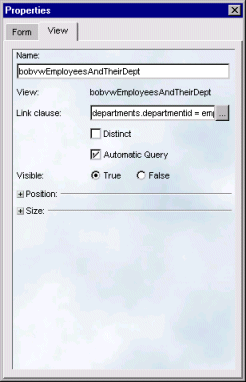
NOTE If a Link clause is specified, SilverStream ignores the setting for Automatic Query on the View tab; SilverStream will retrieve the view's data whenever the linked data on the form is retrieved, regardless of the Automatic Query setting.
-
Click the ellipsis beside the Link clause field. The Expression Builder dialog box appears, enabling you to modify the link clause.
-
Click the Test button from the Form Designer toolbar to see the form and view with data. To return to Design Mode, click the same button, now with the Design icon.
Including images in your form
You can use an image as the background for your form, or you can place a static image on your form. You can also create a button that displays as an images that change according to the user's actions.
Selecting an image
In all the controls that display images, you use the Edit Property dialog box to choose the image. The file you choose can be in a SilverStream database, stored in the local file system, or accessed from a web server. Whatever you pick, the file is added to the current SilverStream database.
To choose an image:
-
Click the ellipses next to an image field.
-
In the Edit Property dialog box, specify an image location by selecting Database, File, or URL. The dialog changes according to your selection. If you select:
-
When you select OK in the Edit Property dialog box, a message box tells you that the file has been added to the current database. Click OK in the message box and you see the image in the control.
Including a background image in your form
To use an image as the background for your form:
-
Open the Property Inspector and select the Form tab, if necessary.
-
Click the plus sign (+) next to Background. The Background options expand to enable you to choose a background color from the palette or an image.
-
Select the ellipses next to the Image field. The Edit Property dialog box appears.
-
Select an image as described in
Selecting an image.
When you return to the Form Designer, the image you selected appears as the background of your form.
Creating an Image button
Swing buttons can display several images, depending on the user's actions. You can specify an image for these button states:
-
Normal
-
Selected
-
Pressed
-
Disabled
-
Disabled selected
-
Rollover
-
Rollover selected
You don't need to specify images for all of these. For example, Disabled may be handled automatically by Swing's look-and-feel support. For more information, see the documentation for Swing controls from Sun.
The Swing buttons available on the Common tab of the toolbar are JButton and JToggleButton.
To create a button on your form that displays an image:
-
From the Common tab of the Form Designer toolbar, select JButton or JToggleButton.
-
Click on the form and drag to size the button.
-
Open the Property Inspector and select the tab for your control, if necessary.
-
Click the plus sign next to Images to display the image options.
-
Select images for as many image options as you want as described in
Selecting an image.
-
Specify other options in the Property Inspector, such as:
-
The programming name for the image control in the Name field.
-
A text label for the button in the Caption section. You can specify static text in the Text field or a value that is interpreted at runtime in the Expression field.
-
Font size and style for the caption text in the Font section.
-
A tool tip text in the Tooltip field.
-
A help page in the Help Page field.
Including a static image in your form
The JLabel control lets you display an image with an optional text label. The text can be positioned above, below, beside, or over the image. There are two ways to create the control. You can create the control and then select an image; or, if the image is already in a SilverStream database, you can select the image in the Media Store and a JLabel control is created for it on the form.
To create a control and select an image from a database, file, or URL:
-
Select the JLabel button from the SilverStream Object toolbar.
-
On the form, click and drag to set the location and size of the control.
-
Open the Property Inspector and select the tab for the control, if necessary.
-
Select an image as described in
Selecting an image.
The image appears in the JLabel control.
To select an image from the Media Store:
-
In the gallery on the left side of the Form Designer, click Media.
NOTE To select an image in a different database, see
Using objects from a different database.
-
In the popup list, click the plus sign next to Images to display a list of the images in the database's Media Store.
-
Select the image; the new control appears in the center of the form.
or
Select the image and drag it to a specific position on the form.
The size of the new JLabel control is set to the size of the image.
To set properties for the JLabel control:
-
On the property sheet, enter the programming name for the image in the Name field. The name is used for programming purposes only.
-
If you want to display a text label for the image, then:
-
In the Caption section, enter the label in the Text field or enter an expression in the Expression field.
-
Specify the position of the text relative to the image in the Horizontal text position and Vertical text position fields.
-
Specify the position of the image and text within the control in the Horizontal alignment and Vertical alignment fields.
Cropping a larger image within the control
You can display part of a larger image in an image control by specifying the pixel coordinates of a portion of the image in the Property Inspector. You might do this because:
-
You want to display part of an existing image.
-
For efficiency, you have combined several small images into a single GIF or JPEG file and you want to display different parts of the image in different controls.
Keeping several small images in a single file is useful because one large file compresses better and loads faster than a lot of little files. Having one large image file also removes clutter from the Media Store and enables you to load your forms and views faster. For example, instead of having a separate file for each toolbar button that you want to use, you can have one large file that contains all the toolbar buttons.
If you do not know the pixel coordinates for the image area that you want to use, use an image editing program to determine the values.
You can specify cropping coordinates anywhere in SilverStream that you can use images.
To create smaller images from a larger one:
-
In the image field for Enter four coordinates in the Image column after the filename in the format
x y width height
The coordinates are pixel measurements that define the area of the image that you want to include in your form. For example, to display an area of 20x20 pixels with the upper left corner at 10 pixels from the left edge and 5 pixels from the top, you would specify the file name and coordinates like this:
calendar.gif 10 5 20 20
-
The area you specified appears on your form.
-
Select the Test button to see what the image looks like on the running form.
Using JavaBeans in your form
You can include JavaBeans in your form. JavaBeans is a specification for third party reusable software components. Before you can include JavaBeans in your form, however, you have to import them into your database. This section describes:
Importing JavaBeans into your database
JavaBeans are contained in .JAR files. Each .JAR file can contain several beans.
To upload beans to the SilverStream Media Store:
-
In the Main Designer, in the Gallery on the left, click the plus sign next to the database to which you want to upload the bean.
-
In the list of object types for that database, select EJB Jars & Media. You see a list of item types in the Media Store. You can expand the lists to see individual items in your database.
-
In the right panel, click the New action icon in the toolbar at the bottom.
-
In the popup menu, select Upload JAR, ZIP, or EJB. A file browser displays.
-
In the file browser, select the JAR file that you want to upload.
Status messages appear as SilverStream analyzes the JAR and uploads it to the server. The JAR file appears in the database's Media Store. To see the beans the JAR contains, see the next procedure.
NOTE SilverStream only supports Java Beans that use JDK 1.1 events.
NOTE You should be careful when deleting beans from the Media Store. When you delete a Bean, you also delete the .JAR file associated with it, as well as any other Beans that were included in the .JAR file.
Including JavaBeans in your form
To use JavaBeans in your form:
-
In the Form Designer, select the Media icon from the gallery on the left.
NOTE To select a bean in a different database, see
Using objects from a different database.
-
In the popup list, click the plus sign next to JavaBeans. The list expands to display the beans in the Media Store.
-
Select a bean from the list. The bean is added to your form where it appears as a rectangle with an icon. Use the Property Inspector to set the properties for the bean.
-
Select the Show Programming Editor button from the Form Designer toolbar to access the Programming Editor. You can create code using either SilverStream's Simple Actions or by entering Java code that causes the Java Bean to respond to events.
Using objects from a different database
You can include objects in your form that reside on a different database from the one you originally specified.
To use objects from a different database:
-
Select the Database icon in the Objects Gallery. A list of databases appears.
-
Select the new database from the list. The first icon name changes to the selected database gallery.
-
Select the Media icon to see a list of the objects contained in the database. Select the object you want to use. It appears on your form.
Creating validation rules for form fields
Use the Property Inspector and the Expression Builder to ensure data integrity by creating validation rules for the fields on your form.
For more information about specifying expressions, see
Expression Builder.
To create a validation rule:
-
On your form, select a field that is data-bound to a table column.
-
Open the Property Inspector and select the Field property tab, if necessary.
-
Select the plus sign next to Validation rules to expand the section.
-
Select Add New Rule. The Rule1 box appears.
-
Click the ellipses next to this box. The Expression Builder appears.
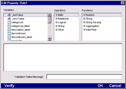
-
Use the Expression Builder functions and operators to create a data validation rule for the field.
Use the special value _newValue to refer to the value that the user just entered; use the special value _lastValue to refer to the previous value in the form.
For example, if you want to prevent someone from entering a value less than zero in a field, specify the following validation rule for the field:
_newValue >= 0
Validation expressions can also refer to other fields in the form. The Expression Builder shows other fields in the form with this icon:  . For example, if you want to make sure that the date a user enters in the shipDate field is later than the value entered in orderDate, specify this rule for the shipDate field:
_newValue > orderdate
You can also refer to values in the database for the current row by selecting database columns, which are listed last in the Variables pane. The primary table is listed at the top level in the Variables pane. Click + to expand the table and display its columns. Also, tables related to the primary table are listed. You can pick columns from these tables to include in your validation rule.
For more information about relationships between tables, see
Relationship Designer.
-
In the Validation Failed Message field, enter an error message that is displayed when the data causes the rule to evaluate to false.
-
Select Verify to test your expression when you finish building it. If there is a syntax error, a message box appears.
-
Select OK to save your expression (if it is correct) and return to the Form Designer.
What happens
When a user changes the value in the field, then changes focus from the field, the validation rule will be triggered. If the new entry doesn't pass validation, a dialog will display with the message you specified.
Programmatic validation checking
You can perform more complex validation testing, notification, and processing by writing code in validation-related events. For information, see the Programmer's Guide.
Creating a full-text search form
SilverStream provides the ability for you to provide full-text search in your forms.
For more information, see
Full Text Search.
Using the HTML Edit Control
This section describes how to use the HTML Edit Control in Test Mode. The users of your application will also use these procedures to edit HTML in the control.
The HTML Edit Control enables you to apply formatting to text in the same way that standard word processing packages do. Simply type in text, highlight it, and select the appropriate formatting button from the toolbar. The toolbar buttons take the place of inserting HTML tags into the text. For example, if you are coding raw HTML and want to make a word bold, you would have to enter:
<B>WARNING</B>
To bold text in the HTML Edit Control, all you have to do is select the Bold button.
The HTML Edit control toolbar and popup menu
The HTML Edit Control toolbar has tools for formatting text, creating links to other web pages, incorporating images into the HTML, and creating image maps. Place your mouse pointer over a button in the toolbar to see what the button does.
Use the buttons to:
-
Align text on the HTML Edit Control
-
Create tables
-
Create bulleted and numbered lists
-
Insert graphics
-
Create links
There is also a popup menu for changing the text. (Right-click in the editing area to display the menu.) The menu options vary based on the current selection or the location of the insertion point. The first option is always Properties, which displays a Property Inspector for the current editing object.
There are some text styles that are not on the toolbar but can be applied in the Property Inspector. They are:
-
Strikethrough
-
Blinking text
-
Superscript
-
Subscript
Pasting existing text
The HTML Edit Control is for entering HTML for purposes of storing it in a database. It does not format HTML tags that you paste.
To paste existing text:
-
In the other application, select the text you want to incorporate into your HTML Edit Control and cut or copy it.
-
Position your cursor at the location in the HTML Edit Control where you want the text to be located. Press the right mouse button. A pop-up menu appears.
-
Select Paste. The text is treated as normal text. HTML tags, if any, are displayed as text, not interpreted.
Inserting raw HTML
You can use the Raw HTML window to enter HTML tags that are not supported on the formatting toolbar. The HTML is not formatted, but appears as an icon in the editing area.
To insert raw HTML:
-
Select the area of your HTML Edit Control where you want to insert the HTML codes.
-
Select the Insert Raw HTML button. The button has an icon of HTML angle brackets and is on the dropdown panel at the right end of the toolbar. The Raw HTML window appears.
-
Enter the HTML code and any text in this window. Select OK. An icon appears in your HTML Edit Control. Double-click on it to see or modify the code.
Creating text links
You can specify that words or phrases in your HTML Edit control link to web pages.
To create a text link:
-
Highlight the text that you want to serve as the link.
-
Select the Link button from the HTML Edit Control toolbar (It has a chain link icon and is near the right end). The Insert Link dialog box appears.
-
Enter the URL of the link in the dialog box.
-
Select OK. The text you highlighted appears in blue.
You can change the colors for text, active links, and visited links in the Property Inspector.
When the HTML Edit Control is read-only, you can follow the links by clicking on them. When it allows editing, you must press the right mouse button to follow the link.
Changing text colors
You can specify different colors for the background or the text of your HTML Edit control.
To change text colors:
-
Select the Inspect button at the right end of the HTML Edit Control toolbar.
-
On the Page tab, click the plus sign beside Background and colors. Check Specify background and colors if it isn't already.
-
In the Background dropdown, click the down arrow to choose a color from the color palette.
You can also set text and link colors. Your changes appear immediately.
Inserting graphics
You must convert bitmaps or graphics created using other graphic packages (such as PowerPoint or Visio) into web-compatible formats such as .GIF or .JPG. Once you convert your image to the appropriate format, you can include it in the HTML Edit control and an inline or background image.
To insert a graphic:
-
To insert an inline image, select the Image button from the HTML Edit Control toolbar.
or
To specify a background image, open the Property Inspector, select the Page tab, expand the Background and colors section, and click the ellipses beside the Image field.
A dialog box appears.
-
Specify the location of the image file by entering the URL for the image. To specify an image:
-
In the same SilverStream database, enter the file name
-
In another SilverStream database on the same server, enter
databasename:filename
-
On another web server, enter the fully qualified URL
-
Select OK. The image appears in the HTML Edit Control.
Creating image maps
Image maps are descriptions of areas on an image. You can create an image map by selecting parts of a graphic file and specifying the URL that you want it to link to.
To create an image map:
-
Click on the image to select it.
-
Select either the Circular Hot Spot or the Rectangular Hot Spot button from the toolbar. A new hotspot appears in the upper left corner of the image.
-
Drag the hotspot into position on the image. Drag a handle to change its size.
-
With the hotspot still selected, open the Property Inspector. You can choose Properties from the popup menu or click the Inspect button on the toolbar. The Property Inspector appears, displaying the Hotspot property sheet.
-
In the Link section, click the ellipses next to the Page field.
-
Specify the target of the link by entering the URL of the file or web page. To specify an file:
-
In the same SilverStream database, enter the file name
-
In another SilverStream database on the same server, enter
databasename:filename
-
On another web server, enter the fully qualified URL
Using the Layout Region control
The Layout Region control lets you create a layout area with absolute positioning for other controls.
NOTE Once you place a control inside a layout region, you cannot move it to an area outside the region unless you cut and paste it.
To add a layout region:
-
Set the insertion point where you want the layout region to appear.
-
Select the Layout Region button from the HTML Edit Control toolbar. (It's in the dropdown near the right end; its icon has the text "ab".) The HTML Edit Control displays a border around the region inside the control.
-
Size the layout region by positioning the cursor over a border until it becomes a two-headed arrow and dragging the border.
-
Place other controls such as plug-ins, tab panels, ActiveX controls, and applets inside the layout region.
Adding a plug-in, Java applet, or ActiveX component
On the dropdown near the right end of the toolbar, there are buttons for:
-
PlugIns; the button's icon is a plug
-
Java applets; the icon is a coffee cup
-
ActiveX controls; the icon is an X
To include a component in your HTML Edit control:
-
Set the insertion point where you want the control to appear.
-
On the HTML Edit Control toolbar, select the button for the component you want from the dropdown. A blank square appears in the editing area.
-
With the component selected, open the Property Inspector.
-
In the Property Inspector, enter a name for the component in the Name field.
-
Select the Programmable check box if you plan to pass parameters to the control dynamically using Java code.
-
Specify where and how you want the applet to appear by entering information in the Layout and Size fields. You can choose either pixels or a percentage as the standard of measurement. Use pixels when you want your size information to be absolute regardless of the browser you are using. When you specify a percentage, the size of the control changes, depending on the browser.
-
Specify component-specific information:
-
For plugins, in the Source section, enter the URL for the plug-in (if there is one) in the URL field.
-
For applets, in the Class section, enter the name of the applet's parent class in the Code field. Specify the JAR or CAB file needed by the applet in the Code Base field. Select the Java 1.2 Plug-In check box, if appropriate.
-
For ActiveX controls, in the Class section, enter the GUID or identifier for the control in the Class ID field. Specify CAB files needed by the ActiveX control in the Code Base field.
-
If desired, click the Edit HTML button to edit the contents of the HTML tag for the control directly.
Copyright © 2000, SilverStream Software, Inc. All rights
reserved.