

| |
This section contains sample Trend Analysis windows to help you interpret and analyze the trend analysis data you collect.
NOTE: The grace period or minimum connection duration needed for a connection to be included as trend analysis data can be set in the Grace Period page of the Preferences dialog box. To access this dialog box, choose File > Preferences. By default, the grace period is set at 30 seconds.
Refer to the following descriptions of the types of graphs available:
Maximum ports usage graphs show the maximum number of ports in use simultaneously during the display period to enable you to monitor port utilization, perform capacity planning, and evenly distribute port usage across Novell Internet Access Server 4.1 servers running the remote access software.
To obtain this data, ConnectView checks the recorded status of each port for each minute of the display period. If a port was accessed during a minute, ConnectView counts the port as used during that minute. Then, ConnectView compares the number of ports used during each minute for a 60 minute interval and selects the highest value as the maximum port usage for that hour. This process is repeated for each hour of the display period. The highest hourly value within a 24 hour period is then used as the daily maximum port usage.
NOTE: Because it is unlikely a port will be used more than once per minute, ConnectView uses a minute interval to check for port usage. If a port happens to be used more than once during a minute, the port usage data will be inaccurate. Also, ConnectView considers only complete connections, so if a port is in use when the port usage data is calculated, it will not be counted.
If a port is accessed more than once per minute, ConnectView counts it as being used only once during the minute interval.
To display maximum ports usage data, click the Maximum Ports Usage icon in the Category list box. By default, data is displayed at hourly intervals from 8 a.m. to 5 p.m. for each day for the specified dates.
Figure 19 shows a sample Trend Analysis window for ports usage on server NWCServer1. To change the time of day and display interval, ensure the desired graph is selected and choose View > Display Options (F4).
Figure 19
ExampleTrend Analysis Windowfor Maximum Ports Usage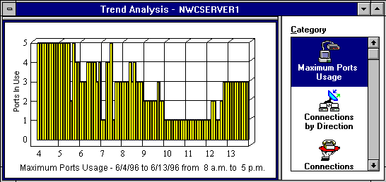
From this example, you can see that the maximum ports usage on the server NWCServer1 is displayed from 8:00 a.m. to 5:00 p.m for 10 days (6/4/96 to 6/13/96). This data indicates that a maximum of five ports were in use simultaneously on 6/4. Only one port was used on 6/10 and 6/11. If the remote access software is licensed for eight ports, this data suggests that port utilization is greater than 50 percent of the available port licenses for more than two days.
NOTE: Maximum ports usage does not reflect the number of sessions using the ports.
When you are viewing maximum ports usage, connections by direction, connections by service, and connection attempts data, ConnectView enables you to customize the display of data within the originally specified start and end dates by changing the
IMPORTANT: Displaying connection data by hour shows the number of connections that were established during the displayed hours. If a connection crosses hours, the connection will be counted in each hourly interval that it crosses. In this case, the total number of connections could exceed the total when the data is displayed by a daily interval.
To access the Trend Analysis Display Options dialog box, ensure that the desired graph is selected and choose View > Display Options (F4). ConnectView opens the Trend Analysis Display Option dialog box, shown in Figure 20.
Figure 20
Example Trend Analysis Display Options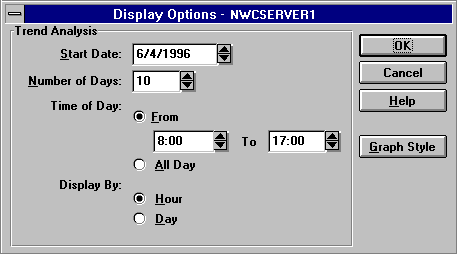
Specify the desired options and click the OK button.
Connections by Direction graphs help you determine the number of dial-in, dial-out, and dialback connections made during a specified period, monitor resource usage, and evenly distribute dial-in, dial-out, and dialback users for more efficient performance.
ConnectView counts the number of valid dial-in, dial-out, and dialback connections that occurred during each hour of the display period. The hourly totals for each twenty-four hour period within the display period are then added together for the daily totals. For a connection to be valid for this trend analysis category, both a start connection record and an end connection record must be found within the display period.
IMPORTANT: Within the same display period, the number of valid connections for this category might not match the number of valid connections for the Connections by Service, Connection Attempts, and Connection Duration categories. Connection Direction graphs require both a start connection record and an end connection record within the display period. These other categories require that valid connections have only an end connection record within the display period.
To display connections-by-direction data, click the Connections by Direction icon in the Category list box. By default, this graph shows the number of connections by direction on a daily interval.
Figure 21 shows a sample Trend Analysis window with connections by direction data.
Figure 21
Example Trend Analysis Windowfor Connections by Direction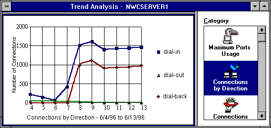
In this example, you can see the number of dial-in, dial-out, and dialback connections made between 6/4/96 and 6/13/96 on server NWCServer1. This data indicates that approximately 1,500 dial-in connections and 1,000 dialback connections were made each day between 6/8 and 6/13, while there were few dial-out connections during the display period.
To change the display options for connections by direction data, choose View > Display Options (F4). For an example Display Options dialog box, see Example Trend Analysis Display Options.
Connections by Service graphs provide data to enable you to track service usage and proactively plan for service expansion.
ConnectView counts the number of valid connections for each service that occurred during each hour of the display period. The hourly totals for each twenty-four hour period within the display period are then added together for the daily totals. For a connection to be valid for this trend analysis category, only an end connection record must be found within the display period.
IMPORTANT: Within the same display period, the number of valid connections for this category might not match the number of valid connections for the Connections by Direction, Traffic Statistics, and Usage by Media categories. Connections by Service graphs require only an end connection record within the display period. These other categories require that valid connections have both a start connection record and an end connection record within the display period.
To display connections-by-service data, click the Connection by Service icon in the Category list box. By default, this graph displays the daily number of connections by service.
Figure 22 shows a sample Trend Analysis window with connections by service data.
Figure 22
Example Trend Analysis Windowfor Connections by Service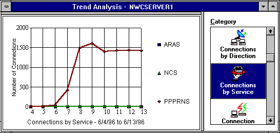
In this example, you can see that connections were made using the PPPRNS service from 6/6/96 to 6/13/96 on the server NWCServer1. No AppleTalk Remote Access Services (ARAS) or NASITM Connection Service (NCS) connections occurred throughout the period.
NOTE: The remote access services that are configured and loaded on the server or recorded in the audit trail file appear in this graph.
To change the display options for connections by service data, ensure the desired graph is selected and choose View > Display Options (F4). For an example Display Options dialog box, see Example Trend Analysis Display Options.
Connection attempts graphs show the number of normal connections, abnormal connections, dial-out failures, and login failures on a server. These graphs help you monitor how successful users are in establishing their connections and assess connection and security problems during this period. Table 32 describes the connection attempt categories.
Table 32. Connection Attempt Categories
IMPORTANT: Within the same display period, the number of valid connections for this category might not match the number of valid connections for the Connections by Direction, Traffic Statics, and Usage by Media categories. Connection Attempts graphs require only an end connection record within the display period. These other categories require that valid connections have both a start connection record and an end connection record within the display period.
To display connection attempts data, click the Connection Attempts icon in the Category list box. The connection attempts graph shows daily connection attempts from the specified start date to the specified end date.
Figure 23 shows a sample Trend Analysis window with connection attempts data.
Figure 23
Example Trend Analysis Windowfor Connection Attempts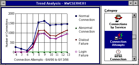
In this example, you can see that there were approximately 1,500 successful connections each day between 6/8/96 and 6/13/96 on the server NWCServer1. Also, notice that during this period a number of dial-out failures and login failures occurred. There were no abnormal connections during the display period.
To change the display options for connection attempts data, ensure that the desired graph is selected and choose View > Display Options (F4). For an example Display Options dialog box, see Example Trend Analysis Display Options.
Connection duration graphs enable you to track connection durations and patterns in connection durations. This data can help you to set duration standards and monitor the amount of time users are connected to the remote access software.
For each day of the display period, ConnectView counts the number of connections with connected times within each duration interval. Connection times are calculated in seconds and then converted to minutes. The number of connections within each connection duration interval provides the daily totals. For a connection attempt to be valid for this trend analysis category, only an end connection record must be found within the display period.
IMPORTANT: Within the same display period, the number of valid connections for this category might not match the number of valid connections for the Connections by Direction, Traffic Statics, and Usage by Media categories. Connection Duration graphs require only an end connection record within the display period. These other categories require that valid connections have both a start connection record and an end connection record within the display period.
To display connection duration data, click the Connection Duration icon in the Category list box.
NOTE: This data can be viewed only on a daily basis.
Figure 24 shows a sample Trend Analysis window with connection duration data. By default, this graph shows the number of connections established for less than 15 minutes, between 15 and 120 minutes (2 hours), and more than 120 minutes. Also, data is displayed daily from the specified start date to the specified end date.
Figure 24
Example Trend Analysis Windowfor Connection Duration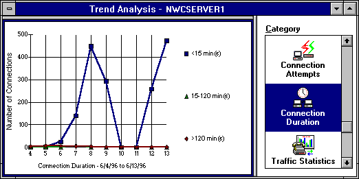
In this example, you can see the duration of connections between
6/4/96 and 6/13/96 on the server NWCServer1. This data indicates that almost all connections were established for less than 15 minutes.
When you are viewing connection duration data, ConnectView enables you to customize the display of data within the originally specified start and end dates by changing the
NOTE: This data can be displayed only in daily intervals.
To access the Trend Analysis Display Options dialog box, ensure that a connection duration graph is selected and choose View > Display Options (F4). ConnectView opens the Trend Analysis Display Options dialog box, shown in Figure 25. Specify the desired options and click the OK button.
Figure 25
Example Display Options(Connection Duration)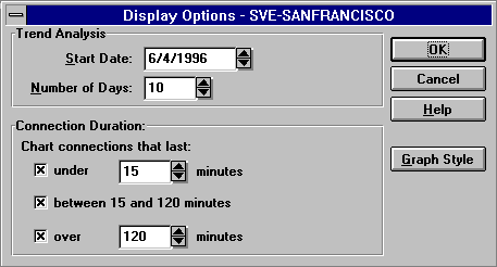
Traffic statistics graphs help you monitor traffic patterns, anticipate periods of heavy or light traffic, and more evenly distribute traffic across your remote access servers.
These graphs show the number of connections in groups of the average traffic patterns. Traffic consists of the number of kilobytes or kilopackets sent and received per second. To determine the level of traffic, the total number of bytes or packets is divided by the number of seconds in the connection duration. The resultant rates of traffic are then grouped according to intervals. For a connection to be valid for this trend analysis category, both a start connection record and an end connection record must be found within the display period.
IMPORTANT: Within the same display period, the number of valid connections for this category might not match the number of valid connections for the Connections by Service, Connection Duration, and Connection Attempts categories. Traffic Statistics graphs require both a start connection record and an end connection record within the display period. These other categories require that valid connections have only an end connection record within the display period.
By default, the traffic intervals start at 0.1 KBps (100 bytes) and continue for 10 intervals. The display options allow you to adjust these intervals and display values and to display data for Kilopackets sent and received.
NOTE: This data can be displayed only in daily intervals.
To display traffic statistics, click the Traffic Statistics icon in the Category list box.
Figure 26 shows a sample Trend Analysis window with traffic statistics data.
Figure 26
Example Trend Analysis Windowfor Traffic Statistics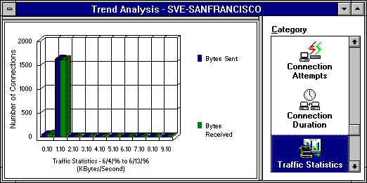
In this example, you can see that all connections between 6/4/96 and 6/13/96 on the server NWCServer1 had less than 2 KBps of traffic.
When viewing traffic statistics data, you can customize the display of data based on the originally specified start and end dates by changing the
NOTE: This data can be displayed only in daily intervals.
To access the Trend Analysis Display Options dialog box, ensure that a traffic statistics graph is selected and choose View > Display Options (F4). ConnectView opens the Trend Analysis Display Option dialog box, shown in Figure 27. Specify the desired options and click the OK button
Figure 27
Example Display Options(Traffic Statistics)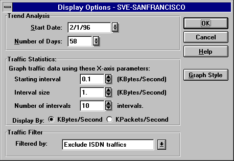
Usage by media graphs help you monitor media usage, analyze media usage patterns, and distribute media utilization across your remote access servers.
These graphs contain pie charts that show the percentage of data traffic and the percentage of connections by media groups. Media groups are defined as analog, ISDN, X.25, and other. Other refers to remote access connections that use a media type different from those listed.
NOTE: Media type is not supported by NetWare Connect 2.0 servers. Connections to NetWare Connect 2.0 servers will show the media type as other.
ConnectView counts the amount of traffic in kilobytes and the number of connections for each media type for each day of the display period. The resultant totals are then divided by the total amount of traffic and the total number of connections, respectively. For a connection to be valid for this trend analysis category, both a start connection record and an end record must be found within the display period.
IMPORTANT: Within the same display period, the number of valid connections for this category might not match the number of valid connections for the Connections by Service, Connection Duration, and Connection Attempts categories. Usage by Media graphs require both a start connection record and an end connection record within the display period. These other categories require that valid connections have only an end connection record within the display period.
To display media usage data, click the Usage by Media icon in the Category list box.
NOTE: This data can be displayed only in daily intervals. You can choose View > Display Options to adjust the dates of the displayed data.
Figure 28 shows a sample Trend Analysis window with usage by media data.
Figure 28
Example Trend Analysis Windowfor Usage by Media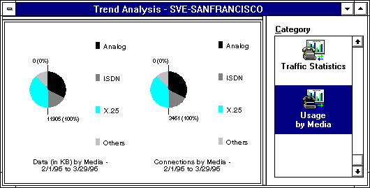
In this example, you can see that most data traffic (40%) on the server San Francisco during the period 2/1/97 to 3/29/97 was analog traffic. Also, most connections (40%) were established for analog connections.
NOTE: Because the numerical values for traffic and connections are displayed in the graphs, the hot graph feature is disabled for this trend analysis category.
| |